Search results used to be a doorway. You ranked, someone clicked, and they landed on your site. But today, that model is eroding faster than most marketing teams are equipped to move.
Bain & Company research found that about 80% of consumers now rely on “zero-click” results in at least 40% of their searches. For some businesses, this means more impressions, but across the board, it’s reducing organic web traffic by an estimated 15% to 25%.
What does this mean for your team and how it measures and achieves success?
This guide breaks it all down, including what zero-click searches are, why they matter, and how to turn zero-click visibility into conversions using answer engine optimization (AEO).
Table of Contents
- TLDR Executive Summary
- What are zero-click searches?
- How Zero-Click Disrupts the Marketing Funnel
- How to Adapt SEO in a Zero-Click World
- When to Pursue or Avoid Zero-Click Keywords
- How to Measure Zero-Click Impact
- Zero-Click Searches Playbook by Funnel Stage
- FAQs About Zero-Click Searches
- AEO is SEO Evolved
TLDR Executive Summary
Zero-click searches occur when a user gets their answer on the search results page through an AI overview or other rich results, without clicking on a website. AI Overviews increase the likelihood of zero-click behavior for informational queries, while featured snippets satisfy simple question intent directly on the SERP, and People Also Ask (PAA) boxes expand answer paths without requiring a click.
Answer engine optimization focuses on earning citations, summaries, answer placements, and even voice mentions for your website and brand, in ways traditional SEO does not. AEO includes, but is not limited to, creating answer-first content to improve eligibility for featured snippets, AI Overviews, and other answer surfaces.
HubSpot’s free AEO grader can help you see how you're currently doing in AI engines and understand what you need to do to improve your visibility.
What are zero-click searches?
A zero-click search occurs when a search engine query is answered directly on the search results page via a featured snippet, knowledge panel, People Also Ask (PAA) box, local pack, AI Overview, or other rich results rather than having a user visit a separate website.
AI-powered rich results include:
- Featured snippets, which return a direct answer in a boxed format at the top of the SERP
- Knowledge panels, which provide quick overviews of entities like companies, people, and places
- People Also Ask, which boxes surface-related questions with expandable answers
- AI Overviews, which synthesize multi-source answers directly in the SERP
- Local Pack, which displays a map and three local business listings based on your location or search.
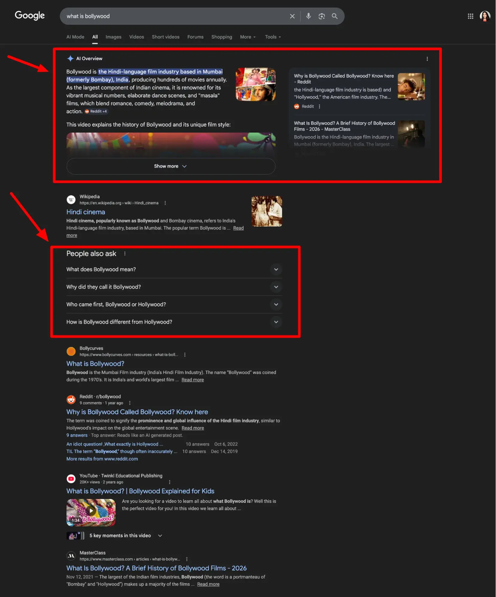
Here’s an example of one from the very on-brand search of: “What is Bollywood?”
As consumers, these results can be convenient and helpful, but for businesses, they’re taking their toll on the organic website traffic that was once a golden metric.
Why should marketers care about zero-click searches?
They’ve changed buyer search behavior.
According to McKinsey, half of Google's results already feature these AI Overviews along with other rich results, and trends predict that number will reach 75% by 2028. Also, thanks to those rich results, Google itself reports that over 27% of searches now end without a click.
That means many queries that used to earn businesses clicks and bring prospective buyers to their websites are no longer performing as well as they once did.
Just consider my “What is Bollywood?” search. In it, searchers are hit with an AI overview and PAA module. Traffic double whammy.
They’ve changed reporting.
The challenge with AI features for marketers isn‘t just traffic, however; it’s also attribution.
Organic click-through rates (CTR) have dropped to 40.3% in the U.S. and 43.5% in the EU/UK, while clicks to Google-owned properties like YouTube and Maps increased to 14.3% in the U.S.
Because of this, the impression data in your Search Console may be stable or growing, but it's likely increasingly coming from sources other than the sessions, leads, and pipeline your stakeholders expect to see. Zero clicks are not all bad news, though.
They can improve brand recognition and recall.
While zero-click results may not directly drive organic traffic, they can still demonstrate expertise, and the brand awareness that comes from being cited can drive higher conversion rates when users do eventually visit your site.
When a buyer sees a brand cited in an AI Overview or featured snippet multiple times during their research, they automatically arrive at your site with far less convincing needed at conversion.
Now that you know how zero-click searches affect businesses, let’s dig a little deeper into why.
Curious how you’re currently performing with AI tools like ChatGPT and Gemini? Use HubSpot’s free AEO grader to get a detailed brand perception analysis across five dimensions with a written interpretation of your results.
How Zero-Click Disrupts the Marketing Funnel
The traditional marketing funnel (illustrating the buyer’s journey) assumed that search drove a click, the click drove a visit, and the visit eventually drove a lead.
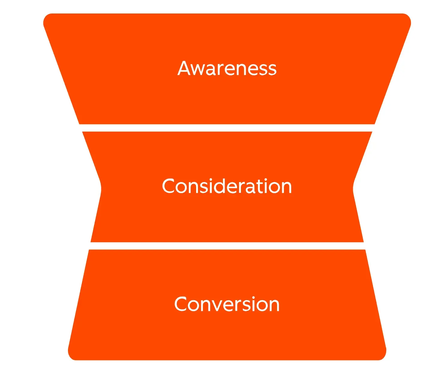
Zero-click searches don't eliminate this path, but it restructures it, with more of the early stages happening directly on the SERP. HubSpot’s evolved hourglass visualization of the buyer’s journey and Loop Marketing accounts for this.
Let’s take a look at the potential impact of zero-click searches in each phase of the buyer’s journey.
Awareness: The SERP is now a branding arena
At the top of the funnel, users are just beginning to understand their pain point and become aware of possible solutions. In the SERP, they’re learning about brands that are in this conversation before they ever reach a website.
Before AI, users would scroll through the SERP, seeing different brand names and favicons and associate them with their search, even if they didn't click.
Now, when a query has an AI overview or another rich result, that scrolling doesn’t happen as often. Users only see and “become aware” of the brands and websites cited in the results, while everything below tends to get ignored.
Your brand's representation in those answers functions like advertising. They're the key to building awareness and attracting leads in the SERP.
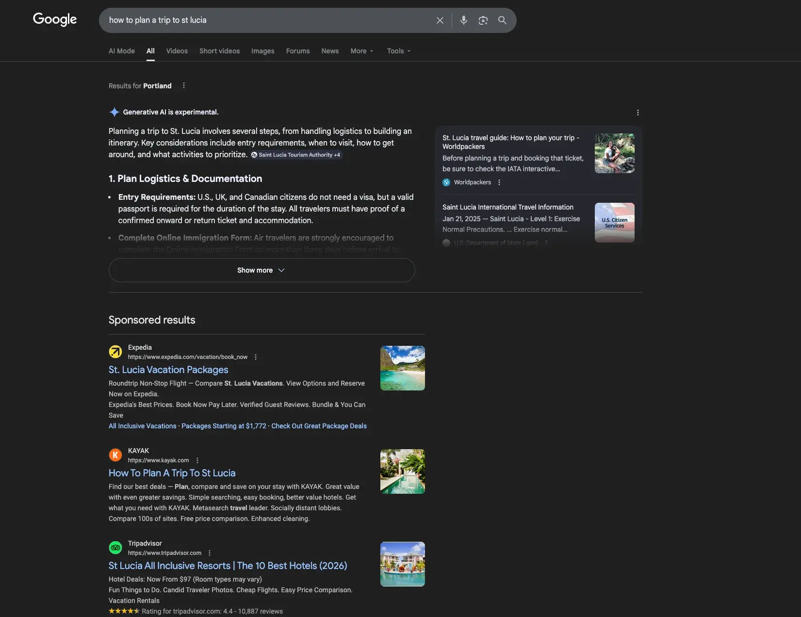
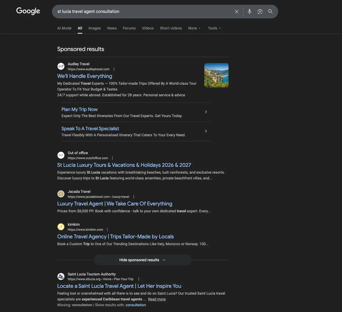
Say you’re a luxury travel agent specializing in the Caribbean. Users researching “how to plan a trip to St. Lucia” may get their ideas and education from AI recommendations and sponsored results, not from your content.
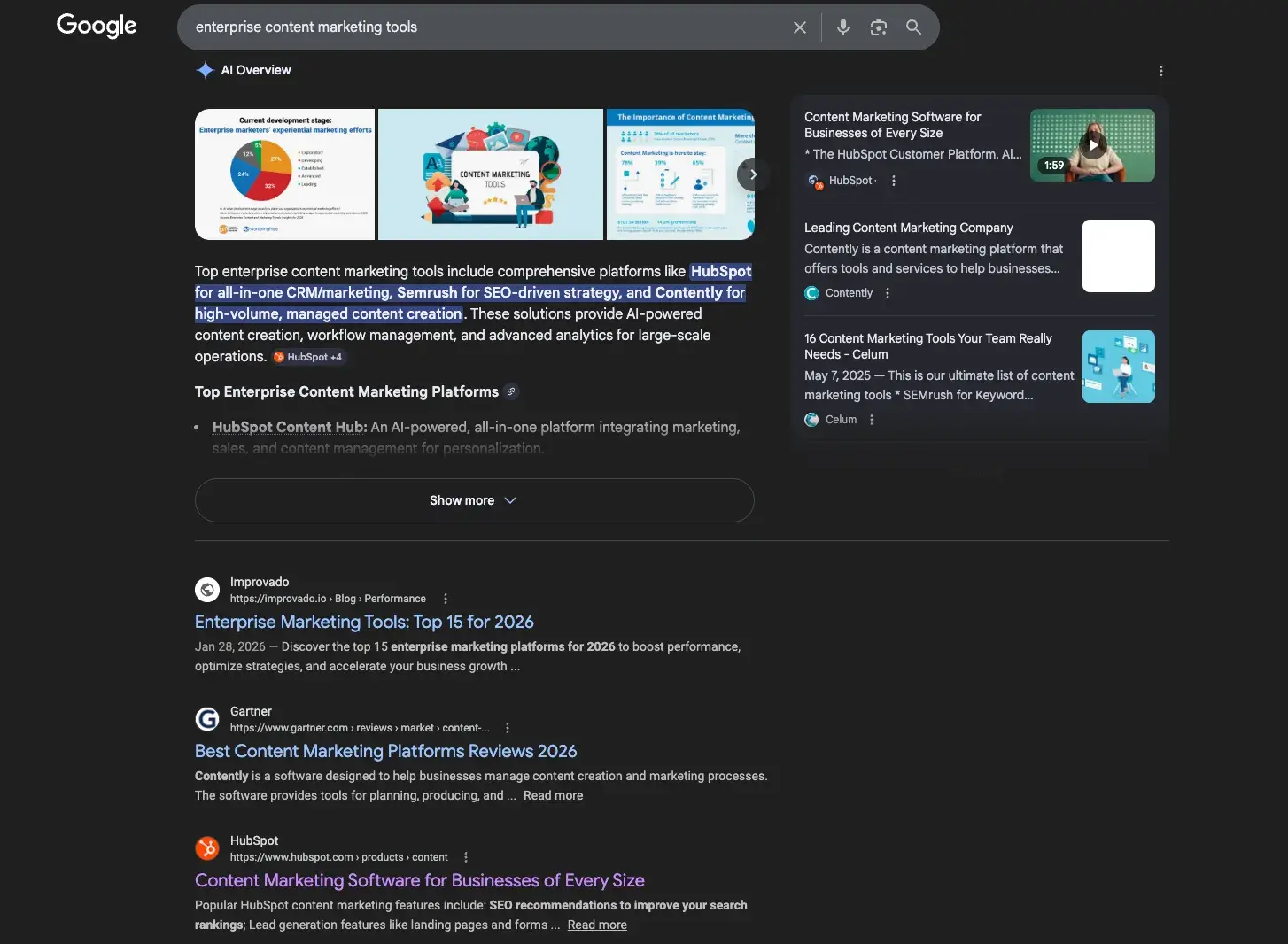
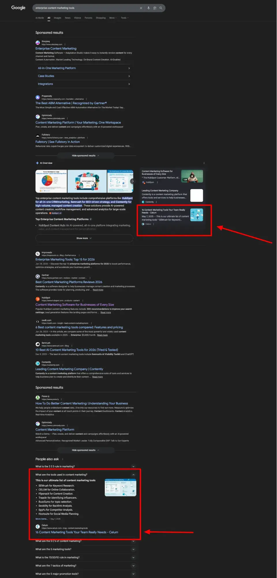
But this is particularly consequential for B2B teams. Say someone searches “best CRM for mid-market” or “enterprise content marketing tools.” There’s a good chance they may form vendor shortlists based on AI overviews, not on your content.
Consideration: Interest and evaluation without a click
In the consideration stage, people are actively looking for solutions and considering which one might be right for them. People Also Ask boxes and featured snippets satisfy the depth of research that used to require three or four site visits during this stage.
For instance, if a user sees your brand mentioned in a featured snippet and then cited in the PAA, they are already poised to build a preference. In the consideration phase, the goal isn‘t to force a click; it’s to make your brand the recurring right answer.
Using our travel agent example, if users researching “how to plan a trip to st lucia” see your website both in the AI overview and PAA, there’s a good chance they’ll begin to see you as someone who knows their stuff.
The same goes for our B2B Saas example:
Repetition breeds familiarity, and familiarity breeds trust.
Conversion: Queries with intent
Conversion is the one stage in the buyer’s journey where traditional SERP is still fairly intact.
In some instances, conversion-stage queries may surface a Local Pack or structured snippets with commercial intent. However, many conversion-related queries, such as comparisons or those containing words like “buying,” “demo,” or “consultation,” are less likely to trigger AI overviews. So, investments in paid search and SEO are still wise.
Thinking of our St. Lucia search, for instance, the query “st lucia travel agent consultation” returns no AI overview or rich results.
Kind of a relief, right? It can be especially for B2B businesses.
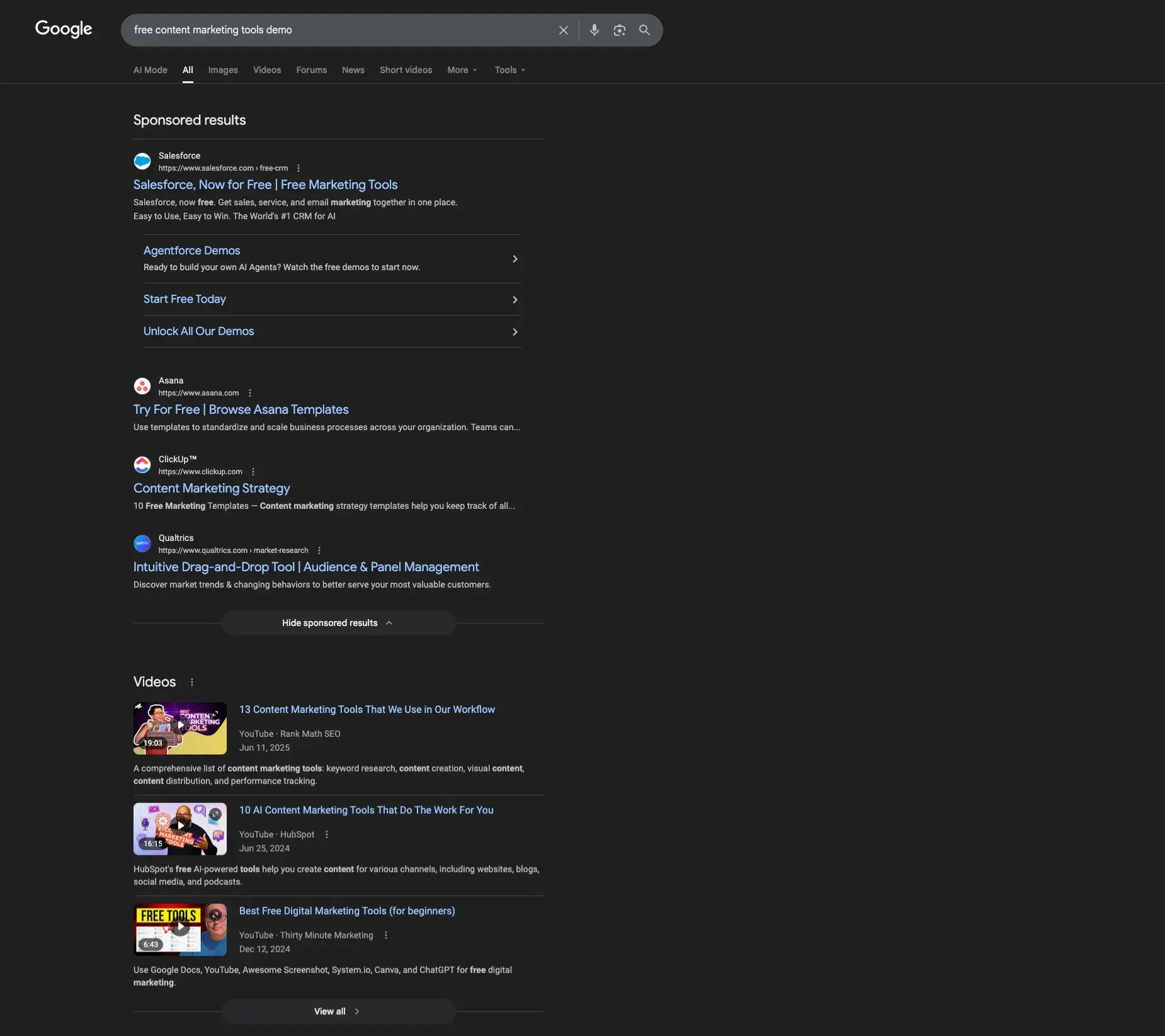
For B2B with high-intent commercial queries, the path from the SERP to owned engagement can be compressed thanks to AI. As with our St. Lucia trip, the query “free content marketing tools demo” for our SaaS example returns no rich results.
Alternatively, a search for “HubSpot vs Salesforce” may surface a comparison page in an AI Overview, but it still requires a click for the user to get the full value. Plus, the prospect who arrives on your website already understands your offering. At this point, the landing page's job is confirmation, not introduction.
But remember, buyers also don’t usually jump straight to the conversion stage of their journey. So, stay vigilant. Regardless of the experience here, the path to the brand’s website and a purchase can be significantly longer than it once was due to AI intervention.
Note: Loop Marketing revisits the buyer’s journey and marketing funnel to adapt to modern behaviors and AI influence on search. Learn more about it here.
Content and capture strategy by funnel stage:
How to Adapt SEO in a Zero-Click World
The fact that Google rank doesn't matter the way it used to doesn‘t mean organic optimization is obsolete. It means the mechanics of what you’re optimizing for have changed. Enter Answer Engine Optimization (AEO).
Here’s what you should do.
Shift your KPIs before your content
The first thing you need to pivot is how you define success. If your team is still reporting organic sessions as the primary SEO metric, you're measuring a declining output instead of the influence driving it.
Swap or supplement these metrics:
- Organic sessions as the headline KPI → Add: SERP impression share, branded search volume, and AI citation frequency
- Rank tracking for individual keywords → Add: Featured snippet and AI Overview ownership rate across keyword clusters
- Traffic-based content ROI → Add: Pipeline influenced by organic touchpoints, including zero-click ones
This reframe also protects your team internally.
When leadership asks why traffic is down, you'll have data showing that despite the traffic dip, impressions are stable, branded search is up, and the organic-assisted pipeline is growing.
Format your content to lead with direct answers
AI search platforms like Google‘s AI Overviews, Google’s AI Mode, ChatGPT Search, Perplexity, and Microsoft Copilot don't process web content the way traditional crawlers do. Rather, they build knowledge networks that connect facts, entities, and relationships, and formatting plays a big part in this.
Thankfully, the content formatting that improves zero-click eligibility is many of the same ones that have helped with traditional SEO:
- Lead with the answer. Open each section with a direct, 40–60-word response to the implicit question before expanding into evidence and context. AI and snippet algorithms reward answer-first architecture.
- Use structured headers as question formats. “What is zero-click SEO?” performs better for SERP features than “Overview” or “Introduction.”
- Include definition boxes or callouts. A clearly formatted definition paragraph is highly likely to be pulled as a snippet.
- Use tables for comparisons and lists for sequential steps. Google consistently favors these formats for list and table-type featured snippets.
- Add FAQ schema to pages already ranking on page one. This signals Q&A structure to both Google and AI systems, helping you show up for common questions and PAA results.
Speaking of PAA, for PAA eligibility, make sure to:
- Map the questions your content needs to answer
- Include those questions verbatim as H3 subheads
- Follow each with a 2–4 sentence direct answer.
This mirrors the format Google uses to serve PAA results and can also aid other AI-powered rich results.
Pro Tip: Prioritize pages that already have strong impressions but declining CTR. Those are your clearest signals that a SERP feature has moved in, and that your content formatting isn't competing with it.
From there, audit your content for answer-first eligibility, asking yourself, “Does this page answer the target query within the first 100 words, or does it make the reader scroll to find it?”
Pages that bury their answer are losing snippet eligibility to competitors who lead with it.
Implement structured data in your content
Speaking of formatting, more and more AI SERP results, such as knowledge panels and featured snippets, depend specifically on structured data (aka schema markup) to provide answers directly in search results.
The essential schema types to implement:
- FAQ schema: Surfaces answers in expandable SERP formats and signals Q&A structure to AI systems. Note that since 2024, Google restricts FAQ rich results to authoritative government and health sites, but FAQ schema still provides structural value for AI citation. This is especially helpful for PAA.
- Article/BlogPosting schema — makes your editorial content eligible for Top Stories and establishes author, publication date, and content context
- Organization and Website schema — anchors your entity in the Knowledge Graph and supports knowledge panel eligibility
- HowTo schema — supports how-to queries with step-based answer formats
According to Google's own structured data documentation, Rotten Tomatoes saw a 25% higher click-through rate after adding structured data to 100,000 pages, and Nestlé found that pages appearing as rich results earned an 82% higher CTR than pages without them.
Implement schema in JSON-LD format (Google's preferred method), validate using Google's Rich Results Test, and prioritize the pages already ranking on page one.
Use local SEO to optimize for knowledge panels and packs
For brands with physical locations or local service areas, local search optimization is one of the highest-leverage zero-click investments available. In fact, according to Backlinko, 42% of searchers click on Google map pack results for local queries, making a 3-pack listing one of the highest-value placements in local search.
To strengthen local zero-click presence:
- Keep your Google Business Profile fully populated and regularly updated
- Implement LocalBusiness schema with consistent NAP (name, address, phone) data
- Earn structured citations across relevant directories
- Generate review volume — star ratings in rich snippets directly influence clicks
Let’s take a look at how this comes together in the buyer’s journey.
Optimize third-party channels that AI systems trust
If your product appears consistently across Reddit discussions, forums, industry articles, and review sites with similar messaging, AI systems gain confidence citing the consensus around you.
In practice, this means your pivot plan needs to include channels that feel adjacent to SEO but directly feed it:
- Third-party review platforms (G2, Capterra, Trustpilot): AI systems heavily draw on these for product-category queries. An incomplete or outdated profile or poor reviews here could be a missed citation.
- Industry publications and guest content: A mention in a high-profile article carries more AI citation weight than ten posts on your own blog. They are an external validation of your expertise.
- Reddit and community forums: Google and AI systems increasingly treat these as authoritative signals for how real users perceive a product. Participating authentically, not spamming, matters.
- YouTube: YouTube is held as the second most widely trafficked website in the world, and its content is even delivered in Google SERPs. A video that answers a core question your audience searches for is a zero-click asset that works across multiple surfaces simultaneously.
Focus your efforts on commercial intent
When AI Overviews are present, click-through rates plummet to just 8%, compared to 15% for traditional search results without AI summaries, according to The Digital Bloom.
The pivot: reduce investment in purely informational, top-of-funnel content that will increasingly be answered by AI without a click, and reinvest in:
- Commercial comparison content (“X vs. Y,” “best [category] for [use case]”): these queries still drive clicks because users need to evaluate details.
- Original research and proprietary data: AI systems can‘t synthesize what doesn’t exist yet; your own studies become both citation bait and click drivers
- Tool pages, templates, and calculators: Utility content that requires interaction can't be zero-clicked away; it must be experienced.
This doesn‘t mean abandoning awareness content entirely, but be strategic about where you expect a click vs. where you’re optimizing for citation and brand recall.
When to Pursue or Avoid Zero-Click Keywords
Not every keyword deserves an optimization investment for zero-click visibility. The decision should come down to commercial potential and content differentiation. Here are some quick tips to help you decide when to pursue zero-click visibility and when not to.
Pursue zero-click visibility when:
- The query has commercial or navigational intent. Users searching things like “best project management tools for agencies” are evaluating vendors, not just learning.
- You're targeting brand awareness at scale, and a SERP placement gets your brand in front of net-new audiences.
- You can win the snippet with differentiated data, such as original research, unique statistics, or a proprietary framework that no other competitor has.
- The keyword represents an easy win where your existing content is close to snippet-eligible with minor reformatting
Avoid zero-click investment when:
- The query is purely informational and of low commercial value. Definitions, basic how-tos, and commodity facts won't move the pipeline.
- Your negative keyword strategy already deprioritizes that traffic as irrelevant.
- Winning the snippet would cannibalize an existing high-performing page by satisfying intent before a click to a higher-value offer.
Pro Tip: Use a test-first approach. Run a 30-day experiment on 3–5 target keywords: restructure the content with an answer-first format, add FAQ schema, and compare CTR and brand mentions before and after. This tells you whether the investment scales before committing full editorial resources.
How to Measure Zero-Click Impact
Like its counterparts, SEO, content marketing, social media, etc. AEO is a long-term strategy. That said, you must make a habit of reviewing your work and tracking your performance.
Let’s take a look at the metrics you’ll want to report on.
AEO and AI Visibility Metrics
Click-through rate is no longer a sufficient measure of search performance. A robust zero-click measurement framework includes SERP, brand, and pipeline measurements.
SERP visibility metrics:
- Impression share by keyword cluster (not just ranked keywords)
- Featured snippet and AI Overview ownership rate for target queries
- PAA appearance frequency across priority topic groups
Brand influence metrics:
- Branded search volume month-over-month
- Direct traffic trends correlated with SERP feature wins
- Share of voice in AI-generated answers (trackable via HubSpot's AEO Grader)
Pipeline influence metrics:
- Assisted conversions where the first or last touch was a branded or non-branded organic search
- Demo and trial volume from pages receiving AI Overview or snippet traffic
- Time-to-conversion trends for search-driven vs. direct-traffic leads
A Sample Zero-Click Scorecard
Reporting Frequency
Build a monthly cadence of measuring your AEO performance. Teams that do compound their advantage as AI search continues to expand.
Your review cadence should include:
- Re-running your AEO Grader score to track AI visibility trends
- Auditing your top-20 priority queries for snippet and AI Overview ownership changes
- Reviewing Search Console impression data for queries gaining impressions without corresponding click growth (a signal of zero-click capture)
- Checking search evolution trends to stay ahead of new SERP features as they roll out
Zero-Click Searches Playbook by Funnel Stage
Awareness: How to Get Cited in AI Overviews and Snippets
Getting cited in AI Overviews isn‘t purely a technical challenge, it’s a challenge of credibility. AI systems favor sources that demonstrate expertise, consistency, and corroboration across multiple platforms.
In other words, if your product appears consistently across Reddit discussions, forums, industry articles, and review sites with similar messaging, AI systems gain confidence citing the consensus around you.
Awareness-stage actions:
- Publish original research and proprietary data. AI systems are trained to value primary sources
- Earn mentions in high-authority industry publications, not just your own blog. Think interviews, guest articles, podcast appearances, news coverage, and reviews.
- Maintain consistent brand messaging and positioning across all owned and earned content. This means both visual and verbal.
- Optimize for E-E-A-T signals: author bios, credentials, and first-hand expertise markers
Consideration: How to Capture Interest Without a Click
At the consideration stage, the goal is to make your brand the persistent right answer to the questions buyers are actively researching. Even if they don't click, repeated positive SERP exposure builds trust and ultimately preference.
Consideration-stage actions:
- Build “vs.” and comparison content that surfaces when buyers evaluate alternatives
- Create answer-first FAQ sections on product and service pages — these are highly eligible for PAA boxes
- Target questions with commercial intent: “how does [your product] work,” “what does [your product] cost,” “[competitor] alternative”
- Use SERP feature tracking to monitor which of your pages are earning snippet placements and optimize the ones close to the threshold
Conversion: How to Turn Zero-Click Visibility into Demand
The conversion question is where most zero-click guides go quiet. Here‘s the practical answer: visibility that doesn’t convert is a targeting problem, not a zero-click problem.
Conversion-stage actions:
- Make your AI Overview citations lead to pages with strong, single CTAs — don't send AI-referred traffic to generic blog posts
- Create conversion paths that don't require a click-first journey: branded search demand, direct type-in traffic, and re-engagement via email all benefit from SERP-level awareness
- Use retargeting to capture users who search for your brand terms but don't convert on their first visit
- For B2B, measure demo requests and pipeline influenced by branded search as a proxy for zero-click conversion impact
Pro Tip: Tag AI Overviews and featured snippet traffic as a separate segment in your analytics. If those visitors convert at a higher rate than average organic traffic — which data suggests they do — it's a strong signal to double down on zero-click optimization.
FAQs About Zero-Click Searches
How do I turn zero-click visibility into conversions?
The key is recognizing that zero-click visibility is top-of-funnel influence. It builds brand recall and trust before the conversion moment.
To convert that visibility, ensure every page that earns AI citations or featured snippets has a high-intent CTA visible above the fold (i.e., free trial, demo request, gated asset).
Track branded search volume as your leading conversion indicator. When zero-click awareness is working, branded searches (and their conversion rates) should increase.
If you‘re building this infrastructure now, start with HubSpot’s free AEO Grader to understand your current AI representation baseline, then map which cited content is sending users toward or away from conversion.
When should you prioritize AEO over traditional SEO?
AEO and traditional SEO aren't competing priorities; AEO is a part of SEO.
Prioritize AEO-specific investments (answer-first content formatting, FAQ schema, AI citation tracking) when your organic traffic has plateaued despite stable or improving rankings, when your product is being evaluated in AI-powered research interfaces, or when you‘re in a category where buyers conduct significant zero-click research before ever reaching a brand’s website (software, financial services, professional services).
Traditional SEO remains essential for capturing the 40% of searches that still result in clicks, and strong rankings remain a prerequisite for AI citation eligibility. Build both, measure them separately.
What is the best way to report zero-click wins internally?
Frame zero-click reporting around business outcomes, not search mechanics. Show stakeholders the connection between SERP impression share and branded search volume growth, between AI citation frequency and direct traffic trends, and between featured snippet ownership and pipeline-influenced revenue.
For teams using HubSpot's Marketing Hub Professional or higher, our AEO tools offer deeper scoring, guidance, and content recommendations that can help build dashboards combining page performance, AI visibility, and conversion impact — giving you the data architecture to make that business case clearly.
The most effective internal reporting frames zero-click search not as “traffic we're losing” but as “influence we're gaining in a channel that's growing faster than traditional search.”
AEO is SEO Evolved
Think of AEO as the evolution of SEO: one unified strategy where content ranks in SERPs and gets cited in rich results.
The same structured data, E-E-A-T signals, and authoritative content that rank well in traditional search also improve AI citation frequency. So, if anything, AEO is just a new “zero-click layer” on your SEO strategy.
- Run HubSpot's free AEO Grader to establish your baseline AI visibility score across ChatGPT, Perplexity, and Gemini before you make changes. This will help you measure the impact of your pivot
- Add answer-first sections to your top 10 existing SEO pages rather than creating new content from scratch
- Include schema as a standard step in your content production workflow, not an afterthought
- Report on both traditional rankings and AI citations in your regular SEO reporting, so leadership sees the full picture.
HubSpot's AEO Grader is a free tool that evaluates how ChatGPT, Perplexity, and Gemini currently represent your brand — scored across sentiment, presence quality, brand recognition, share of voice, and market position. Run your analysis to establish a baseline before your next optimization cycle.
from Marketing https://blog.hubspot.com/marketing/zero-click-searches
Search results used to be a doorway. You ranked, someone clicked, and they landed on your site. But today, that model is eroding faster than most marketing teams are equipped to move.
Bain & Company research found that about 80% of consumers now rely on “zero-click” results in at least 40% of their searches. For some businesses, this means more impressions, but across the board, it’s reducing organic web traffic by an estimated 15% to 25%.
What does this mean for your team and how it measures and achieves success?
This guide breaks it all down, including what zero-click searches are, why they matter, and how to turn zero-click visibility into conversions using answer engine optimization (AEO).
Table of Contents
- TLDR Executive Summary
- What are zero-click searches?
- How Zero-Click Disrupts the Marketing Funnel
- How to Adapt SEO in a Zero-Click World
- When to Pursue or Avoid Zero-Click Keywords
- How to Measure Zero-Click Impact
- Zero-Click Searches Playbook by Funnel Stage
- FAQs About Zero-Click Searches
- AEO is SEO Evolved
TLDR Executive Summary
Zero-click searches occur when a user gets their answer on the search results page through an AI overview or other rich results, without clicking on a website. AI Overviews increase the likelihood of zero-click behavior for informational queries, while featured snippets satisfy simple question intent directly on the SERP, and People Also Ask (PAA) boxes expand answer paths without requiring a click.
Answer engine optimization focuses on earning citations, summaries, answer placements, and even voice mentions for your website and brand, in ways traditional SEO does not. AEO includes, but is not limited to, creating answer-first content to improve eligibility for featured snippets, AI Overviews, and other answer surfaces.
HubSpot’s free AEO grader can help you see how you're currently doing in AI engines and understand what you need to do to improve your visibility.
What are zero-click searches?
A zero-click search occurs when a search engine query is answered directly on the search results page via a featured snippet, knowledge panel, People Also Ask (PAA) box, local pack, AI Overview, or other rich results rather than having a user visit a separate website.
AI-powered rich results include:
- Featured snippets, which return a direct answer in a boxed format at the top of the SERP
- Knowledge panels, which provide quick overviews of entities like companies, people, and places
- People Also Ask, which boxes surface-related questions with expandable answers
- AI Overviews, which synthesize multi-source answers directly in the SERP
- Local Pack, which displays a map and three local business listings based on your location or search.
Here’s an example of one from the very on-brand search of: “What is Bollywood?”
As consumers, these results can be convenient and helpful, but for businesses, they’re taking their toll on the organic website traffic that was once a golden metric.
Why should marketers care about zero-click searches?
They’ve changed buyer search behavior.
According to McKinsey, half of Google's results already feature these AI Overviews along with other rich results, and trends predict that number will reach 75% by 2028. Also, thanks to those rich results, Google itself reports that over 27% of searches now end without a click.
That means many queries that used to earn businesses clicks and bring prospective buyers to their websites are no longer performing as well as they once did.
Just consider my “What is Bollywood?” search. In it, searchers are hit with an AI overview and PAA module. Traffic double whammy.
They’ve changed reporting.
The challenge with AI features for marketers isn‘t just traffic, however; it’s also attribution.
Organic click-through rates (CTR) have dropped to 40.3% in the U.S. and 43.5% in the EU/UK, while clicks to Google-owned properties like YouTube and Maps increased to 14.3% in the U.S.
Because of this, the impression data in your Search Console may be stable or growing, but it's likely increasingly coming from sources other than the sessions, leads, and pipeline your stakeholders expect to see. Zero clicks are not all bad news, though.
They can improve brand recognition and recall.
While zero-click results may not directly drive organic traffic, they can still demonstrate expertise, and the brand awareness that comes from being cited can drive higher conversion rates when users do eventually visit your site.
When a buyer sees a brand cited in an AI Overview or featured snippet multiple times during their research, they automatically arrive at your site with far less convincing needed at conversion.
Now that you know how zero-click searches affect businesses, let’s dig a little deeper into why.
Curious how you’re currently performing with AI tools like ChatGPT and Gemini? Use HubSpot’s free AEO grader to get a detailed brand perception analysis across five dimensions with a written interpretation of your results.
How Zero-Click Disrupts the Marketing Funnel
The traditional marketing funnel (illustrating the buyer’s journey) assumed that search drove a click, the click drove a visit, and the visit eventually drove a lead.
Zero-click searches don't eliminate this path, but it restructures it, with more of the early stages happening directly on the SERP. HubSpot’s evolved hourglass visualization of the buyer’s journey and Loop Marketing accounts for this.
Let’s take a look at the potential impact of zero-click searches in each phase of the buyer’s journey.
Awareness: The SERP is now a branding arena
At the top of the funnel, users are just beginning to understand their pain point and become aware of possible solutions. In the SERP, they’re learning about brands that are in this conversation before they ever reach a website.
Before AI, users would scroll through the SERP, seeing different brand names and favicons and associate them with their search, even if they didn't click.
Now, when a query has an AI overview or another rich result, that scrolling doesn’t happen as often. Users only see and “become aware” of the brands and websites cited in the results, while everything below tends to get ignored.
Your brand's representation in those answers functions like advertising. They're the key to building awareness and attracting leads in the SERP.
Say you’re a luxury travel agent specializing in the Caribbean. Users researching “how to plan a trip to St. Lucia” may get their ideas and education from AI recommendations and sponsored results, not from your content.
But this is particularly consequential for B2B teams. Say someone searches “best CRM for mid-market” or “enterprise content marketing tools.” There’s a good chance they may form vendor shortlists based on AI overviews, not on your content.
Consideration: Interest and evaluation without a click
In the consideration stage, people are actively looking for solutions and considering which one might be right for them. People Also Ask boxes and featured snippets satisfy the depth of research that used to require three or four site visits during this stage.
For instance, if a user sees your brand mentioned in a featured snippet and then cited in the PAA, they are already poised to build a preference. In the consideration phase, the goal isn‘t to force a click; it’s to make your brand the recurring right answer.
Using our travel agent example, if users researching “how to plan a trip to st lucia” see your website both in the AI overview and PAA, there’s a good chance they’ll begin to see you as someone who knows their stuff.
The same goes for our B2B Saas example:
Repetition breeds familiarity, and familiarity breeds trust.
Conversion: Queries with intent
Conversion is the one stage in the buyer’s journey where traditional SERP is still fairly intact.
In some instances, conversion-stage queries may surface a Local Pack or structured snippets with commercial intent. However, many conversion-related queries, such as comparisons or those containing words like “buying,” “demo,” or “consultation,” are less likely to trigger AI overviews. So, investments in paid search and SEO are still wise.
Thinking of our St. Lucia search, for instance, the query “st lucia travel agent consultation” returns no AI overview or rich results.
Kind of a relief, right? It can be especially for B2B businesses.
For B2B with high-intent commercial queries, the path from the SERP to owned engagement can be compressed thanks to AI. As with our St. Lucia trip, the query “free content marketing tools demo” for our SaaS example returns no rich results.
Alternatively, a search for “HubSpot vs Salesforce” may surface a comparison page in an AI Overview, but it still requires a click for the user to get the full value. Plus, the prospect who arrives on your website already understands your offering. At this point, the landing page's job is confirmation, not introduction.
But remember, buyers also don’t usually jump straight to the conversion stage of their journey. So, stay vigilant. Regardless of the experience here, the path to the brand’s website and a purchase can be significantly longer than it once was due to AI intervention.
Note: Loop Marketing revisits the buyer’s journey and marketing funnel to adapt to modern behaviors and AI influence on search. Learn more about it here.
Content and capture strategy by funnel stage:
How to Adapt SEO in a Zero-Click World
The fact that Google rank doesn't matter the way it used to doesn‘t mean organic optimization is obsolete. It means the mechanics of what you’re optimizing for have changed. Enter Answer Engine Optimization (AEO).
Here’s what you should do.
Shift your KPIs before your content
The first thing you need to pivot is how you define success. If your team is still reporting organic sessions as the primary SEO metric, you're measuring a declining output instead of the influence driving it.
Swap or supplement these metrics:
- Organic sessions as the headline KPI → Add: SERP impression share, branded search volume, and AI citation frequency
- Rank tracking for individual keywords → Add: Featured snippet and AI Overview ownership rate across keyword clusters
- Traffic-based content ROI → Add: Pipeline influenced by organic touchpoints, including zero-click ones
This reframe also protects your team internally.
When leadership asks why traffic is down, you'll have data showing that despite the traffic dip, impressions are stable, branded search is up, and the organic-assisted pipeline is growing.
Format your content to lead with direct answers
AI search platforms like Google‘s AI Overviews, Google’s AI Mode, ChatGPT Search, Perplexity, and Microsoft Copilot don't process web content the way traditional crawlers do. Rather, they build knowledge networks that connect facts, entities, and relationships, and formatting plays a big part in this.
Thankfully, the content formatting that improves zero-click eligibility is many of the same ones that have helped with traditional SEO:
- Lead with the answer. Open each section with a direct, 40–60-word response to the implicit question before expanding into evidence and context. AI and snippet algorithms reward answer-first architecture.
- Use structured headers as question formats. “What is zero-click SEO?” performs better for SERP features than “Overview” or “Introduction.”
- Include definition boxes or callouts. A clearly formatted definition paragraph is highly likely to be pulled as a snippet.
- Use tables for comparisons and lists for sequential steps. Google consistently favors these formats for list and table-type featured snippets.
- Add FAQ schema to pages already ranking on page one. This signals Q&A structure to both Google and AI systems, helping you show up for common questions and PAA results.
Speaking of PAA, for PAA eligibility, make sure to:
- Map the questions your content needs to answer
- Include those questions verbatim as H3 subheads
- Follow each with a 2–4 sentence direct answer.
This mirrors the format Google uses to serve PAA results and can also aid other AI-powered rich results.
Pro Tip: Prioritize pages that already have strong impressions but declining CTR. Those are your clearest signals that a SERP feature has moved in, and that your content formatting isn't competing with it.
From there, audit your content for answer-first eligibility, asking yourself, “Does this page answer the target query within the first 100 words, or does it make the reader scroll to find it?”
Pages that bury their answer are losing snippet eligibility to competitors who lead with it.
Implement structured data in your content
Speaking of formatting, more and more AI SERP results, such as knowledge panels and featured snippets, depend specifically on structured data (aka schema markup) to provide answers directly in search results.
The essential schema types to implement:
- FAQ schema: Surfaces answers in expandable SERP formats and signals Q&A structure to AI systems. Note that since 2024, Google restricts FAQ rich results to authoritative government and health sites, but FAQ schema still provides structural value for AI citation. This is especially helpful for PAA.
- Article/BlogPosting schema — makes your editorial content eligible for Top Stories and establishes author, publication date, and content context
- Organization and Website schema — anchors your entity in the Knowledge Graph and supports knowledge panel eligibility
- HowTo schema — supports how-to queries with step-based answer formats
According to Google's own structured data documentation, Rotten Tomatoes saw a 25% higher click-through rate after adding structured data to 100,000 pages, and Nestlé found that pages appearing as rich results earned an 82% higher CTR than pages without them.
Implement schema in JSON-LD format (Google's preferred method), validate using Google's Rich Results Test, and prioritize the pages already ranking on page one.
Use local SEO to optimize for knowledge panels and packs
For brands with physical locations or local service areas, local search optimization is one of the highest-leverage zero-click investments available. In fact, according to Backlinko, 42% of searchers click on Google map pack results for local queries, making a 3-pack listing one of the highest-value placements in local search.
To strengthen local zero-click presence:
- Keep your Google Business Profile fully populated and regularly updated
- Implement LocalBusiness schema with consistent NAP (name, address, phone) data
- Earn structured citations across relevant directories
- Generate review volume — star ratings in rich snippets directly influence clicks
Let’s take a look at how this comes together in the buyer’s journey.
Optimize third-party channels that AI systems trust
If your product appears consistently across Reddit discussions, forums, industry articles, and review sites with similar messaging, AI systems gain confidence citing the consensus around you.
In practice, this means your pivot plan needs to include channels that feel adjacent to SEO but directly feed it:
- Third-party review platforms (G2, Capterra, Trustpilot): AI systems heavily draw on these for product-category queries. An incomplete or outdated profile or poor reviews here could be a missed citation.
- Industry publications and guest content: A mention in a high-profile article carries more AI citation weight than ten posts on your own blog. They are an external validation of your expertise.
- Reddit and community forums: Google and AI systems increasingly treat these as authoritative signals for how real users perceive a product. Participating authentically, not spamming, matters.
- YouTube: YouTube is held as the second most widely trafficked website in the world, and its content is even delivered in Google SERPs. A video that answers a core question your audience searches for is a zero-click asset that works across multiple surfaces simultaneously.
Focus your efforts on commercial intent
When AI Overviews are present, click-through rates plummet to just 8%, compared to 15% for traditional search results without AI summaries, according to The Digital Bloom.
The pivot: reduce investment in purely informational, top-of-funnel content that will increasingly be answered by AI without a click, and reinvest in:
- Commercial comparison content (“X vs. Y,” “best [category] for [use case]”): these queries still drive clicks because users need to evaluate details.
- Original research and proprietary data: AI systems can‘t synthesize what doesn’t exist yet; your own studies become both citation bait and click drivers
- Tool pages, templates, and calculators: Utility content that requires interaction can't be zero-clicked away; it must be experienced.
This doesn‘t mean abandoning awareness content entirely, but be strategic about where you expect a click vs. where you’re optimizing for citation and brand recall.
When to Pursue or Avoid Zero-Click Keywords
Not every keyword deserves an optimization investment for zero-click visibility. The decision should come down to commercial potential and content differentiation. Here are some quick tips to help you decide when to pursue zero-click visibility and when not to.
Pursue zero-click visibility when:
- The query has commercial or navigational intent. Users searching things like “best project management tools for agencies” are evaluating vendors, not just learning.
- You're targeting brand awareness at scale, and a SERP placement gets your brand in front of net-new audiences.
- You can win the snippet with differentiated data, such as original research, unique statistics, or a proprietary framework that no other competitor has.
- The keyword represents an easy win where your existing content is close to snippet-eligible with minor reformatting
Avoid zero-click investment when:
- The query is purely informational and of low commercial value. Definitions, basic how-tos, and commodity facts won't move the pipeline.
- Your negative keyword strategy already deprioritizes that traffic as irrelevant.
- Winning the snippet would cannibalize an existing high-performing page by satisfying intent before a click to a higher-value offer.
Pro Tip: Use a test-first approach. Run a 30-day experiment on 3–5 target keywords: restructure the content with an answer-first format, add FAQ schema, and compare CTR and brand mentions before and after. This tells you whether the investment scales before committing full editorial resources.
How to Measure Zero-Click Impact
Like its counterparts, SEO, content marketing, social media, etc. AEO is a long-term strategy. That said, you must make a habit of reviewing your work and tracking your performance.
Let’s take a look at the metrics you’ll want to report on.
AEO and AI Visibility Metrics
Click-through rate is no longer a sufficient measure of search performance. A robust zero-click measurement framework includes SERP, brand, and pipeline measurements.
SERP visibility metrics:
- Impression share by keyword cluster (not just ranked keywords)
- Featured snippet and AI Overview ownership rate for target queries
- PAA appearance frequency across priority topic groups
Brand influence metrics:
- Branded search volume month-over-month
- Direct traffic trends correlated with SERP feature wins
- Share of voice in AI-generated answers (trackable via HubSpot's AEO Grader)
Pipeline influence metrics:
- Assisted conversions where the first or last touch was a branded or non-branded organic search
- Demo and trial volume from pages receiving AI Overview or snippet traffic
- Time-to-conversion trends for search-driven vs. direct-traffic leads
A Sample Zero-Click Scorecard
Reporting Frequency
Build a monthly cadence of measuring your AEO performance. Teams that do compound their advantage as AI search continues to expand.
Your review cadence should include:
- Re-running your AEO Grader score to track AI visibility trends
- Auditing your top-20 priority queries for snippet and AI Overview ownership changes
- Reviewing Search Console impression data for queries gaining impressions without corresponding click growth (a signal of zero-click capture)
- Checking search evolution trends to stay ahead of new SERP features as they roll out
Zero-Click Searches Playbook by Funnel Stage
Awareness: How to Get Cited in AI Overviews and Snippets
Getting cited in AI Overviews isn‘t purely a technical challenge, it’s a challenge of credibility. AI systems favor sources that demonstrate expertise, consistency, and corroboration across multiple platforms.
In other words, if your product appears consistently across Reddit discussions, forums, industry articles, and review sites with similar messaging, AI systems gain confidence citing the consensus around you.
Awareness-stage actions:
- Publish original research and proprietary data. AI systems are trained to value primary sources
- Earn mentions in high-authority industry publications, not just your own blog. Think interviews, guest articles, podcast appearances, news coverage, and reviews.
- Maintain consistent brand messaging and positioning across all owned and earned content. This means both visual and verbal.
- Optimize for E-E-A-T signals: author bios, credentials, and first-hand expertise markers
Consideration: How to Capture Interest Without a Click
At the consideration stage, the goal is to make your brand the persistent right answer to the questions buyers are actively researching. Even if they don't click, repeated positive SERP exposure builds trust and ultimately preference.
Consideration-stage actions:
- Build “vs.” and comparison content that surfaces when buyers evaluate alternatives
- Create answer-first FAQ sections on product and service pages — these are highly eligible for PAA boxes
- Target questions with commercial intent: “how does [your product] work,” “what does [your product] cost,” “[competitor] alternative”
- Use SERP feature tracking to monitor which of your pages are earning snippet placements and optimize the ones close to the threshold
Conversion: How to Turn Zero-Click Visibility into Demand
The conversion question is where most zero-click guides go quiet. Here‘s the practical answer: visibility that doesn’t convert is a targeting problem, not a zero-click problem.
Conversion-stage actions:
- Make your AI Overview citations lead to pages with strong, single CTAs — don't send AI-referred traffic to generic blog posts
- Create conversion paths that don't require a click-first journey: branded search demand, direct type-in traffic, and re-engagement via email all benefit from SERP-level awareness
- Use retargeting to capture users who search for your brand terms but don't convert on their first visit
- For B2B, measure demo requests and pipeline influenced by branded search as a proxy for zero-click conversion impact
Pro Tip: Tag AI Overviews and featured snippet traffic as a separate segment in your analytics. If those visitors convert at a higher rate than average organic traffic — which data suggests they do — it's a strong signal to double down on zero-click optimization.
FAQs About Zero-Click Searches
How do I turn zero-click visibility into conversions?
The key is recognizing that zero-click visibility is top-of-funnel influence. It builds brand recall and trust before the conversion moment.
To convert that visibility, ensure every page that earns AI citations or featured snippets has a high-intent CTA visible above the fold (i.e., free trial, demo request, gated asset).
Track branded search volume as your leading conversion indicator. When zero-click awareness is working, branded searches (and their conversion rates) should increase.
If you‘re building this infrastructure now, start with HubSpot’s free AEO Grader to understand your current AI representation baseline, then map which cited content is sending users toward or away from conversion.
When should you prioritize AEO over traditional SEO?
AEO and traditional SEO aren't competing priorities; AEO is a part of SEO.
Prioritize AEO-specific investments (answer-first content formatting, FAQ schema, AI citation tracking) when your organic traffic has plateaued despite stable or improving rankings, when your product is being evaluated in AI-powered research interfaces, or when you‘re in a category where buyers conduct significant zero-click research before ever reaching a brand’s website (software, financial services, professional services).
Traditional SEO remains essential for capturing the 40% of searches that still result in clicks, and strong rankings remain a prerequisite for AI citation eligibility. Build both, measure them separately.
What is the best way to report zero-click wins internally?
Frame zero-click reporting around business outcomes, not search mechanics. Show stakeholders the connection between SERP impression share and branded search volume growth, between AI citation frequency and direct traffic trends, and between featured snippet ownership and pipeline-influenced revenue.
For teams using HubSpot's Marketing Hub Professional or higher, our AEO tools offer deeper scoring, guidance, and content recommendations that can help build dashboards combining page performance, AI visibility, and conversion impact — giving you the data architecture to make that business case clearly.
The most effective internal reporting frames zero-click search not as “traffic we're losing” but as “influence we're gaining in a channel that's growing faster than traditional search.”
AEO is SEO Evolved
Think of AEO as the evolution of SEO: one unified strategy where content ranks in SERPs and gets cited in rich results.
The same structured data, E-E-A-T signals, and authoritative content that rank well in traditional search also improve AI citation frequency. So, if anything, AEO is just a new “zero-click layer” on your SEO strategy.
- Run HubSpot's free AEO Grader to establish your baseline AI visibility score across ChatGPT, Perplexity, and Gemini before you make changes. This will help you measure the impact of your pivot
- Add answer-first sections to your top 10 existing SEO pages rather than creating new content from scratch
- Include schema as a standard step in your content production workflow, not an afterthought
- Report on both traditional rankings and AI citations in your regular SEO reporting, so leadership sees the full picture.
HubSpot's AEO Grader is a free tool that evaluates how ChatGPT, Perplexity, and Gemini currently represent your brand — scored across sentiment, presence quality, brand recognition, share of voice, and market position. Run your analysis to establish a baseline before your next optimization cycle.