If you're a marketer, you've undoubtedly asked yourself, "How can I track clicks on a link in Google Analytics?"
Tracking clicks can help you understand where your audience is going from one page to another. It'll also let you know what links they're interested in, what CTAs they're clicking, and more.
With the new Google Analytics 4, link click tracking happens automatically. This is great, because previous versions of Google Analytics haven't been able to do it automatically. You used to have to set up custom event tracking, which can be confusing.
But we're here to help. If you haven't set up Google Analytics 4 yet and you aren't sure how to get started with tracking clicks on a link, keep reading.
![→ Download Now: SEO Starter Pack [Free Kit]](https://no-cache.hubspot.com/cta/default/53/1d7211ac-7b1b-4405-b940-54b8acedb26e.png)
1. Add a Google Analytics 4 property to your site.
In Google Analytics 4, you can automatically track links. While GA4 rolled out in October 2020, your site won't automatically switch to GA4. You need to set it up.
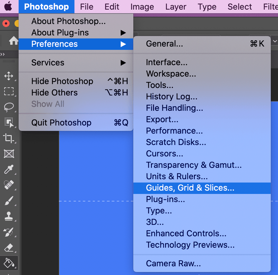
To do this, click "Admin" on the bottom left of your Google Analytics home page. Then, ensure the right account is selected, and in the "Property" column you'll see a GA4 setup assistant. Go through the process (takes a minute or so), and then click "Create Property."
You should be all done now and you'll have GA4 set up.
2. Click "See your GA4 property."
Once you're done setting up GA4, you should be able to click "See your GA4 property." This will give you all the information on your property that you need.
Before you continue, it's a good idea to explore around and see what's new in GA4.
3. Click "Data Streams."
Now that you've explored and set up your GA4 property, you'll want to click "Data Streams" in the left column.
This will give you detailed information about what GA4 is tracking for your site.
4. Click your site.
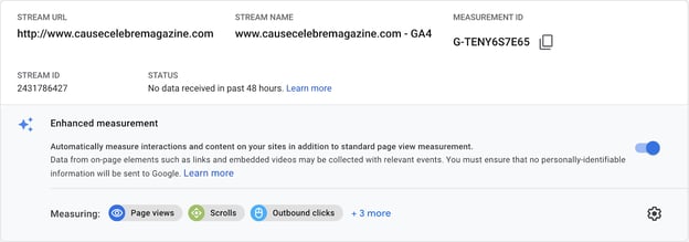
Lastly, you just need to click on your site, and you should see the enhanced measurement. It should automatically be toggled on.
This feature automatically tracks events such as page views, scrolls, outbound link clicks, site search, video engagement, and file downloads.
To see this information, your GA homepage should have an area now called "Events" where you can see outbound link clicks.
This is what it looks like when you see enhanced measurements:
5. Set up custom link clicks.
Now you've officially set up certain link tracking in the future. While this feature will help you track a number of events, you might want to track certain links clicks specifically. In this case, you'll want to set up custom link clicks.
You can do this through Google Tags Manager. If you don't already have an account, create an account for your site and connect to your GA4 property.
You can learn more about event editing in GA4 by watching this video:
Essentially, you'll need to create a trigger to distinguish between the custom links you want to track and the page views and outbound clicks that the enhanced measurement feature is tracking.
Go to your Google Tags Manager and add a new trigger. Then, you'll have to connect this trigger to your events tracking.
Watch this video to learn how to set up Google Tags Manager with your GA4 property.
While this is all great if you're converting your current analytics account to GA4, it will only track these link clicks going forward. It's not retroactive.
Now, let's discuss how to track Google Analytics click events if you aren't using GA4.
How to Track Clicks in Older Versions of Google Analytics
If you aren't using GA4, then you'll need to use Google Tags Manager. We have an in-depth guide to help you navigate the tags manager, because it can be confusing.
Without GA4, the process is the same as setting up custom events. Google Analytics didn't have the capability to automatically track link clicks before GA4.
While it does now, you might not be using GA4, and still want to track those links.
That's okay. You can read our in-depth guide, watch the videos in step 5, and review how to set up custom link click tracking through the Google Tags Manager.
While it might seem confusing to set up, there are numerous resources available from Google to help you set up custom event tracking. And it's worth it. Knowing where your customers are clicking and being able to attribute a certain amount of clicks from one blog post to another is invaluable information.

from Marketing https://blog.hubspot.com/marketing/google-analytics-track-clicks
If you're a marketer, you've undoubtedly asked yourself, "How can I track clicks on a link in Google Analytics?"
Tracking clicks can help you understand where your audience is going from one page to another. It'll also let you know what links they're interested in, what CTAs they're clicking, and more.
With the new Google Analytics 4, link click tracking happens automatically. This is great, because previous versions of Google Analytics haven't been able to do it automatically. You used to have to set up custom event tracking, which can be confusing.
But we're here to help. If you haven't set up Google Analytics 4 yet and you aren't sure how to get started with tracking clicks on a link, keep reading.
1. Add a Google Analytics 4 property to your site.
In Google Analytics 4, you can automatically track links. While GA4 rolled out in October 2020, your site won't automatically switch to GA4. You need to set it up.
To do this, click "Admin" on the bottom left of your Google Analytics home page. Then, ensure the right account is selected, and in the "Property" column you'll see a GA4 setup assistant. Go through the process (takes a minute or so), and then click "Create Property."
You should be all done now and you'll have GA4 set up.
2. Click "See your GA4 property."
Once you're done setting up GA4, you should be able to click "See your GA4 property." This will give you all the information on your property that you need.
Before you continue, it's a good idea to explore around and see what's new in GA4.
3. Click "Data Streams."
Now that you've explored and set up your GA4 property, you'll want to click "Data Streams" in the left column.
This will give you detailed information about what GA4 is tracking for your site.
4. Click your site.
Lastly, you just need to click on your site, and you should see the enhanced measurement. It should automatically be toggled on.
This feature automatically tracks events such as page views, scrolls, outbound link clicks, site search, video engagement, and file downloads.
To see this information, your GA homepage should have an area now called "Events" where you can see outbound link clicks.
This is what it looks like when you see enhanced measurements:
5. Set up custom link clicks.
Now you've officially set up certain link tracking in the future. While this feature will help you track a number of events, you might want to track certain links clicks specifically. In this case, you'll want to set up custom link clicks.
You can do this through Google Tags Manager. If you don't already have an account, create an account for your site and connect to your GA4 property.
You can learn more about event editing in GA4 by watching this video:
Essentially, you'll need to create a trigger to distinguish between the custom links you want to track and the page views and outbound clicks that the enhanced measurement feature is tracking.
Go to your Google Tags Manager and add a new trigger. Then, you'll have to connect this trigger to your events tracking.
Watch this video to learn how to set up Google Tags Manager with your GA4 property.
While this is all great if you're converting your current analytics account to GA4, it will only track these link clicks going forward. It's not retroactive.
Now, let's discuss how to track Google Analytics click events if you aren't using GA4.
How to Track Clicks in Older Versions of Google Analytics
If you aren't using GA4, then you'll need to use Google Tags Manager. We have an in-depth guide to help you navigate the tags manager, because it can be confusing.
Without GA4, the process is the same as setting up custom events. Google Analytics didn't have the capability to automatically track link clicks before GA4.
While it does now, you might not be using GA4, and still want to track those links.
That's okay. You can read our in-depth guide, watch the videos in step 5, and review how to set up custom link click tracking through the Google Tags Manager.
While it might seem confusing to set up, there are numerous resources available from Google to help you set up custom event tracking. And it's worth it. Knowing where your customers are clicking and being able to attribute a certain amount of clicks from one blog post to another is invaluable information.


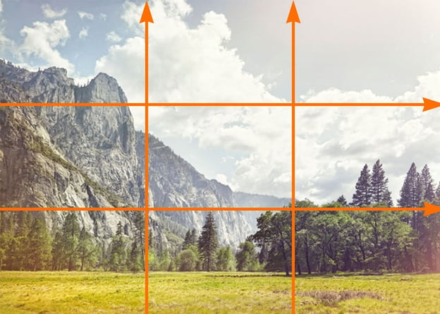
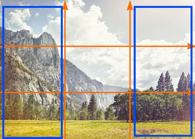

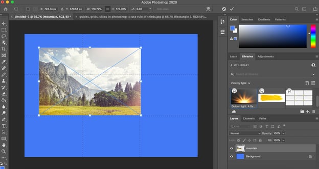
 4. And there you have it! You now have a rule of thirds grid. To add your image, simply drag-and-drop the image onto the existing layered grid, expand it to fill the grid, and then move your focal object until it's either in one of the thirds sections, or on one of the four intersecting points.