If you’re a small business, your website has a big impact on your success. Research shows that roughly a third of people use the web to find local businesses. Honestly, I’m surprised that number isn’t higher.
As a small business, you might not have the budget to hire a designer, bring in a development team, or pay for a suite of design tools for your new site. A basic brochure site will probably have to do for now, right?
But here’s the thing: You don’t need a design portfolio or a branding team to make an effective website. A lot of what makes websites work boils down to clear and intuitive navigation, well-written copy, and tasteful use of color, typography, and images — no design degree necessary.
Still, it’s one thing to talk about good design, and another to actually build a website that delivers on all design fronts. Lucky for us, there are many fascinating websites that have figured out what works. So, to help in your design journey, we’ve compiled our favorite examples of excellent small business website design to inspire your own.
Small Business Website Design Examples
There are, of course, thousands of small business websites you can draw from, but we think these 15 serve as a good starting point whether you’re planning a redesign or wireframing your first iteration. By the way, these are all real businesses, so you can click each link to explore the website yourself. Let’s dive in.
1. Bennett Tea
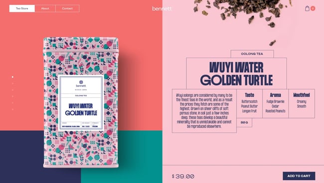
Starting off our list is a gorgeous example of what you can accomplish with color palettes, animated page transitions, scrolling effects, and creative layouts. The Bennett Tea shop offers just a handful of premium tea options, but each is presented elegantly through this online store’s unconventional format.
Typically, stores display their products as grids with links to product pages. On the Bennett Tea website, however, users scroll down to explore each offering, with a life-sized image of the tea box and descriptions of the taste, aroma, and mouthfeel. It’s the perfect visual palette to complement the company’s variety of tastes.
Also notable is the site’s navigation experience. Upon landing on the website, visitors are shown a splash page stating the company’s mission. They then have the option to continue to the store or go to the About or Contact pages. It may require one additional click to get to the store page, but this choice puts the branding front and center for potential customers.
2. Aroz Jewelry
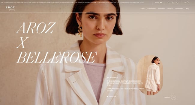
Belgium-based jeweler Aroz has constructed an immaculate website to showcase and sell their items. Offering a variety of accessories, Aroz first greets visitors with a full-width image, below which they present their pieces in a grid slider.
As users continue scrolling, the website makes frequent use of zoom-in animation, slide-in animation, and fade-in effects for greater visual impact. Each text section establishes the store’s offerings, capped off with a contact form and a social media CTA.
For those looking to learn more about Aroz, the website also includes a blog featuring new collections as well as customer and designer stories. All of these components work to conjure a professional, sophisticated, and unique brand image — a great example of what an ecommerce site can be.
3. Chicago French Press
If a tea shop can have a fantastic website, why not a coffee roaster? Chicago French Press sells a variety of rotating flavors while donating a portion of its proceeds to nonprofits and charitable organizations.
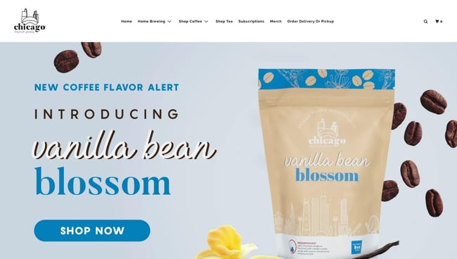
Like Bennett Tea, this website emphasizes the aesthetics of the product packaging. It also implements color backgrounds to distinguish between flavors, as seen in the full-width image slider on the homepage.
The Chicago French Press store is easy to navigate, as visitors can search by different criteria including flavor, brewing method, and bag size. And, if you want to incorporate their flavors with food, the website’s blog includes recipe posts too.
4. Wildwood Bakery
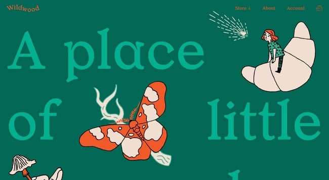
Wildwood Bakery’s website incorporates illustrations in small but stunning ways. The Australian bakery has made a simple but captivating website with little more than some delicate illustrations, a nice orange-and-green color palette, and mouth-watering close-ups of their creations.
On the homepage, visitors can learn about the bakery and click away to the website’s online store or sourdough subscription service. The bottom of the page sports a footer with social links and other useful resources. Note that the footer is more prominent than usual — the large text draws the eye to other important aspects of the business like sustainability and wholesale.
Wildwood’s store page is also worth checking out. Customers can filter products by flavors and quickly add anything to the cart. It’s clear that the designers considered everything, as even the card icon itself is a custom illustration. It’s these details that make this site exceptional.
5. AÃRK Collective
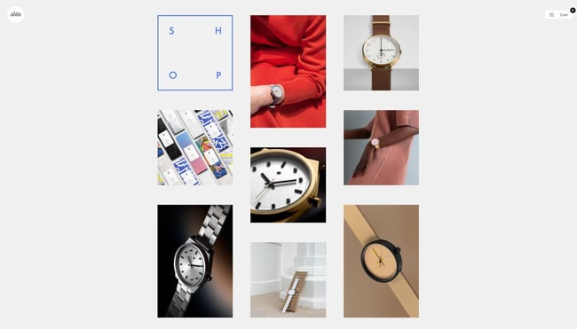
The website for watchmaker AÃRK Collective leaves no question as to what it does — from the start, its timepieces are displayed in full-page, aesthetically pleasing images. The whole thing resembles more of a gallery than an ecommerce site and establishes the brand's commitment to simple and elegant designs.
But, this is ultimately an online store, and scrolling down reveals AÃRK’s product lines in a masonry grid style. The presentation is quite minimal, but this lets visitors focus solely on the designs themselves. There’s no other information until you click on an item, which sends you to a product page with all the relevant information, plus many more images to be sure you’re making the right watch purchase.
6. Cleenland
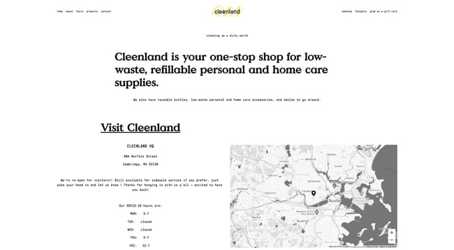
Not all websites have to be visually elaborate — this is proven with Cleenland’s online store. The Boston-based company sells low-waste home care and personal hygiene products, and the site wastes no time nudging visitors to visit the physical location.
Visitors can also shop online in Cleenland’s online store, which lists its product categories with images of each product and information about the supplier. This way, you know products are sourced sustainably. There’s even a “popular products” category serving up the best this store has to offer.
7. Ladies Get Paid
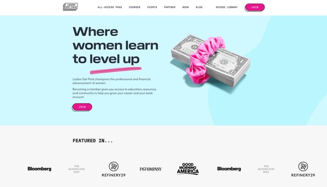
Ladies Get Paid is a membership website that offers financial and professional education courses for women. There are online classes, speaker events, and networking events, as well as job postings and online communities, all to fuel career advancement and financial confidence.
From a visual perspective, Ladies Get Paid does a fantastic job of presenting its variety of benefits in a straightforward manner. Its mission is clear from the start, and the page header lets guests view each offering in more detail.
The website also effectively incorporates hints of color in its interactive items. Its cards and buttons match each other for a cohesive feel and incorporate subtle hover effects for a pleasing user experience. Overall, the website is bold but inviting, a difficult but certainly achievable balance.
8. Good Vibes All Purpose Cleaner
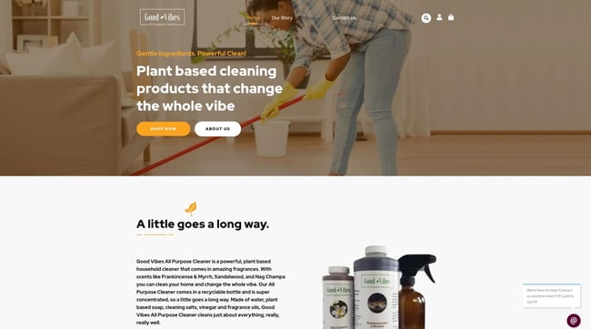
Maybe I’m just biased toward sustainable cleaning products, but Good Vibes All Purpose Cleaner presents a simple, effective ecommerce site that manages to convey its philosophy and offerings seamlessly.
Good Vibes has no frill with its product displays — products are shown in a grid format as you might expect. However, the website also prominently features reviews and testimonials from customers below to instill confidence in new buyers.
Each product page includes a description as well as cleaning instructions, ingredients, reviews, and recommended products. It’s enough to make a positive impression without relying on visual gimmicks.
9. Wisr
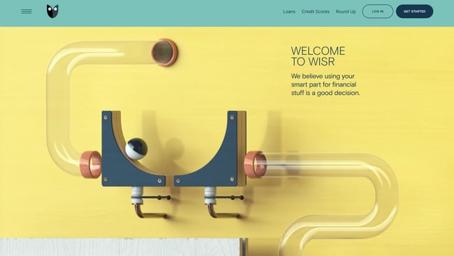
I never expected to have this much fun on a financial services website, but here we are — Wisr offers personal loans, financial planning, and, above all, an incredibly amusing homepage. As you scroll, you follow the path of a simulated marble course from start to end. With each obstacle, you learn more about what Wisr does.
Whether you think this design choice serves as a metaphor for the often unpredictable financial road ahead, or just a cool thing to look at, this website definitely stands out among the rest.
As another cool secondary feature, the website remembers what page you exit from. So, upon a return visit, you’ll see a prompt inviting you back to the page where you left off. It’s a clever use of cookies that can help get prospects back on the conversion path.
10. Cafe con Libros
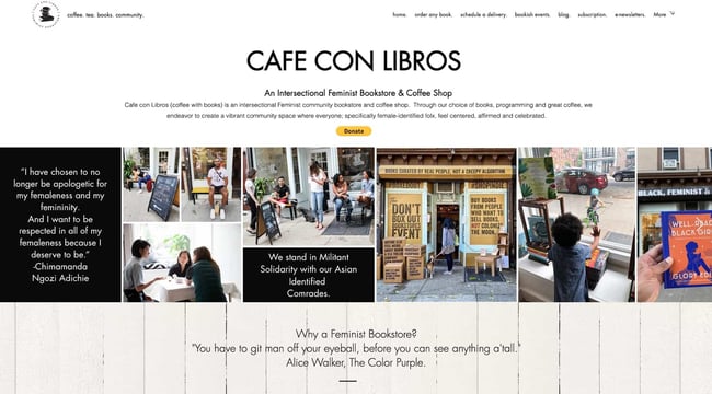
Intersectional Feminist bookstore Cafe con Libros (Coffee with Books) not only offers espressos with your purchase — it also boasts a fantastic website with everything you need under one domain name.
This site manages to pack its book inventory, merch store, event calendar, and mission onto the homepage alone without overcomplicating things. Visitors can also order any book from the store — physical, e-book, or audiobook — for pickup or delivery through the site.
As if that weren’t enough, the website also maintains an active blog with reflections and book reviews, a newsletter, a monthly book subscription service, and a podcast with an on-site player. It’s an excellent balance of quantity of offerings with quality of design.
11. Reform Collective
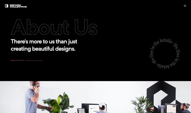
Design agency Reform collective features one of the most cinematic scrolling experiences I’ve seen on a website. It combines fixed scrolling with horizontal scrolling to showcase each section in chunks while keeping visitors on the same page.
Each individual section mentions some piece of the company, be it their design style and philosophy, a case study, testimonials, or a contact form. If you’re looking for a long-scrolling website that presents information to visitors in a specific linear sequence, try emulating this trick — it ensures users see what you want them to and in what order.
12. Sweet Dreams
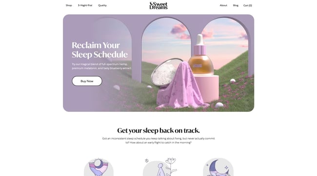
Sweet Dreams may create CBD and melatonin products for better rest, but don’t sleep on this website. Combining 2D and 3D illustrations, scrolling animation effects, customer reviews, and even interactive graphics, the homepage for this small business does a great job getting visitors in the mindset of their product before promoting the products themselves.
Informational sections are interspersed with product links so that new customers, whether sold or skeptical, know what they’re buying and how these products work. To learn more, the About page includes masterful visuals and copy to put visitors at ease. Given what they’re selling, that seems like the right approach.
13. Panache
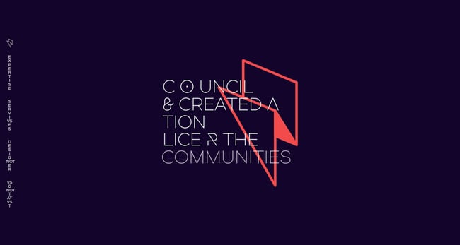
The graphic design and branding experts and Panache have proven their abilities with their one-page informational website. This is another example of how scrolling can be much more than a way to traverse the page — here, it triggers colorful transitions and animations that leave a strong impression.
Panache makes this list because, rather than including a separate gallery for showcasing the work, it blends its aesthetic approach into the construction of the site itself. This ultimately gets potential clients down to the contact form more quickly. There are also navigational links along the left side of the page in case visitors wish to return to a particular section.
14. Scott's Cheap Flights
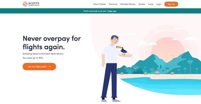
The goal of Scott’s Cheap Flights is to help U.S. travelers easily and cheaply book vacations to international destinations. Its membership website is suitably simple: Just sign up and start getting daily emails with the latest discounted flight offerings.
Once signed in, the website places its offers front-and-center — each one occupies a card with a colorful image of the destination. Clicking a card takes you to a page with information about the destination, instructions on how to book, and ticket prices by airport. Some cards are premium, and the “Upgrade” button lingers in the top right tempting users to subscribe.
Additionally, this website also provides a ton of extra value to free and premium users in its blog section. In it, there are tips for booking flights, travel advice, and guides for exploring new cities.
15. Music Audience Exchange
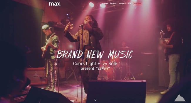
Finally, Music Audience Exchange (MAX) creates partnerships between brands and musical artists for promotional purposes, with a website that conveys class and professionalism.
Since it caters to both artists and companies, it features two pages for both types of clients, with step-by-step guides explaining how the process works. It’s an efficient means to channel both brands and musicians alike toward an application form and a conversion.
Big Design Ideas for Small Businesses
Designing a website is, without a doubt, a challenge for small businesses. But after some perusing, you can come up with a list of your favorite inspiration sites and what makes them pop, then incorporate these features into your own site. Plus, you probably spend a good deal of time on sleek sites already and have a good sense of what you’ll want.
Looking for more inspo? Check out all of our website design resources, including our Website Design lookbook — just click below.
from Marketing https://blog.hubspot.com/blog/tabid/6307/bid/51/small-business-website-are-you-spending-too-much-on-yours.aspx
If you’re a small business, your website has a big impact on your success. Research shows that roughly a third of people use the web to find local businesses. Honestly, I’m surprised that number isn’t higher.
As a small business, you might not have the budget to hire a designer, bring in a development team, or pay for a suite of design tools for your new site. A basic brochure site will probably have to do for now, right?
But here’s the thing: You don’t need a design portfolio or a branding team to make an effective website. A lot of what makes websites work boils down to clear and intuitive navigation, well-written copy, and tasteful use of color, typography, and images — no design degree necessary.
Still, it’s one thing to talk about good design, and another to actually build a website that delivers on all design fronts. Lucky for us, there are many fascinating websites that have figured out what works. So, to help in your design journey, we’ve compiled our favorite examples of excellent small business website design to inspire your own.
Small Business Website Design Examples
There are, of course, thousands of small business websites you can draw from, but we think these 15 serve as a good starting point whether you’re planning a redesign or wireframing your first iteration. By the way, these are all real businesses, so you can click each link to explore the website yourself. Let’s dive in.
1. Bennett Tea
Starting off our list is a gorgeous example of what you can accomplish with color palettes, animated page transitions, scrolling effects, and creative layouts. The Bennett Tea shop offers just a handful of premium tea options, but each is presented elegantly through this online store’s unconventional format.
Typically, stores display their products as grids with links to product pages. On the Bennett Tea website, however, users scroll down to explore each offering, with a life-sized image of the tea box and descriptions of the taste, aroma, and mouthfeel. It’s the perfect visual palette to complement the company’s variety of tastes.
Also notable is the site’s navigation experience. Upon landing on the website, visitors are shown a splash page stating the company’s mission. They then have the option to continue to the store or go to the About or Contact pages. It may require one additional click to get to the store page, but this choice puts the branding front and center for potential customers.

2. Aroz Jewelry
Belgium-based jeweler Aroz has constructed an immaculate website to showcase and sell their items. Offering a variety of accessories, Aroz first greets visitors with a full-width image, below which they present their pieces in a grid slider.
As users continue scrolling, the website makes frequent use of zoom-in animation, slide-in animation, and fade-in effects for greater visual impact. Each text section establishes the store’s offerings, capped off with a contact form and a social media CTA.
For those looking to learn more about Aroz, the website also includes a blog featuring new collections as well as customer and designer stories. All of these components work to conjure a professional, sophisticated, and unique brand image — a great example of what an ecommerce site can be.

3. Chicago French Press
If a tea shop can have a fantastic website, why not a coffee roaster? Chicago French Press sells a variety of rotating flavors while donating a portion of its proceeds to nonprofits and charitable organizations.
Like Bennett Tea, this website emphasizes the aesthetics of the product packaging. It also implements color backgrounds to distinguish between flavors, as seen in the full-width image slider on the homepage.
The Chicago French Press store is easy to navigate, as visitors can search by different criteria including flavor, brewing method, and bag size. And, if you want to incorporate their flavors with food, the website’s blog includes recipe posts too.

4. Wildwood Bakery
Wildwood Bakery’s website incorporates illustrations in small but stunning ways. The Australian bakery has made a simple but captivating website with little more than some delicate illustrations, a nice orange-and-green color palette, and mouth-watering close-ups of their creations.
On the homepage, visitors can learn about the bakery and click away to the website’s online store or sourdough subscription service. The bottom of the page sports a footer with social links and other useful resources. Note that the footer is more prominent than usual — the large text draws the eye to other important aspects of the business like sustainability and wholesale.
Wildwood’s store page is also worth checking out. Customers can filter products by flavors and quickly add anything to the cart. It’s clear that the designers considered everything, as even the card icon itself is a custom illustration. It’s these details that make this site exceptional.

5. AÃRK Collective
The website for watchmaker AÃRK Collective leaves no question as to what it does — from the start, its timepieces are displayed in full-page, aesthetically pleasing images. The whole thing resembles more of a gallery than an ecommerce site and establishes the brand's commitment to simple and elegant designs.
But, this is ultimately an online store, and scrolling down reveals AÃRK’s product lines in a masonry grid style. The presentation is quite minimal, but this lets visitors focus solely on the designs themselves. There’s no other information until you click on an item, which sends you to a product page with all the relevant information, plus many more images to be sure you’re making the right watch purchase.

6. Cleenland
Not all websites have to be visually elaborate — this is proven with Cleenland’s online store. The Boston-based company sells low-waste home care and personal hygiene products, and the site wastes no time nudging visitors to visit the physical location.
Visitors can also shop online in Cleenland’s online store, which lists its product categories with images of each product and information about the supplier. This way, you know products are sourced sustainably. There’s even a “popular products” category serving up the best this store has to offer.

7. Ladies Get Paid
Ladies Get Paid is a membership website that offers financial and professional education courses for women. There are online classes, speaker events, and networking events, as well as job postings and online communities, all to fuel career advancement and financial confidence.
From a visual perspective, Ladies Get Paid does a fantastic job of presenting its variety of benefits in a straightforward manner. Its mission is clear from the start, and the page header lets guests view each offering in more detail.
The website also effectively incorporates hints of color in its interactive items. Its cards and buttons match each other for a cohesive feel and incorporate subtle hover effects for a pleasing user experience. Overall, the website is bold but inviting, a difficult but certainly achievable balance.
8. Good Vibes All Purpose Cleaner
Maybe I’m just biased toward sustainable cleaning products, but Good Vibes All Purpose Cleaner presents a simple, effective ecommerce site that manages to convey its philosophy and offerings seamlessly.
Good Vibes has no frill with its product displays — products are shown in a grid format as you might expect. However, the website also prominently features reviews and testimonials from customers below to instill confidence in new buyers.
Each product page includes a description as well as cleaning instructions, ingredients, reviews, and recommended products. It’s enough to make a positive impression without relying on visual gimmicks.

9. Wisr
I never expected to have this much fun on a financial services website, but here we are — Wisr offers personal loans, financial planning, and, above all, an incredibly amusing homepage. As you scroll, you follow the path of a simulated marble course from start to end. With each obstacle, you learn more about what Wisr does.
Whether you think this design choice serves as a metaphor for the often unpredictable financial road ahead, or just a cool thing to look at, this website definitely stands out among the rest.
As another cool secondary feature, the website remembers what page you exit from. So, upon a return visit, you’ll see a prompt inviting you back to the page where you left off. It’s a clever use of cookies that can help get prospects back on the conversion path.

10. Cafe con Libros
Intersectional Feminist bookstore Cafe con Libros (Coffee with Books) not only offers espressos with your purchase — it also boasts a fantastic website with everything you need under one domain name.
This site manages to pack its book inventory, merch store, event calendar, and mission onto the homepage alone without overcomplicating things. Visitors can also order any book from the store — physical, e-book, or audiobook — for pickup or delivery through the site.
As if that weren’t enough, the website also maintains an active blog with reflections and book reviews, a newsletter, a monthly book subscription service, and a podcast with an on-site player. It’s an excellent balance of quantity of offerings with quality of design.

11. Reform Collective
Design agency Reform collective features one of the most cinematic scrolling experiences I’ve seen on a website. It combines fixed scrolling with horizontal scrolling to showcase each section in chunks while keeping visitors on the same page.
Each individual section mentions some piece of the company, be it their design style and philosophy, a case study, testimonials, or a contact form. If you’re looking for a long-scrolling website that presents information to visitors in a specific linear sequence, try emulating this trick — it ensures users see what you want them to and in what order.

12. Sweet Dreams
Sweet Dreams may create CBD and melatonin products for better rest, but don’t sleep on this website. Combining 2D and 3D illustrations, scrolling animation effects, customer reviews, and even interactive graphics, the homepage for this small business does a great job getting visitors in the mindset of their product before promoting the products themselves.
Informational sections are interspersed with product links so that new customers, whether sold or skeptical, know what they’re buying and how these products work. To learn more, the About page includes masterful visuals and copy to put visitors at ease. Given what they’re selling, that seems like the right approach.

13. Panache
The graphic design and branding experts and Panache have proven their abilities with their one-page informational website. This is another example of how scrolling can be much more than a way to traverse the page — here, it triggers colorful transitions and animations that leave a strong impression.
Panache makes this list because, rather than including a separate gallery for showcasing the work, it blends its aesthetic approach into the construction of the site itself. This ultimately gets potential clients down to the contact form more quickly. There are also navigational links along the left side of the page in case visitors wish to return to a particular section.

14. Scott's Cheap Flights
The goal of Scott’s Cheap Flights is to help U.S. travelers easily and cheaply book vacations to international destinations. Its membership website is suitably simple: Just sign up and start getting daily emails with the latest discounted flight offerings.
Once signed in, the website places its offers front-and-center — each one occupies a card with a colorful image of the destination. Clicking a card takes you to a page with information about the destination, instructions on how to book, and ticket prices by airport. Some cards are premium, and the “Upgrade” button lingers in the top right tempting users to subscribe.
Additionally, this website also provides a ton of extra value to free and premium users in its blog section. In it, there are tips for booking flights, travel advice, and guides for exploring new cities.

15. Music Audience Exchange
Finally, Music Audience Exchange (MAX) creates partnerships between brands and musical artists for promotional purposes, with a website that conveys class and professionalism.
Since it caters to both artists and companies, it features two pages for both types of clients, with step-by-step guides explaining how the process works. It’s an efficient means to channel both brands and musicians alike toward an application form and a conversion.

Big Design Ideas for Small Businesses
Designing a website is, without a doubt, a challenge for small businesses. But after some perusing, you can come up with a list of your favorite inspiration sites and what makes them pop, then incorporate these features into your own site. Plus, you probably spend a good deal of time on sleek sites already and have a good sense of what you’ll want.
Looking for more inspo? Check out all of our website design resources, including our Website Design lookbook — just click below.


No hay comentarios:
Publicar un comentario