When searching for a soul mate, you look for someone that's smart, funny, caring, but above all — consistent. Because if you're going to invest your life in a person, you want someone you can trust, right?
Falling in love with a brand isn't all that different. Brands pull us in with witty slogans and timely discounts, but that’s not the only reason we stick around. Think about it, inbound marketing is all about content and communication that people love. The key to being your leads' and customers’ soul mate, then, is providing brand consistency they can count on.
But how? What’s at the heart of brand consistency is your message, and marketing plays a huge role in that. In this post, we’ll dive into what branding consistency is, its importance, benefits, and share 15 businesses that have done a stellar job showing it.
The Importance of Branding Consistency
Branding consistency sets the stage for a business to gain and maintain credibility and trust. You have to position your brand and its content in a way that appeals to its target audience and carry that same messaging over time. After all, your customers are putting their trust in you, and like any relationship, you want the foundation to be dependable and consistent.
So, not only is this concept important in business strategy, but the benefits speak for themselves.
Benefits of Brand Consistency
Maintain customer expectations.
When creating marketing content, your team can share collateral that delivers the same visual cues from logo, color, and tone that won’t negatively impact customer perception. This standardization of branding let’s them know exactly what to expect every time they come across your business.
Align separate business units.
In creating a uniform brand identity, business teams create varying forms of content across departments that still ring true to clearly specified brand guidelines. While each team won’t be working on the same projects directly — the brand’s story will still shine through.
Establish a more visible, uniform identity.
Brands that are consistently presented are 3 to 4 times more likely to experience brand awareness and visibility. Just think about the iconic Nike swoosh, or Adidas’ signature stripes, these consistent visuals let customers know what brand a product comes from in the blink of an eye.
Now that we’ve gone through the importance and benefits of branding consistency, let’s look at some brands that have used it successfully.
Branding Consistency: 15 Brand Examples
1. GymIt
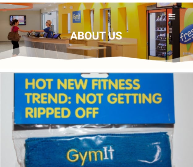
Fitness centers can be intimidating to the average person. GymIt gets it, and takes the intimidation out of the equation by talking to its clientele like real people. The Boston-based gym calls itself "hassle-free" and keeps working out simple.
One of the brand's slogans is "Get In, Work Out" — clean, to-the-point, and clever. To prove that GymIt doesn't cater to protein-shake, bodybuilder types, its marketing doesn't take itself too seriously, either. Below are some snapshots of GymIt's playful copy across social media, merchandise, and unintimidating website.
2. Dropbox
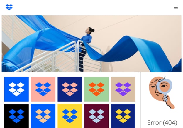
The cloud-based file sharing platform, Dropbox, is great at consistent design and personalization across channels.
You won’t find any Dropbox communication or platforms without its signature open, blue box logo nearby. This style is behind all of the brand’s designs, whether it’s a sleek homepage or a creative error page. Dropbox’s email marketing aligns with that fun, artsy messaging. See the screenshot below of some colorful collateral found across.
3. charity:water
This organization donates 100% of its donations to building water wells in Africa where women and children use yellow jerry cans to carry water back to their villages. charity:water's logo is a stylized jerry can and not only keeps the branding present across channels, but keeps the issue the charity is helping solve top of mind, as well.
While many traditional nonprofits stick to old-school marketing tactics, charity:water recognizes that in order to inspire people to support a cause, you need to have inspired marketing. The organization's birthday campaign has attracted supporters in fashion which charity:water uses to show how nonprofits can be trendy — using jerry cans in annual Charity Ball runways. This brand consistency makes it a leader in reinventing nonprofit marketing.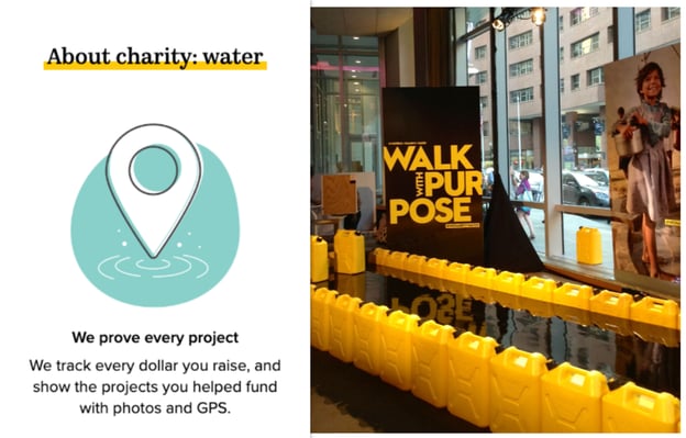
4. Naked Pizza
Naked Pizza — a revealing name for an honest brand. This business offers healthier pizza than the average chain by using only all-natural ingredients and a crust packed with grains and probiotics. Naked Pizza's promise of all-natural is enforced by its refreshing style and tone seen across its marketing assets.
Like GymIt, Naked Pizza suggests it doesn't take itself too seriously and that pizza can be guilt-free and fun. The brand is lovably sarcastic and keeps its design clean and appealing while communicating its delicious message.
5. Wells Fargo
You don't have to use conversational tones or playful designs to be a lovable brand. Wells Fargo, a leading bank worldwide, keeps its messaging traditional and old-school — in a good way!
The brand is committed to its core values, including ethics and putting customers first, and they communicate this consistently through font, colors, layout, and keeping its logo ever-present across channels. Its slogan "Together we'll go far" inspires copy that is rooted in family and building relationships.

6. World Wildlife Fund
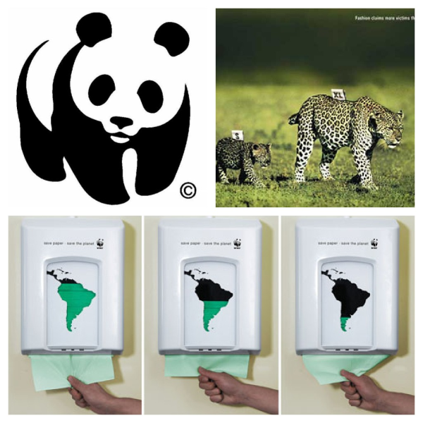
This organization fights for a great cause with great marketing. The WWF's style and imagery create a mood across channels that forces you to reflect for a moment on how we treat our wildlife and ecosystems.
Below are three examples of how the brand communicates that same strong message in creative, thought-provoking ways. Its logo, print ad, and interactive piece all have a darkness to them through suggestive messaging or tone because of how serious the issue is.
7. Warby Parker
Warby Parker "creates boutique-quality, classically crafted eyewear at a revolutionary price point." The brand communicates this boutiquey vibe through all its promotions and marketing assets.
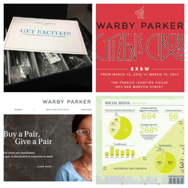
For example, Warby Parker offers a luxurious touch to prospective customers by sending five pairs of glasses to try on for free (top left). Attention to style is also evident across channels: its website (bottom left) is clean and easy to navigate. Even its annual report (bottom right) feels "classically crafted." The brand calls its style "vintage," and its Citizen's Circus event at SXSW was dripping with vintage touches from signage to tents.
8. Lush
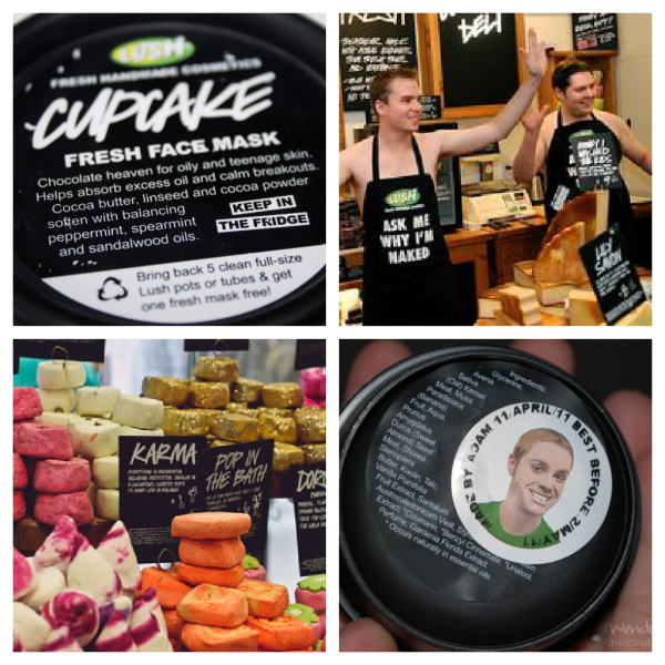
The international handmade cosmetics company, Lush, believes in "making effective products from fresh organic fruits and vegetables," and in "happy people making happy soap." Lush stores, products, packaging, and employees (top right) all tell that story.
Lush’s commitment to natural, organic ingredients is totally aligned with how it displays its products (bottom left); Lush's soaps, powders, and shampoos sit in their raw form in-store until the cashier wraps the product up once it's purchased. Foregoing packaging oozes a natural vibe. Products that require packaging, like face masks (top left), don't hide the ingredients and encourage customers to recycle after use. All packaging also has a sticker on it with the face and name of the employee who packed it. Every piece of marketing collateral at Lush has a personal, no-frills approach.
9. Boloco
Boston-based burrito company, Boloco, pays attention to consistency in detail in its online and offline marketing. The brand's slogan is 'inspired burritos' and its menus, flyers, napkins, events, website, and other collateral all have a playful, hand-made touch that suggests the business is fueled by more than tortillas and guacamole. Boloco partnered with Life is Good by making a yummy Life is Good burrito with 50 cents of each purchase donated to the company's charity, Life is Good Playmakers; this partnership fits with Boloco's inspired brand perfectly.
Boloco keeps branding present by using a playful signature font. No matter the marketing channel, we go loco for Boloco's consistency.
10. Museum of Fine Arts Boston
Boston's Museum of Fine Arts promotes its brand throughout the city and under its own roof with such finesse in execution, that the brand's presence is always incredibly recognizable, yet still subtle. All MFA Boston marketing assets are easy to connect to the source.
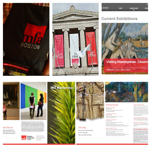
The brand has a two-tone color palette on all collateral, with red being the MFA's signature color. Below are examples of its use of color, as well as its consistently minimalist design on an employee's apron, outdoor banners, website, and brochure. With a museum full of colorful exhibitions and impressive canvases, the MFA keeps its own branding simple but strong.
11. Intercom
Intercom is a web-based customer service platform. "Treating customers with respect will always be good for business," the brand says. "And we believe that making customers jump through hoops to try to get help is incredibly disrespectful." Looking at Intercom’s various forms of communication and marketing tactics, it's visually apparent how much it doesn’t want its customers to "jump through hoops."
The brand presents information in a clear, comprehensive way by using imagery instead of written explanations. After all, a picture says a thousand words. Intercom introduces its company with photos other content with simple graphic design. Enticing me with visuals definitely takes hoops out of the equation.
12. Innocent Drinks
Innocent Drinks is a playful smoothie and juice brand from England that keeps its innocent reputation strong with marketing that will make you feel like a kid again. The meta description reads: "hello, we're innocent and we're here to make it easy for people to do themselves some good (whilst making it taste nice too)." How cute is that?
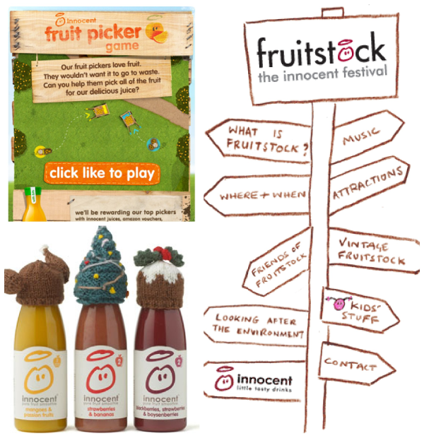
Below are examples of more lovable approaches to branding like its Facebook game (top left), product images (bottom left), and inventive website navigation for the brand's annual event, Fruitstock. Innocent Drinks stays true to its personality in its tone and creative execution.
13. Zendesk
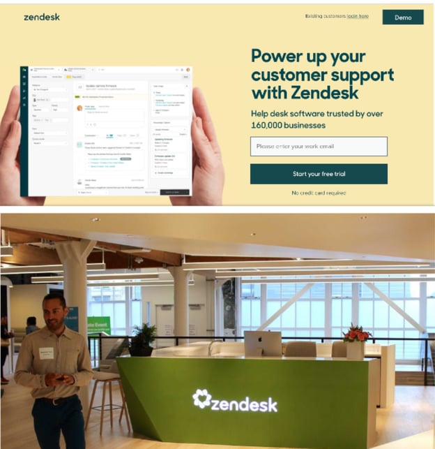
Zendesk is a cloud-based customer service software system that has built a charming brand through sleek, bright design. The "zen" in this company’s branding can be seen through its mellow yellow and natural color palette.
It’s important to communicate a consistent brand image to the world, but Zendesk recognizes that consistency comes from within as well. Its office carries the theme to keep the feeling strong within company walls. The brand’s signature green is used consistently across channels and compliments the brand’s identity.
14. Lululemon Athletica
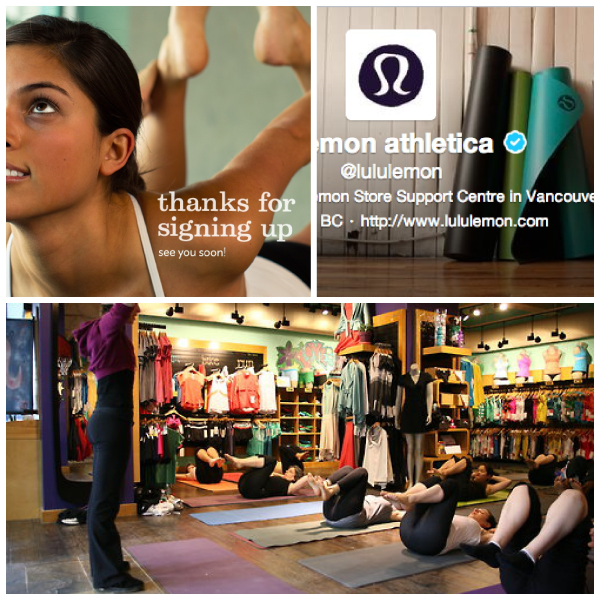
Sportswear brands often promise that their products will make you a better athlete, but the process and hard work it takes to get there is sometimes forgotten. Lululemon Athletica, a yoga and sportswear brand, keeps the act of working out alive across its assets. The brand hosts free yoga classes in its stores, as well as public outdoor classes.
Its confirmation email (top left) for joining its mailing list is a large image of a woman doing yoga, and the brand's Twitter profile (top right) displays yoga mats waiting to be rolled out. The brand designs yoga clothing and gear, so why skip to the gratification of doing it when you can cultivate a feeling around the process?
15. ZocDoc
ZocDoc is an online service for finding and booking appointments with physicians in your area. The brand aims to improve access to healthcare, and it communicates the ease of the process with cartoon mascots across all of its marketing communication channels.
After all, cartoons make us feel like kids again, and boy, were things easy when we were kids. See ZocDoc's charming collateral on the website's personal account page.
Build Better Branding Consistency
Now that's soul mate material, right? A lot of these brands use playful, creative, and conversational tones, while others prefer more serious, thought-provoking approaches. Whatever the tone, be sure to keep it consistent across all channels to give your customers a brand they can count on.
Editor’s note: This article was originally published in March 2013 and has been updated for comprehensiveness.
from Marketing https://blog.hubspot.com/blog/tabid/6307/bid/34227/15-businesses-to-admire-for-consistent-stellar-branding.aspx
When searching for a soul mate, you look for someone that's smart, funny, caring, but above all — consistent. Because if you're going to invest your life in a person, you want someone you can trust, right?
Falling in love with a brand isn't all that different. Brands pull us in with witty slogans and timely discounts, but that’s not the only reason we stick around. Think about it, inbound marketing is all about content and communication that people love. The key to being your leads' and customers’ soul mate, then, is providing brand consistency they can count on.
But how? What’s at the heart of brand consistency is your message, and marketing plays a huge role in that. In this post, we’ll dive into what branding consistency is, its importance, benefits, and share 15 businesses that have done a stellar job showing it.
The Importance of Branding Consistency
Branding consistency sets the stage for a business to gain and maintain credibility and trust. You have to position your brand and its content in a way that appeals to its target audience and carry that same messaging over time. After all, your customers are putting their trust in you, and like any relationship, you want the foundation to be dependable and consistent.
So, not only is this concept important in business strategy, but the benefits speak for themselves.
Benefits of Brand Consistency
Maintain customer expectations.
When creating marketing content, your team can share collateral that delivers the same visual cues from logo, color, and tone that won’t negatively impact customer perception. This standardization of branding let’s them know exactly what to expect every time they come across your business.
Align separate business units.
In creating a uniform brand identity, business teams create varying forms of content across departments that still ring true to clearly specified brand guidelines. While each team won’t be working on the same projects directly — the brand’s story will still shine through.
Establish a more visible, uniform identity.
Brands that are consistently presented are 3 to 4 times more likely to experience brand awareness and visibility. Just think about the iconic Nike swoosh, or Adidas’ signature stripes, these consistent visuals let customers know what brand a product comes from in the blink of an eye.
Now that we’ve gone through the importance and benefits of branding consistency, let’s look at some brands that have used it successfully.
Branding Consistency: 15 Brand Examples
1. GymIt
Fitness centers can be intimidating to the average person. GymIt gets it, and takes the intimidation out of the equation by talking to its clientele like real people. The Boston-based gym calls itself "hassle-free" and keeps working out simple.
One of the brand's slogans is "Get In, Work Out" — clean, to-the-point, and clever. To prove that GymIt doesn't cater to protein-shake, bodybuilder types, its marketing doesn't take itself too seriously, either. Below are some snapshots of GymIt's playful copy across social media, merchandise, and unintimidating website.

2. Dropbox
The cloud-based file sharing platform, Dropbox, is great at consistent design and personalization across channels.
You won’t find any Dropbox communication or platforms without its signature open, blue box logo nearby. This style is behind all of the brand’s designs, whether it’s a sleek homepage or a creative error page. Dropbox’s email marketing aligns with that fun, artsy messaging. See the screenshot below of some colorful collateral found across.

3. charity:water
This organization donates 100% of its donations to building water wells in Africa where women and children use yellow jerry cans to carry water back to their villages. charity:water's logo is a stylized jerry can and not only keeps the branding present across channels, but keeps the issue the charity is helping solve top of mind, as well.
While many traditional nonprofits stick to old-school marketing tactics, charity:water recognizes that in order to inspire people to support a cause, you need to have inspired marketing. The organization's birthday campaign has attracted supporters in fashion which charity:water uses to show how nonprofits can be trendy — using jerry cans in annual Charity Ball runways. This brand consistency makes it a leader in reinventing nonprofit marketing.
4. Naked Pizza
Naked Pizza — a revealing name for an honest brand. This business offers healthier pizza than the average chain by using only all-natural ingredients and a crust packed with grains and probiotics. Naked Pizza's promise of all-natural is enforced by its refreshing style and tone seen across its marketing assets.
Like GymIt, Naked Pizza suggests it doesn't take itself too seriously and that pizza can be guilt-free and fun. The brand is lovably sarcastic and keeps its design clean and appealing while communicating its delicious message.
5. Wells Fargo
You don't have to use conversational tones or playful designs to be a lovable brand. Wells Fargo, a leading bank worldwide, keeps its messaging traditional and old-school — in a good way!
The brand is committed to its core values, including ethics and putting customers first, and they communicate this consistently through font, colors, layout, and keeping its logo ever-present across channels. Its slogan "Together we'll go far" inspires copy that is rooted in family and building relationships.

6. World Wildlife Fund
This organization fights for a great cause with great marketing. The WWF's style and imagery create a mood across channels that forces you to reflect for a moment on how we treat our wildlife and ecosystems.
Below are three examples of how the brand communicates that same strong message in creative, thought-provoking ways. Its logo, print ad, and interactive piece all have a darkness to them through suggestive messaging or tone because of how serious the issue is.

7. Warby Parker
Warby Parker "creates boutique-quality, classically crafted eyewear at a revolutionary price point." The brand communicates this boutiquey vibe through all its promotions and marketing assets.
For example, Warby Parker offers a luxurious touch to prospective customers by sending five pairs of glasses to try on for free (top left). Attention to style is also evident across channels: its website (bottom left) is clean and easy to navigate. Even its annual report (bottom right) feels "classically crafted." The brand calls its style "vintage," and its Citizen's Circus event at SXSW was dripping with vintage touches from signage to tents.

8. Lush
The international handmade cosmetics company, Lush, believes in "making effective products from fresh organic fruits and vegetables," and in "happy people making happy soap." Lush stores, products, packaging, and employees (top right) all tell that story.
Lush’s commitment to natural, organic ingredients is totally aligned with how it displays its products (bottom left); Lush's soaps, powders, and shampoos sit in their raw form in-store until the cashier wraps the product up once it's purchased. Foregoing packaging oozes a natural vibe. Products that require packaging, like face masks (top left), don't hide the ingredients and encourage customers to recycle after use. All packaging also has a sticker on it with the face and name of the employee who packed it. Every piece of marketing collateral at Lush has a personal, no-frills approach.

9. Boloco
Boston-based burrito company, Boloco, pays attention to consistency in detail in its online and offline marketing. The brand's slogan is 'inspired burritos' and its menus, flyers, napkins, events, website, and other collateral all have a playful, hand-made touch that suggests the business is fueled by more than tortillas and guacamole. Boloco partnered with Life is Good by making a yummy Life is Good burrito with 50 cents of each purchase donated to the company's charity, Life is Good Playmakers; this partnership fits with Boloco's inspired brand perfectly.
Boloco keeps branding present by using a playful signature font. No matter the marketing channel, we go loco for Boloco's consistency.
10. Museum of Fine Arts Boston
Boston's Museum of Fine Arts promotes its brand throughout the city and under its own roof with such finesse in execution, that the brand's presence is always incredibly recognizable, yet still subtle. All MFA Boston marketing assets are easy to connect to the source.
The brand has a two-tone color palette on all collateral, with red being the MFA's signature color. Below are examples of its use of color, as well as its consistently minimalist design on an employee's apron, outdoor banners, website, and brochure. With a museum full of colorful exhibitions and impressive canvases, the MFA keeps its own branding simple but strong.

11. Intercom
Intercom is a web-based customer service platform. "Treating customers with respect will always be good for business," the brand says. "And we believe that making customers jump through hoops to try to get help is incredibly disrespectful." Looking at Intercom’s various forms of communication and marketing tactics, it's visually apparent how much it doesn’t want its customers to "jump through hoops."
The brand presents information in a clear, comprehensive way by using imagery instead of written explanations. After all, a picture says a thousand words. Intercom introduces its company with photos other content with simple graphic design. Enticing me with visuals definitely takes hoops out of the equation.
12. Innocent Drinks
Innocent Drinks is a playful smoothie and juice brand from England that keeps its innocent reputation strong with marketing that will make you feel like a kid again. The meta description reads: "hello, we're innocent and we're here to make it easy for people to do themselves some good (whilst making it taste nice too)." How cute is that?
Below are examples of more lovable approaches to branding like its Facebook game (top left), product images (bottom left), and inventive website navigation for the brand's annual event, Fruitstock. Innocent Drinks stays true to its personality in its tone and creative execution.

13. Zendesk
Zendesk is a cloud-based customer service software system that has built a charming brand through sleek, bright design. The "zen" in this company’s branding can be seen through its mellow yellow and natural color palette.
It’s important to communicate a consistent brand image to the world, but Zendesk recognizes that consistency comes from within as well. Its office carries the theme to keep the feeling strong within company walls. The brand’s signature green is used consistently across channels and compliments the brand’s identity.

14. Lululemon Athletica
Sportswear brands often promise that their products will make you a better athlete, but the process and hard work it takes to get there is sometimes forgotten. Lululemon Athletica, a yoga and sportswear brand, keeps the act of working out alive across its assets. The brand hosts free yoga classes in its stores, as well as public outdoor classes.
Its confirmation email (top left) for joining its mailing list is a large image of a woman doing yoga, and the brand's Twitter profile (top right) displays yoga mats waiting to be rolled out. The brand designs yoga clothing and gear, so why skip to the gratification of doing it when you can cultivate a feeling around the process?

15. ZocDoc
ZocDoc is an online service for finding and booking appointments with physicians in your area. The brand aims to improve access to healthcare, and it communicates the ease of the process with cartoon mascots across all of its marketing communication channels.
After all, cartoons make us feel like kids again, and boy, were things easy when we were kids. See ZocDoc's charming collateral on the website's personal account page.
Build Better Branding Consistency
Now that's soul mate material, right? A lot of these brands use playful, creative, and conversational tones, while others prefer more serious, thought-provoking approaches. Whatever the tone, be sure to keep it consistent across all channels to give your customers a brand they can count on.
Editor’s note: This article was originally published in March 2013 and has been updated for comprehensiveness.


No hay comentarios:
Publicar un comentario