If you're reading this blog, you've likely decided to start or revamp your copywriting portfolio. With so many portfolios out there, it's hard to figure out how to make yours stand out from the crowd.
What colors should you use? What kind of writing samples will show off your skills? Fortunately, I've put together a collection of copywriting portfolio examples that are sure to inspire you and guide you in the right direction.
Each copywriting portfolio example I've included is unique in terms of color, layout, and personality — highlighting the various ways you can approach putting a portfolio together and how it's okay to get creative with yours.
How to Create a Copywriting Portfolio
When creating your copywriting portfolio, avoid cramming in too many of your writing samples. You'll want to show off your diverse portfolio —that's understandable — but too many samples can overwhelm potential clients and employers.
Instead, opt for five or six writing samples that capture the different styles of writing you've done, such as technical, marketing, and business writing. Be sure to also include a balance of humorous and serious pieces, B2B and B2C writings, as well as short and long-form content.
If you have little-to-no writing samples, build your portfolio by starting a website or blog to showcase your writing skills, or contribute to other websites. You can also write for nonprofits or work internships.
Another method to build your portfolio is to write mock-copywriting samples based on local businesses. Just be sure to let employers or clients know they are mock-samples and that you weren't actually hired by those companies. The point isn't to deceive, but to show what you can do.
Copywriting Portfolio Examples
Now that you have a few of your best copywriting examples ready to upload, it's time to design your portfolio. You want a portfolio that stands out from the crowd, showcases your personality, highlights your skills, and is easy to navigate by potential employers.
To give you some inspiration, here are 25 examples of excellent copywriting portfolios broken down into the following categories:
- Homepage – The first page people see of your online portfolio and where you'll likely house your work samples
- About Me – Where you'll give readers an idea of who you are and what you do
- Services – What you can provide your clients
Each of these examples presents a different approach to copywriting portfolios that is sure to attract new opportunities.
Homepage
There are many different approaches to creating a homepage for your portfolio — however, it's best practice to ensure your homepage features your name, your contact information, and complementary colors. Most copywriters choose to feature their work directly on their homepage, but some find a way to link to their samples.
Here are several examples of outstanding homepage templates:
1. Carline Anglade-Cole
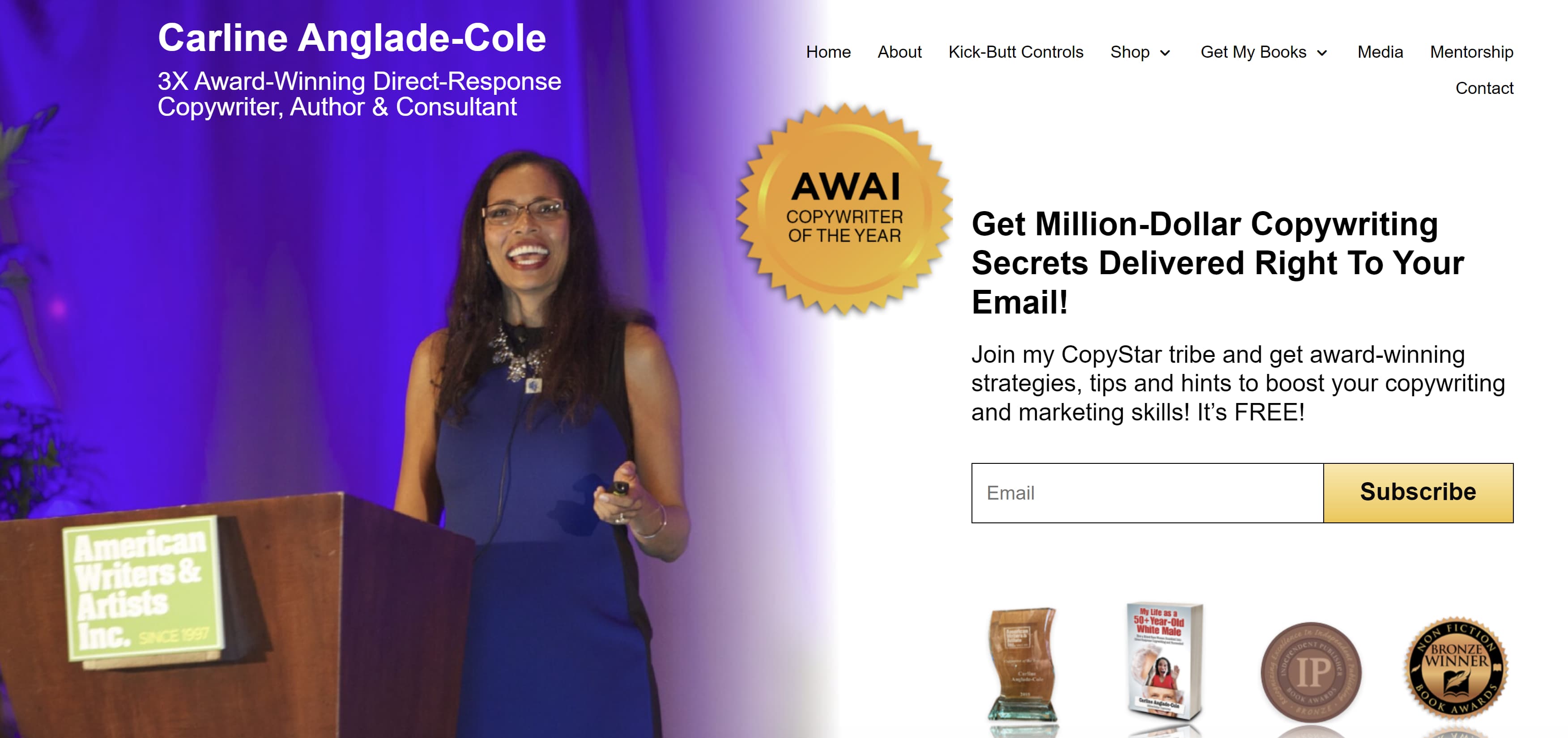
The homepage for Anglade-Cole's copywriting portfolio immediately establishes her as an expert in her field by bringing attention to the awards she's garnered throughout her career. The photo on her front page shows her at a speaking engagement with a confident smile, and the photo's caption clearly states her full name above "3X Award-Winning Direct-Response Copywriter, Author, and Consultant."
The badges for her awards are also displayed throughout, with the American Writers and Artists Institute badge placed in the middle next to the link to subscribe to her email list. Beneath her email list are badges from other accomplishments, including winning the bronze Nonfiction Book Award. If you're an award-winning copywriter, Anglade-Cole's page is a great example of how you can place your awards front and center to establish credibility.
 2. Gari Cruze
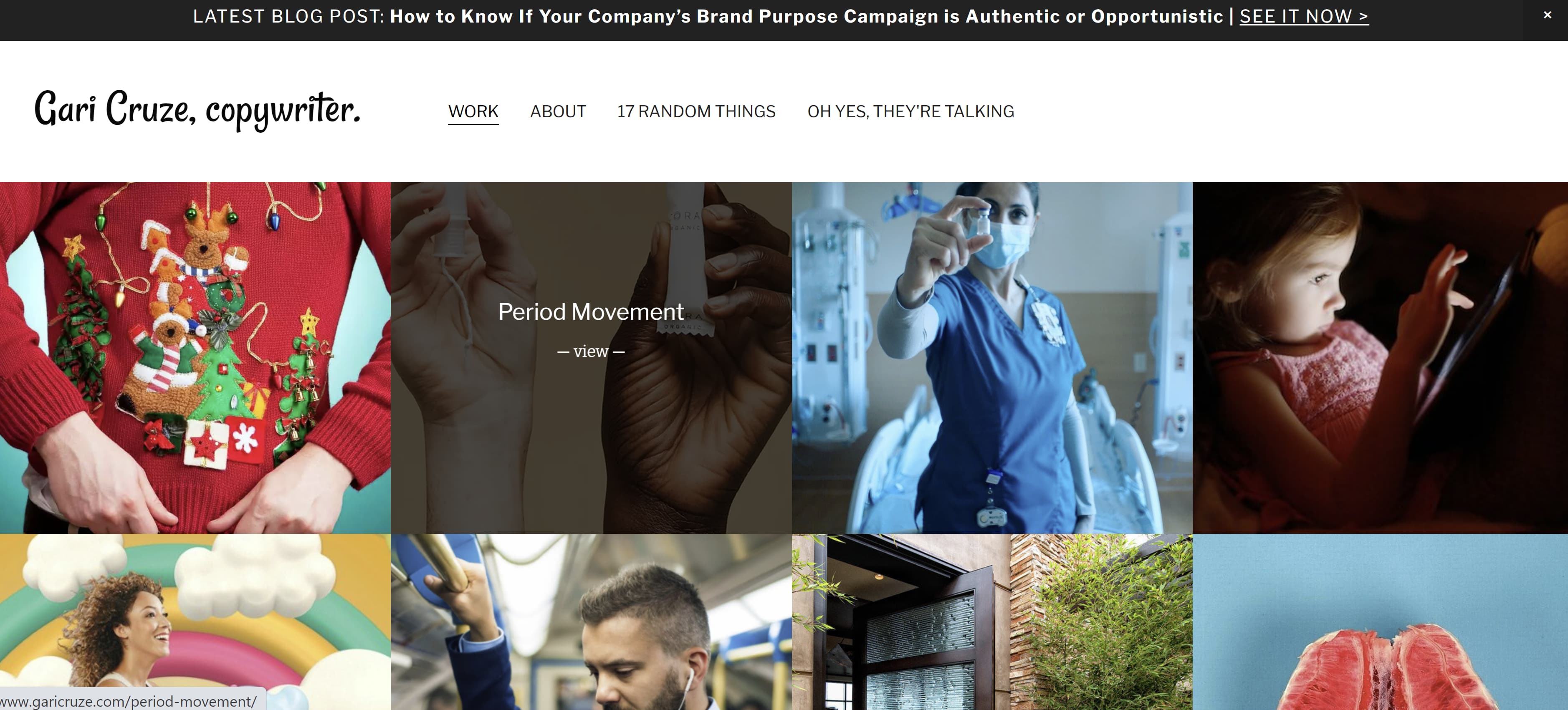
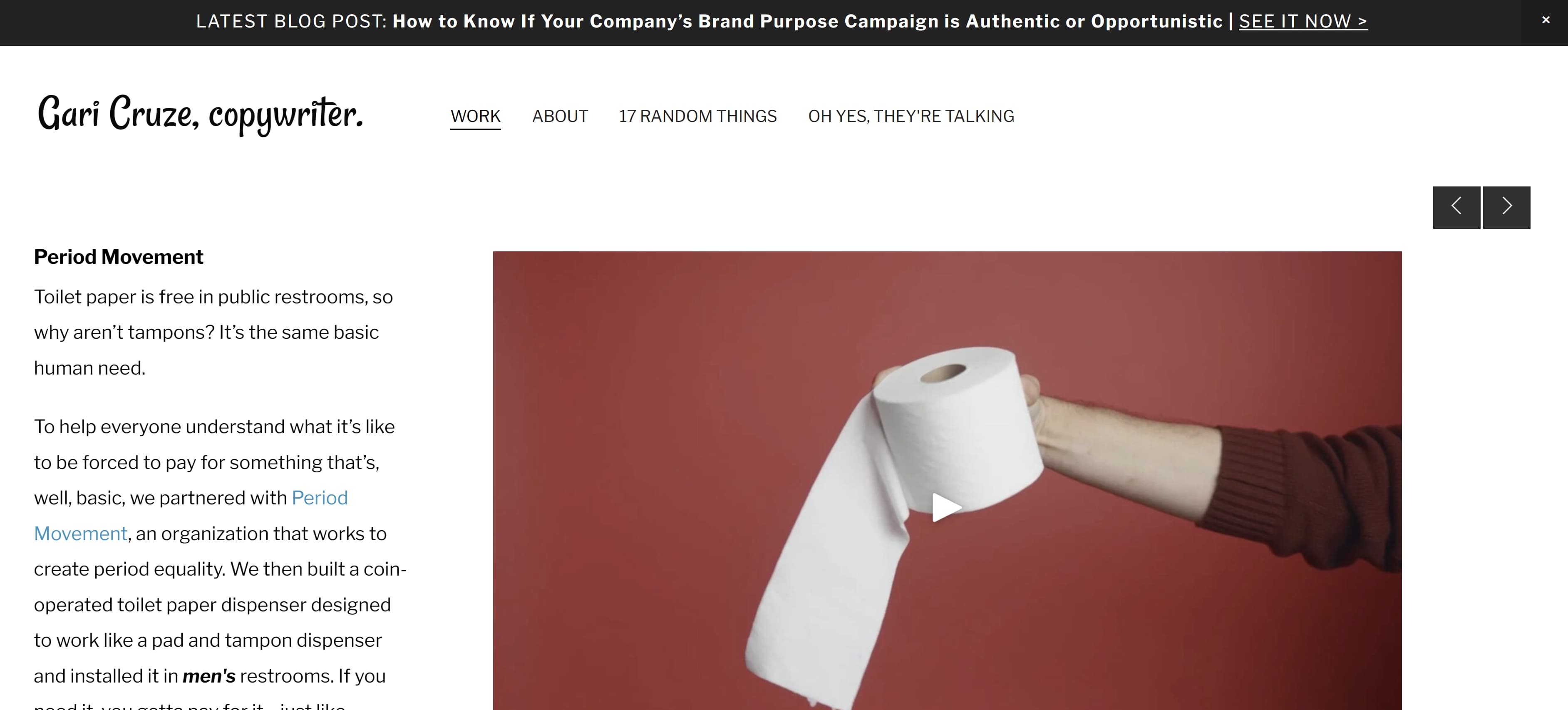
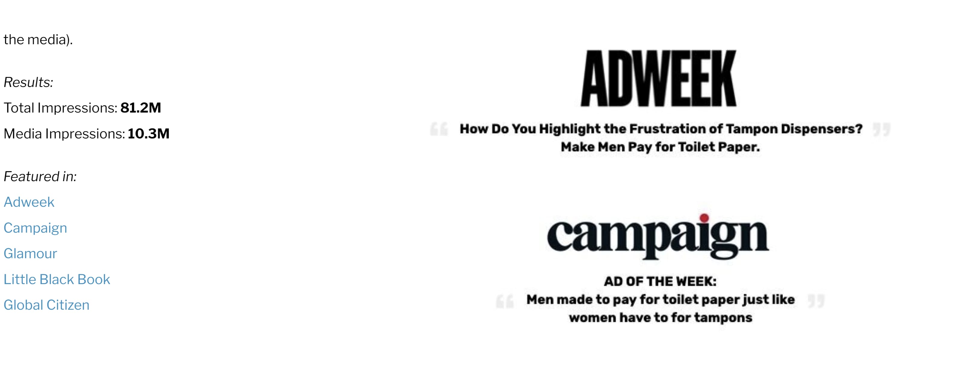
If you want your homepage to focus less on awards and more on who you've worked with, Cruze's homepage is an outstanding example. This homepage heavily features high-quality photos from the different campaigns he's worked on. Simply hover over each photo to see the name of the company or campaign, then click on the photo to see the copy he wrote and where it was published.
 If you're looking for a more straight-forward yet eye-catching approach to displaying your work, Cruze's example can lead you in the right direction.
3. Evan Benner
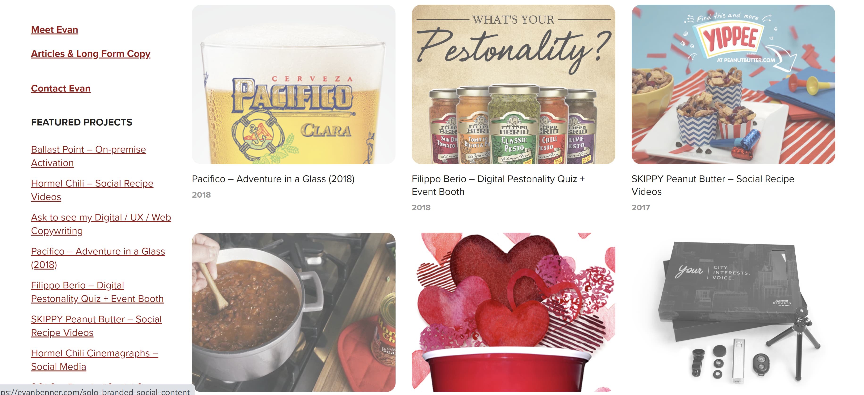
Benner takes a similar approach by using a mixture of high-quality photos and GIFs to display his work on his portfolio's homepage. However, Benner takes it a step further by including the year his work was published next to each photo. His homepage also includes a headshot and a small blurb about who he is and where he is based.
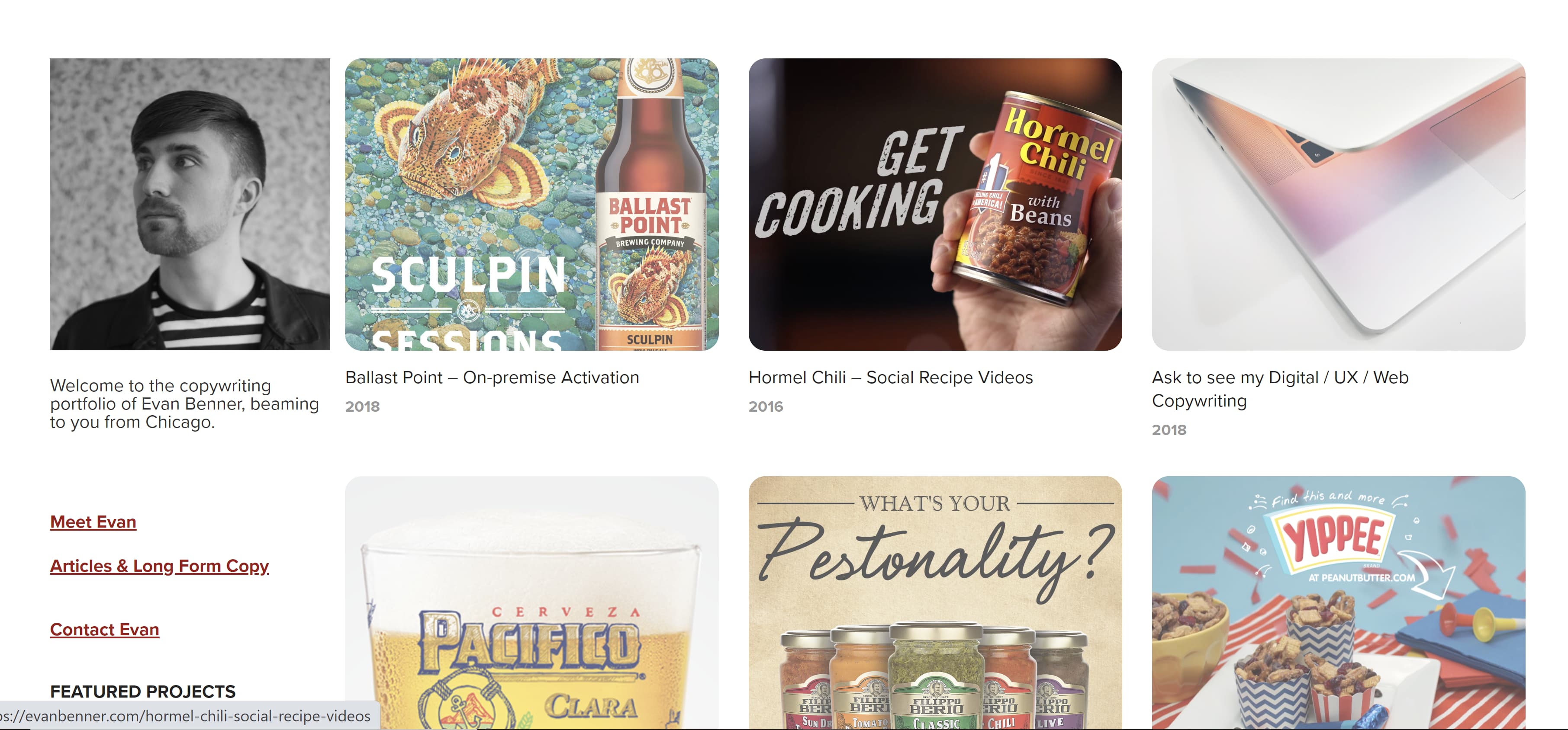 Potential clients and employers can easily navigate his portfolio by scrolling down where they can see more links to his About page ("Meet Evan"), copy, and the projects he worked on.
 4. Jose Carlos Benítez
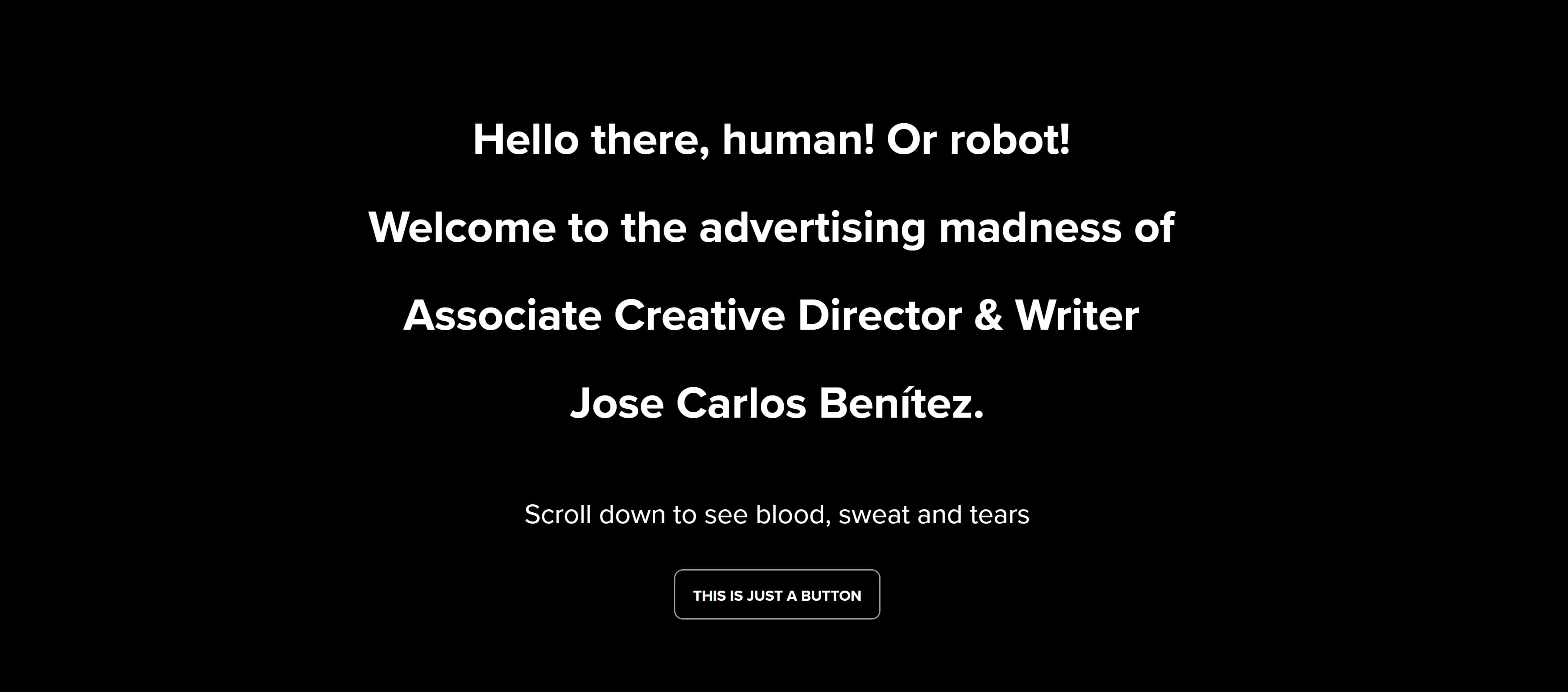
Copywriting portfolios don't have to be all work and no play, so don't be afraid to inject a little humor if you can. Benítez's personality and sense of humor are sprinkled throughout his portfolio's homepage.
Upon visiting his website, you're greeted with a black screen with white text that starts with "Hello there, human! Or robot!" and ends with "Scroll down to see the blood, sweat and tears." And for laughs, there's a random button that says "This is just a button." Spoiler Alert: The button doesn't do anything but I definitely laughed after I clicked on it and waited 30 seconds for something (nothing) to happen.
 Once you scroll down, you'll see a display of GIFs of the different campaigns Benítez has worked on over the years. Similar to Cruze and Brenner's portfolios, hovering over the GIFs will show the name of the company the campaign was for — and clicking on them will take you to his work.

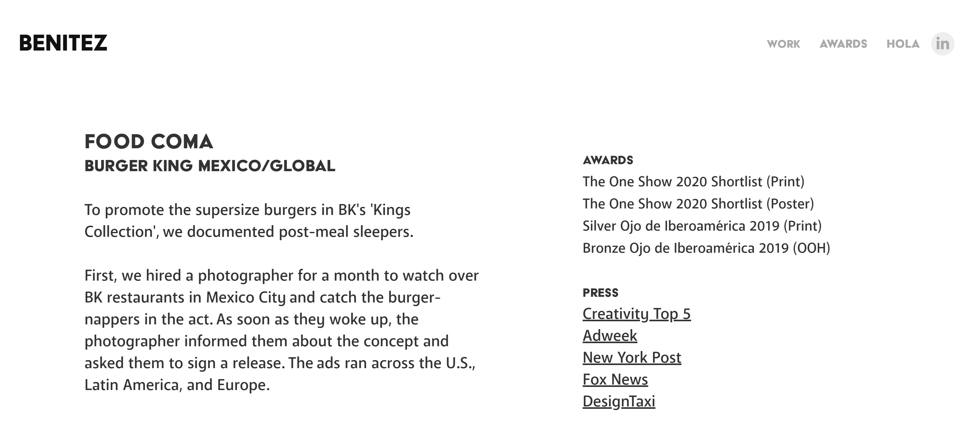
 Featuring a bit of your personality throughout the portfolio will give potential clients and employers an idea of the kind of person they're working with — and their humor and vision might line up with yours.
5. Benji Shaw
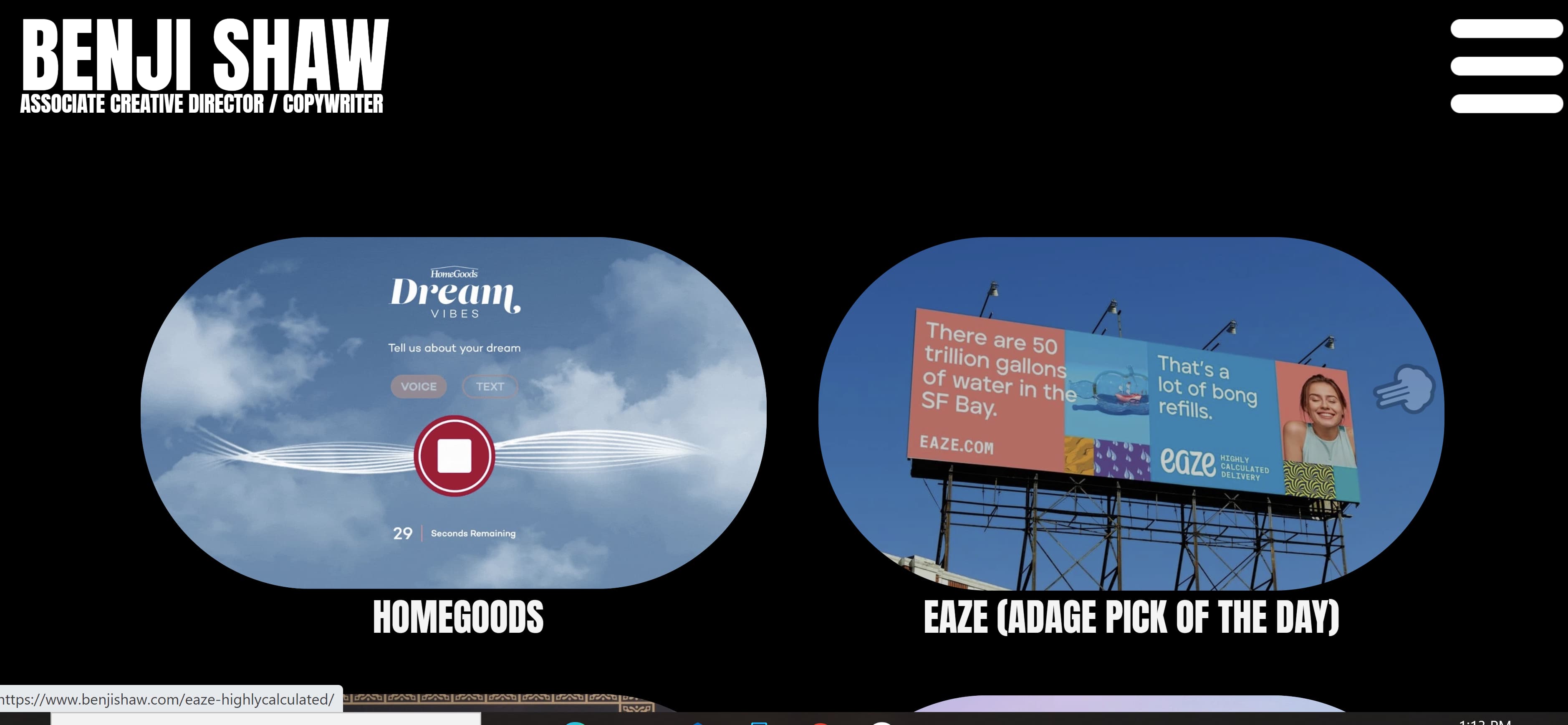
If you want to include imagery in your portfolio, but prefer a more minimalist approach, then Shaw's portfolio will spark a few ideas. This portfolio features a black background with his name displayed in a large, easy-to-read font in the upper left corner. Two large images representing his work are featured in the foreground, and more of his work is shown by simply scrolling down. Like in previous examples, clicking the images will take you to another page that gives greater detail on the projects he's worked on.
 6. Aly J. Yale
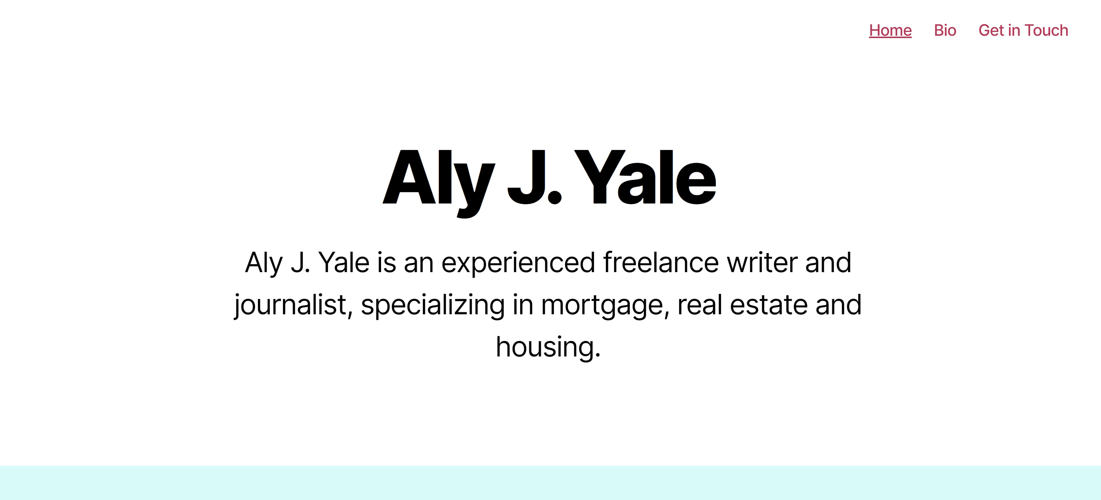
Another excellent example for minimalists, Yale's portfolio doesn't rely on a ton of imagery. Instead her homepage is straightforward, simple, and only features her name in large black text against a white background —along with tabs in the upper right hand corner that lead to her bio, homepage, and contact page.
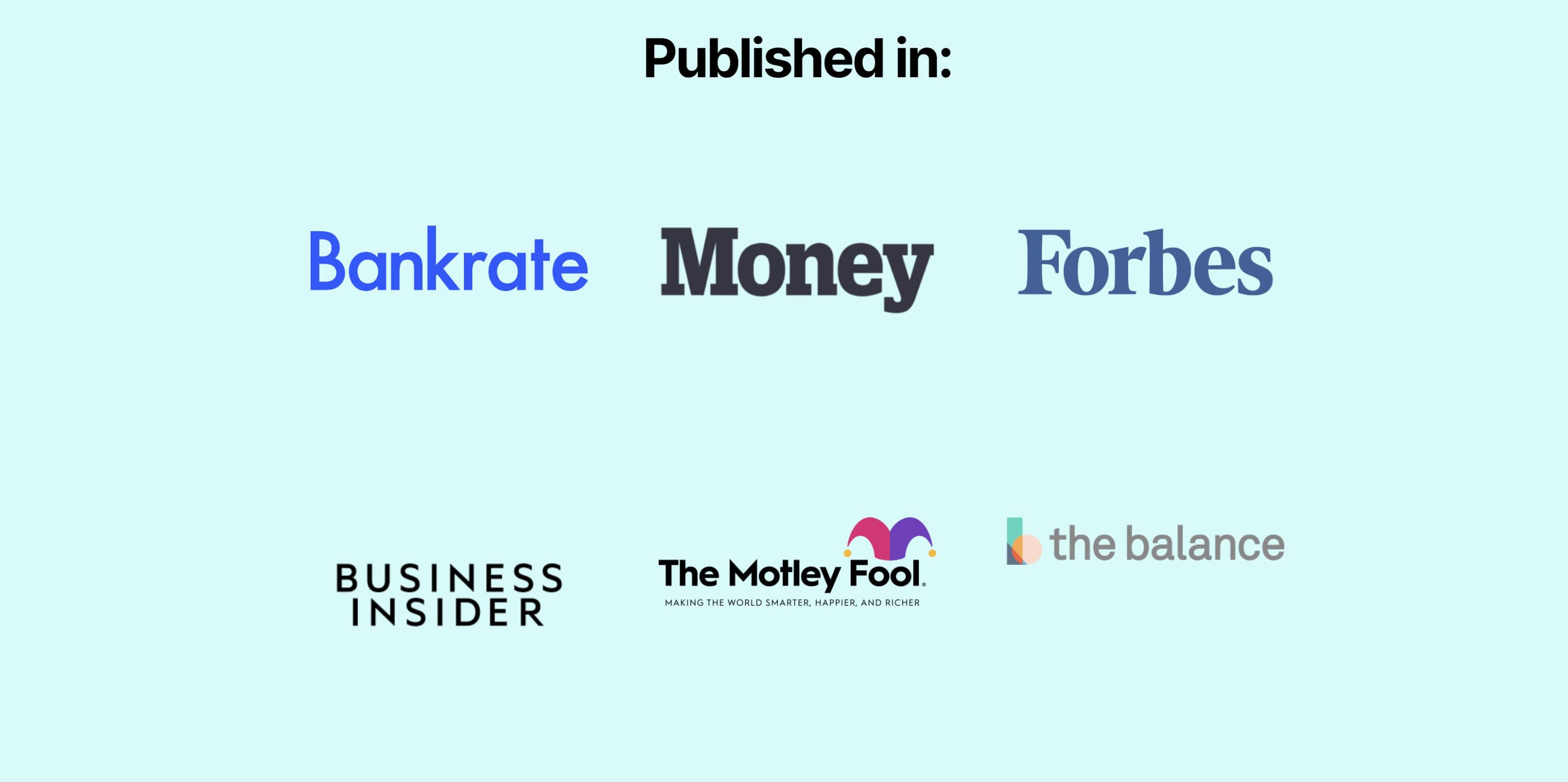
 If you scroll down Yale's homepage, you see the logos of the outlets that have published her work.
 Though I'd definitely suggest including a tab with links to your written work, this homepage shows that sometimes less is more and that you don't have to rely on bold images to have a strong portfolio.
7. Davina van Buren
The homepage for van Buren's portfolio is a great example for copywriters who are looking for a neat, organized way of promoting all of their talents, work, and social media in one place.

The content of the homepage is organized in a way that leads your eyes down the page. Its coordinated neutral colors are engaging without being too jarring. Also, notice how the tabs for the about page, portfolio, testimonials, contact information, and social media widgets are all neatly organized in a single row at the top.
This format is great if you're a copywriter who prefers a clean-cut, business professional portfolio.
8. Stephan Marsh
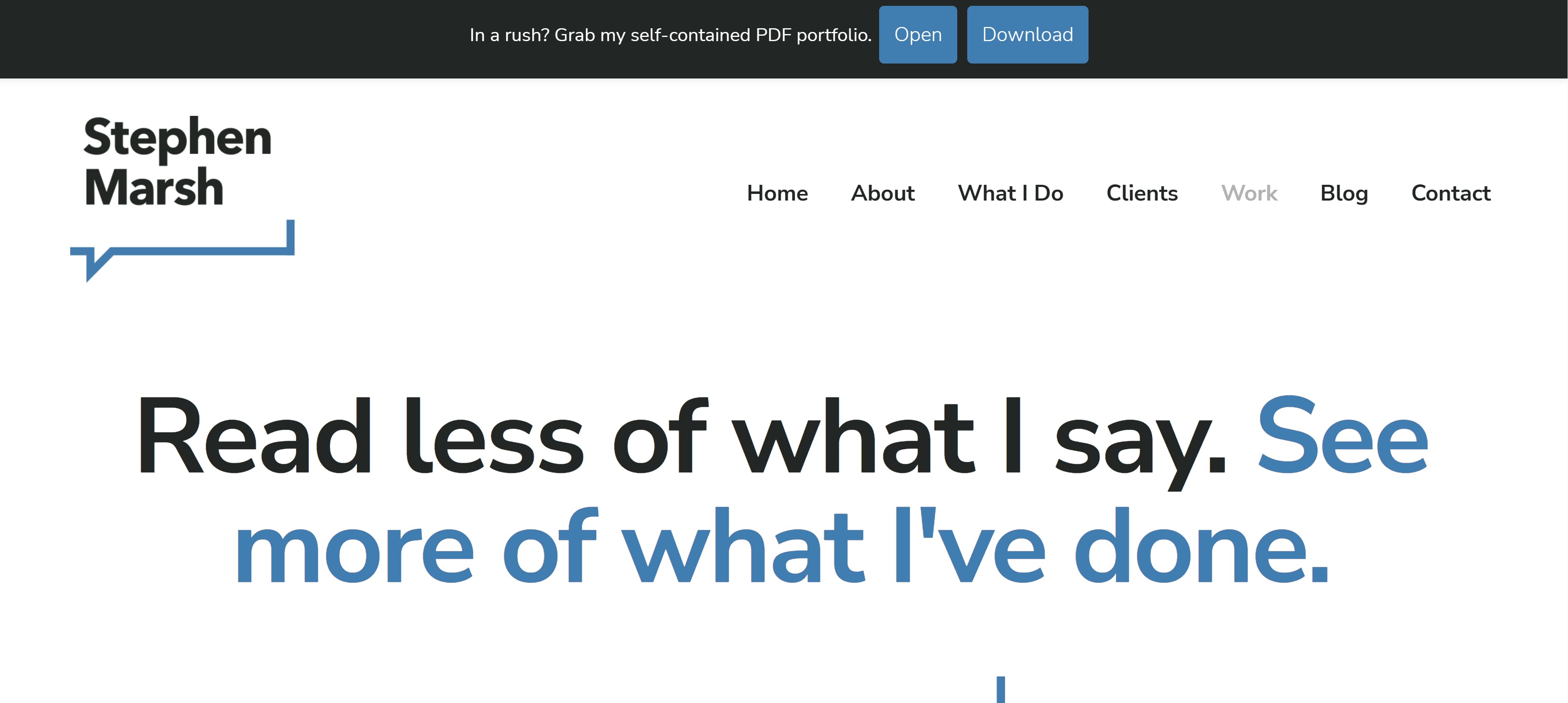
This portfolio is a great example if you're the kind of copywriter who wants to get straight to the point. With a tagline in big bold letters reading "Read less of what I say. See more of what I've done," Marsh makes it clear that he does not want to waste anyone's time. The top of his homepage even includes a self-contained PDF portfolio that can be downloaded immediately.
 This portfolio shows that even a person of few words can still find a way to make a bold first impression.
9. Jennifer Cheek
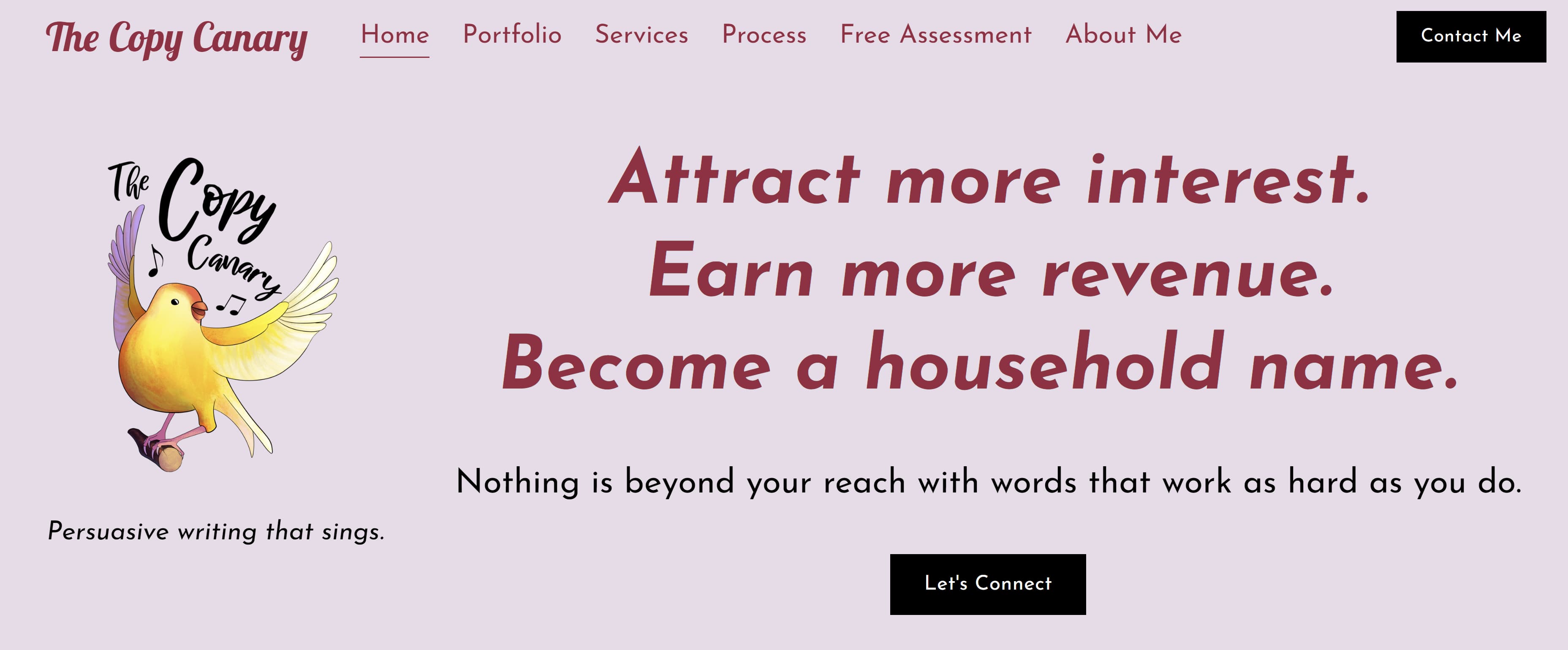
I love this homepage example because it shows how a copywriter can add their own personal touch to a portfolio template. What makes this portfolio stand out is its fun pink hues and the adorable yellow canary logo on the left side of the page. Once again, don't be afraid to show your personality on your portfolio's homepage, and that includes your quirky side.
 10. Anna Rogan
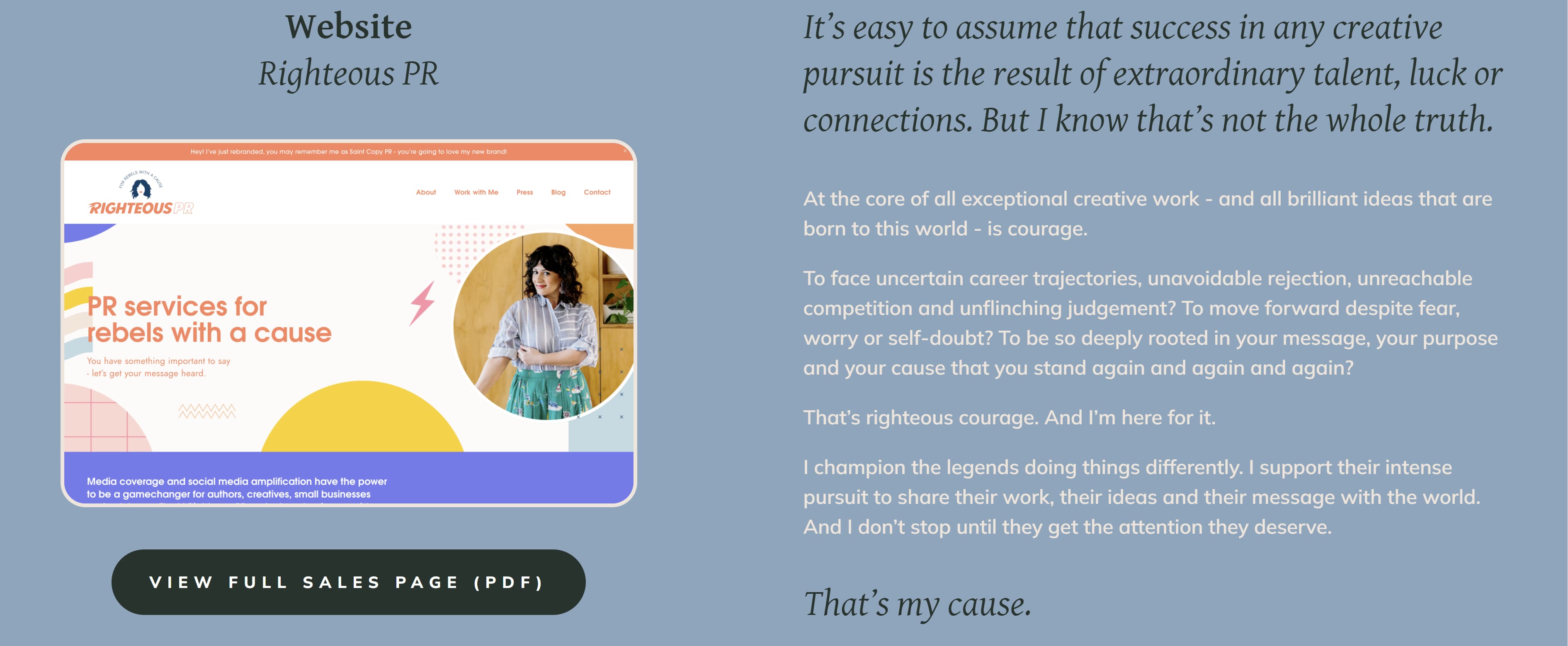
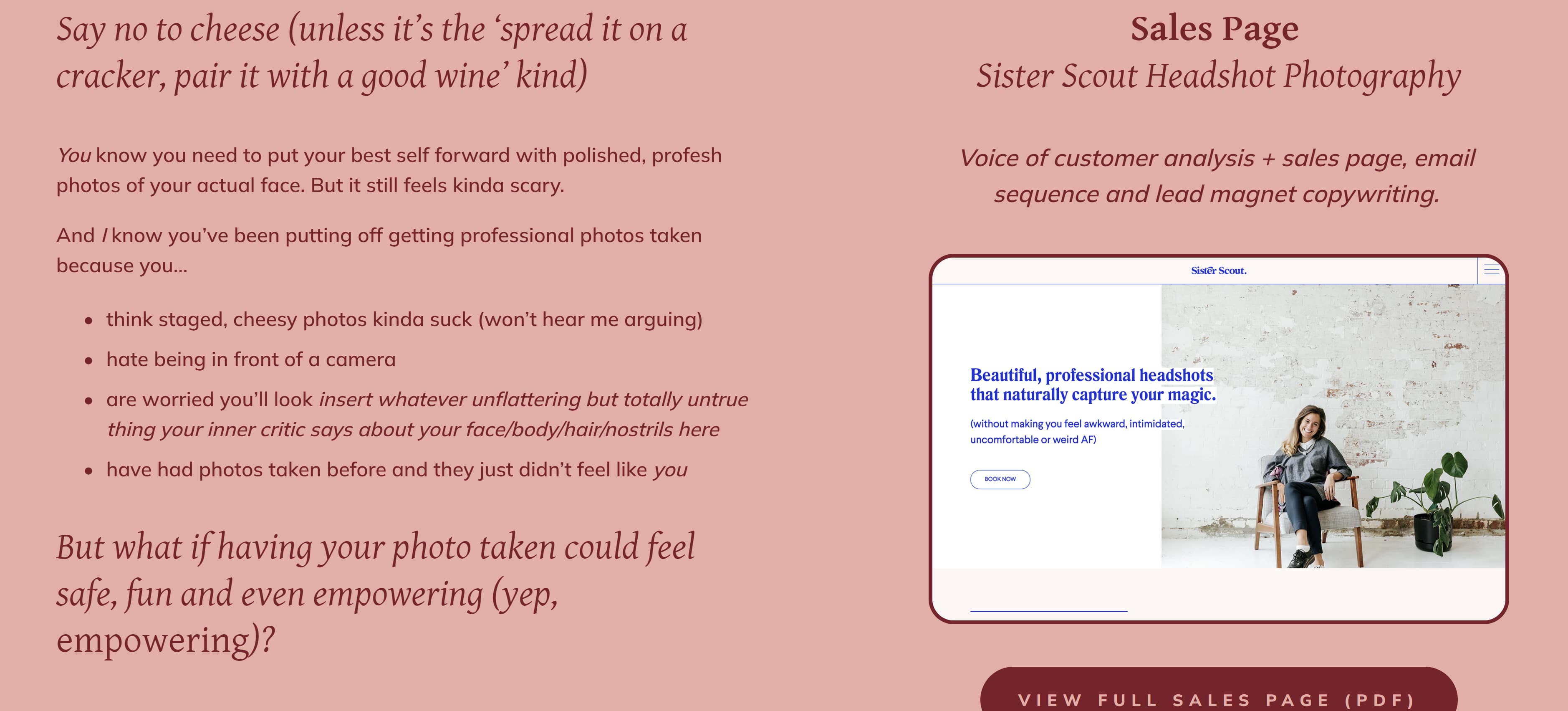
Rogan's homepage, like van Buran's, also leads your eye downward. As you scroll down you'll see more of her work samples, but what makes her page really interesting is that each sample comes with a corresponding color change. This makes for a fun, aesthetically pleasing scroll through her work.
 11. Kayla Dean
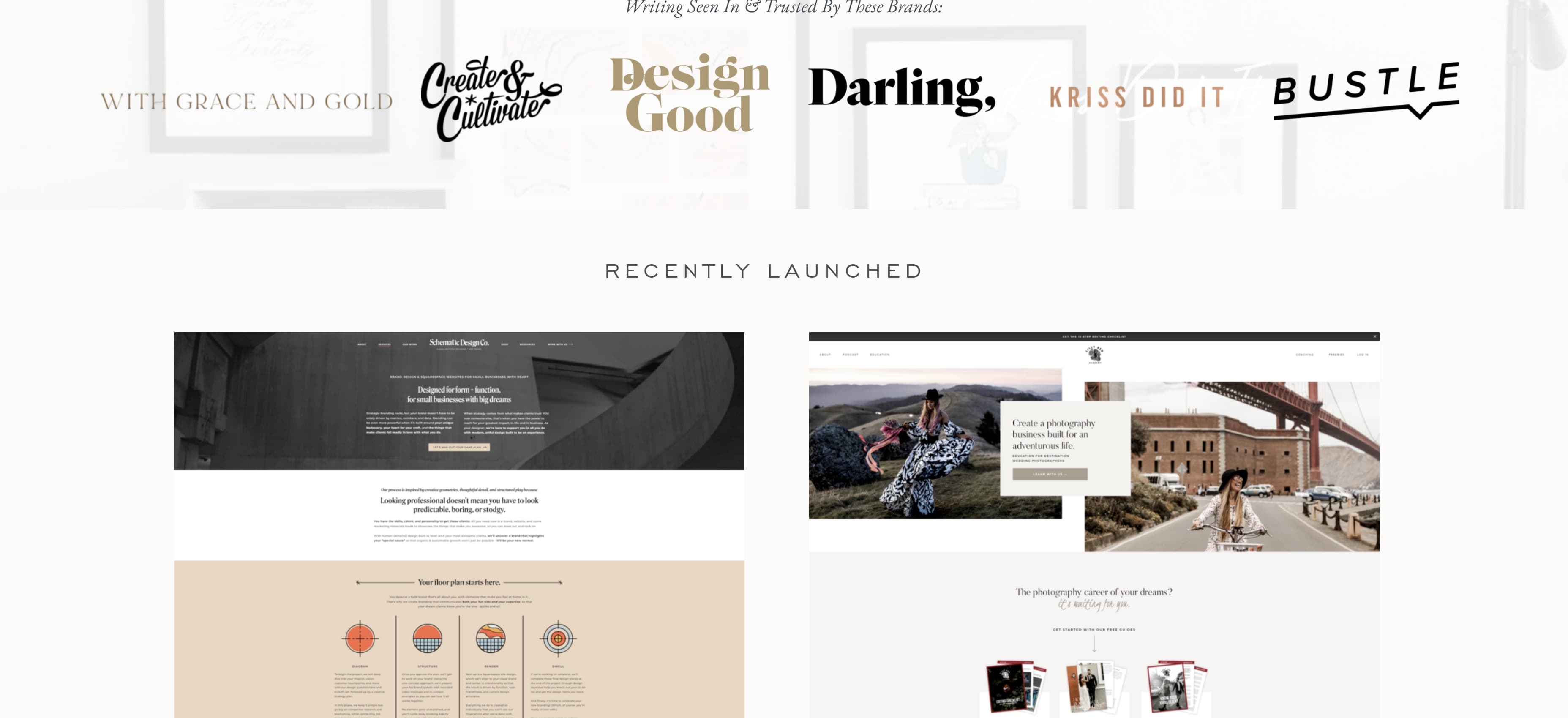
Dean's portfolio is called The Literary Co. and starts by letting visitors know she has a wealth of experience, having created copy for more than 100 clients. Her portfolio also has a blog-style setup where potential clients can scroll down and see all of her latest work, case studies, and the brands she has worked with.

 12. Dayarne Smith
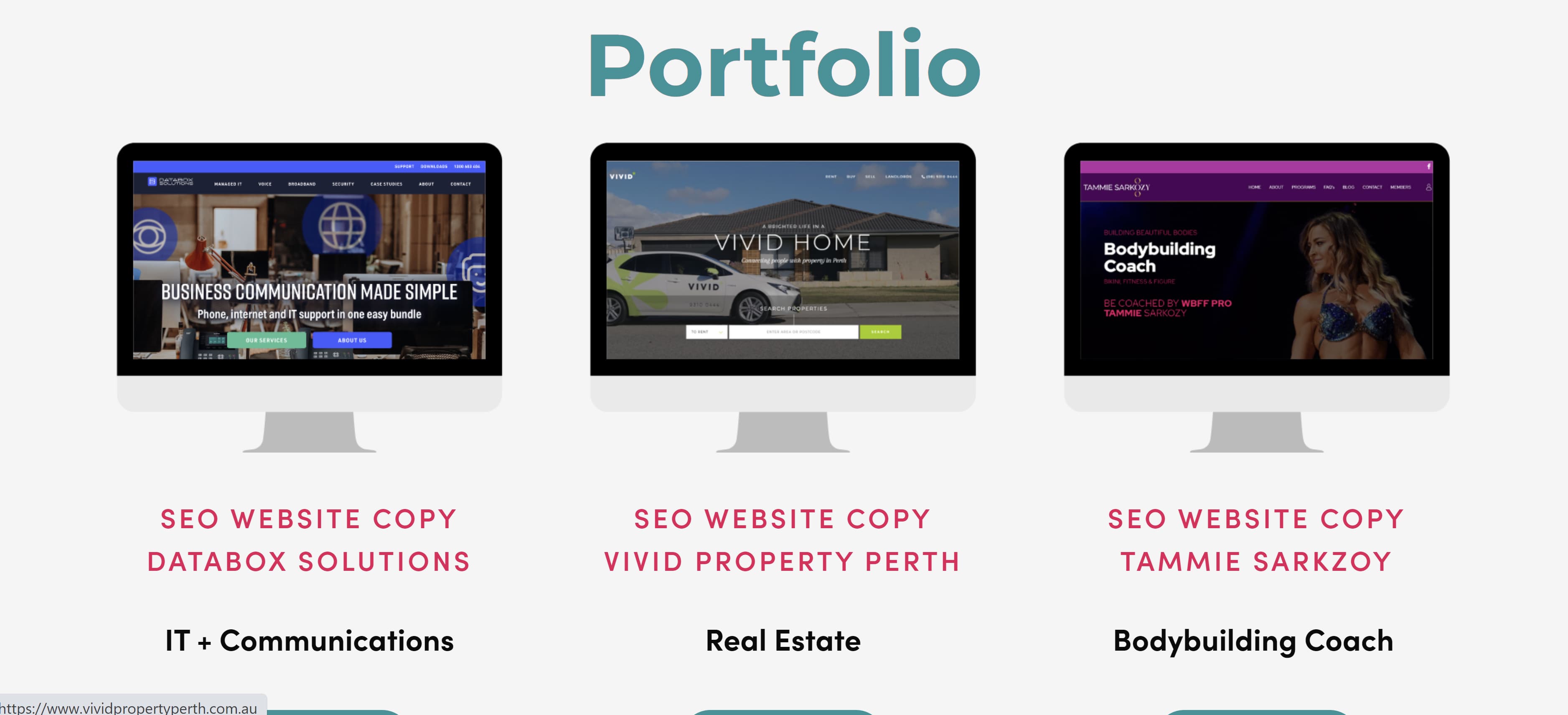
Smith's website opens with a large image of a woman at a keyboard and features all of her relevant tabs at the top of the homepage. Once you scroll down, you'll see her portfolio with links to her work uniquely displayed in fun monitor illustrations.

 13. Sara Frandina
Frandina leaned into the writing theme by having her portfolio's homepage resemble notebook paper. She doubled down on the theme by crossing out a word in the tagline and "writing" in a new word.
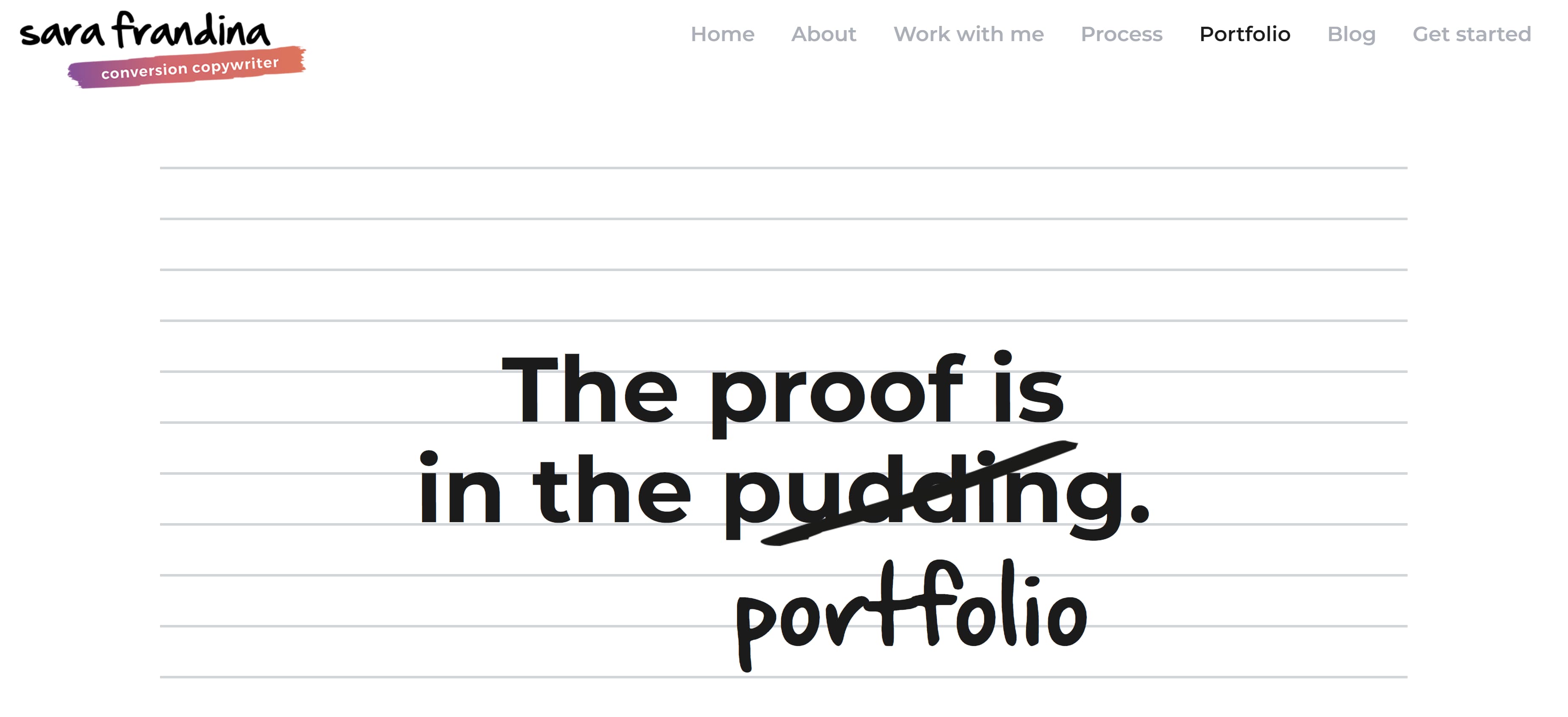 In addition to having standard information tabs at the top of the page, Frandina also included tabs linking to her past works separated by categories — customer research, email sequences, launch copy, long-form sales page, and website copy. These tabs can be found by scrolling down the homepage.
.jpg?width=3723&name=Sara%20Frandina%202%20(1).jpg)
About Me
This is where you showcase your personality and clearly define the expertise you bring as a copywriter. Notice that each example features a photo of the copywriter.
14. Kim Hobson
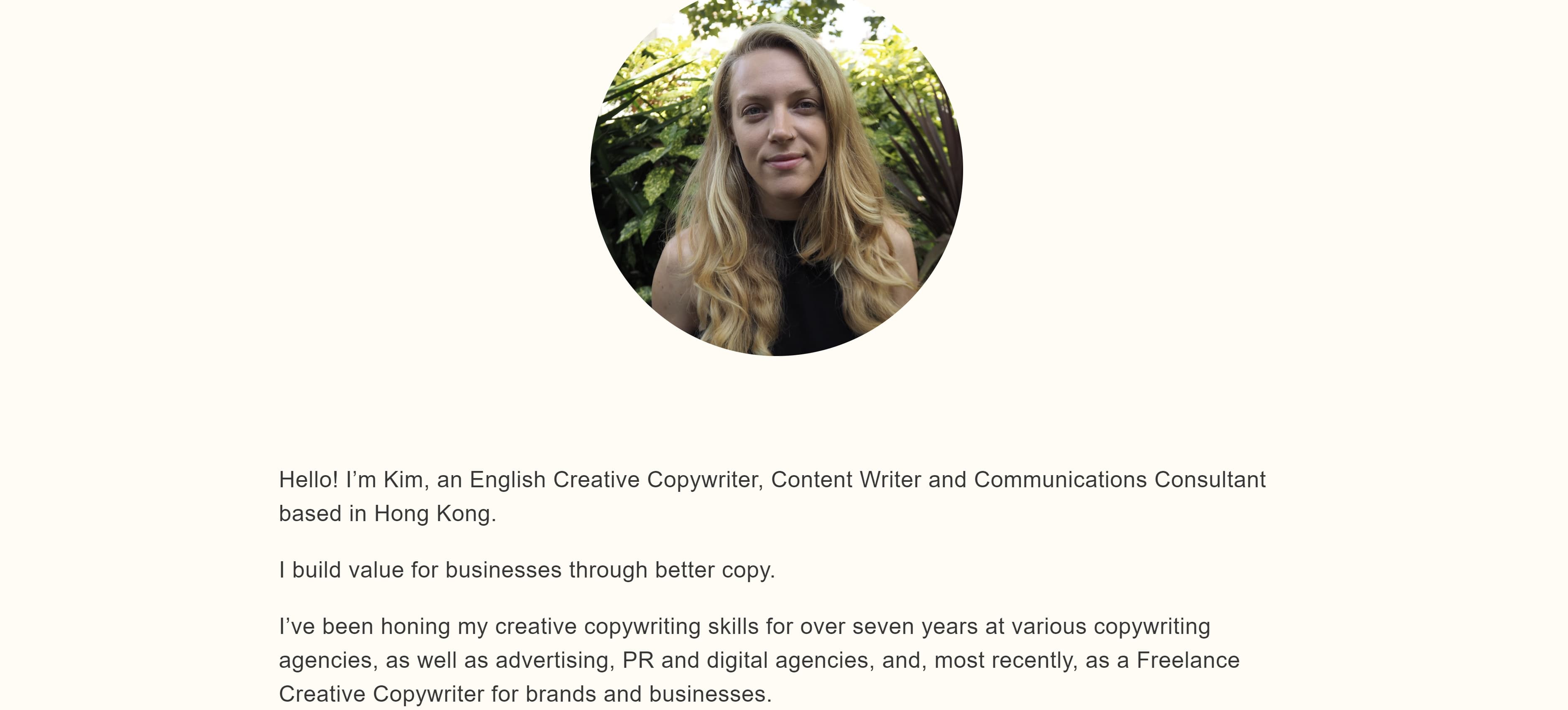
Figuring out what to say about yourself can be difficult. Where do you even start? Hobson found a way around that by breaking her About page into sections. In her introduction, she includes a photo of herself followed by a brief overview of what she does, where she is based, and how long she has been copywriting.
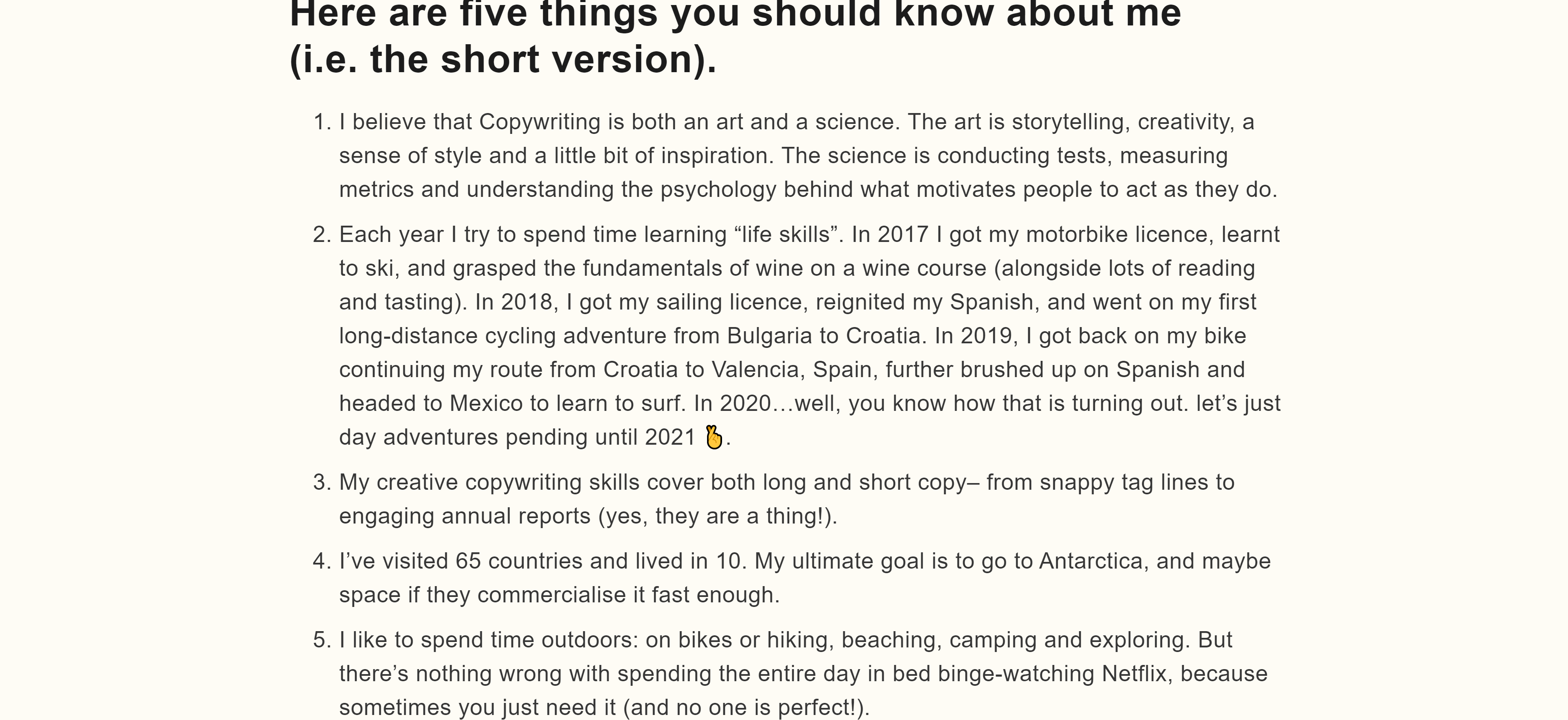
 Below her overview, she lists five quick facts about herself — some of which pertain to copywriting and others that cover her personal life. Then she has a section that breaks down her professional background.
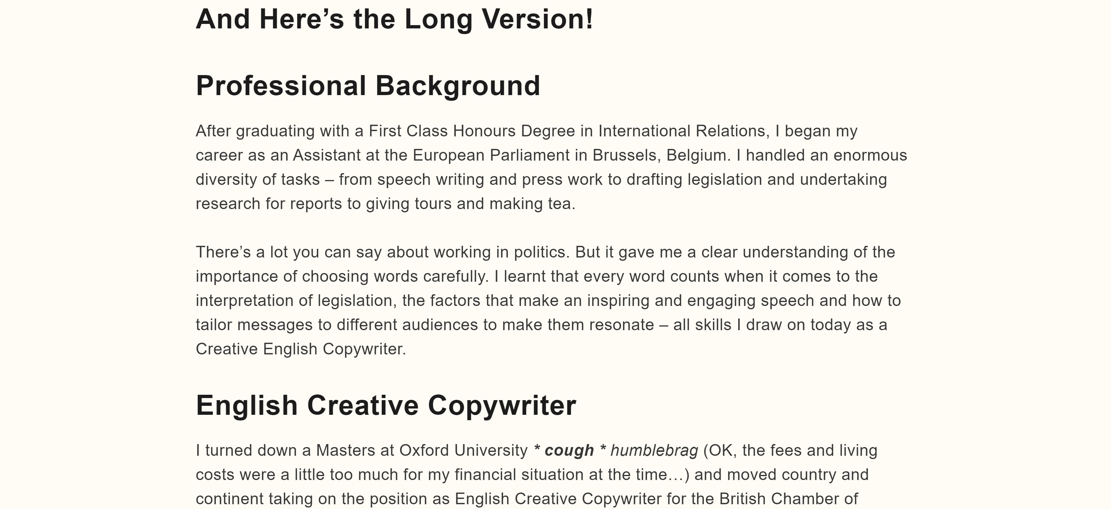 If you're not sure what to put in your About page, you can follow Hobson's formula by including a brief overview followed by a few fun facts and a breakdown of your career thus far.
15. Flourish Writing
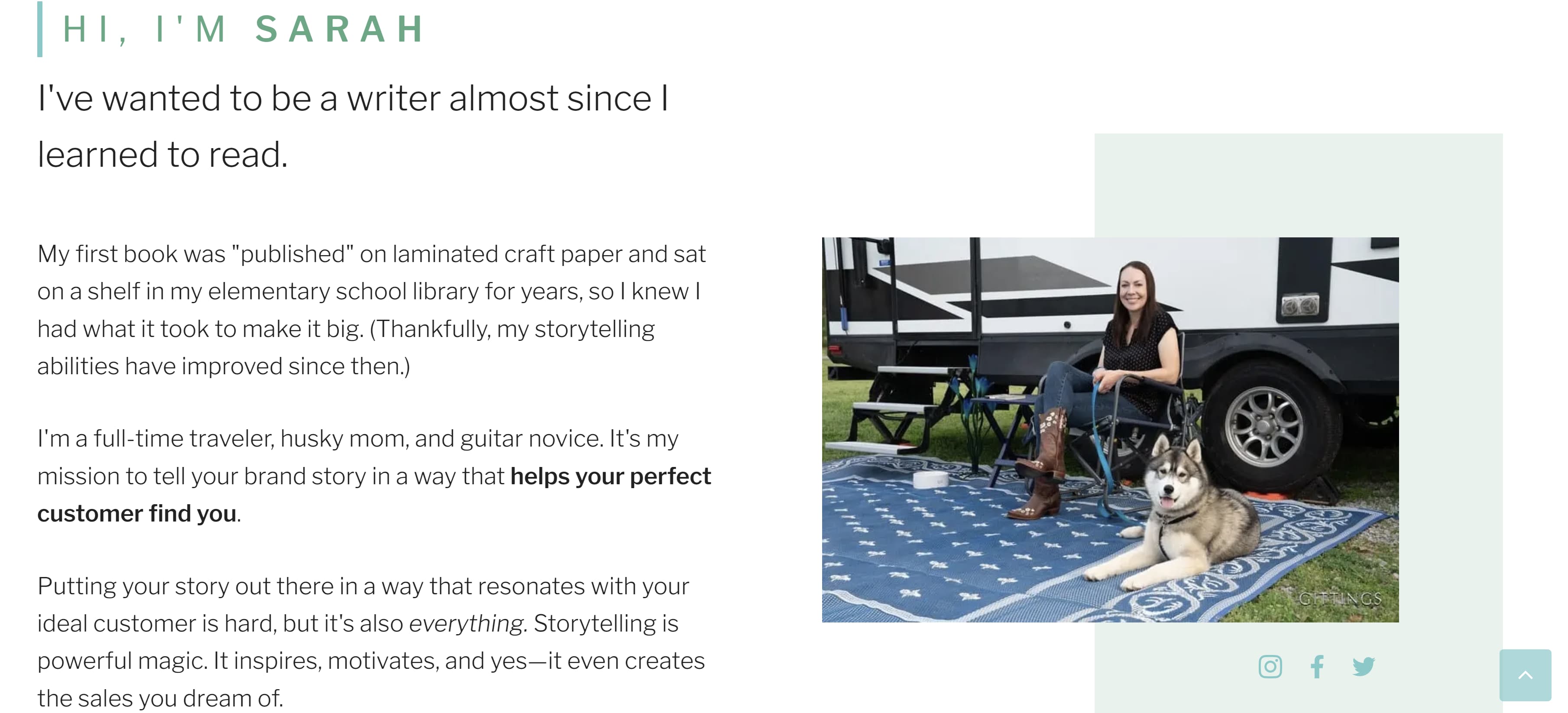
Sarah, whose portfolio is called Flourish Writing, introduces herself using a funny anecdote about her first "published book" being written on craft paper and stored on her elementary school's shelf for years. This anecdote lets the reader know Sarah has had a passion for writing since she was a child and that passion can also produce excellent work.
Complete with a photo of Sarah with her adorable pup, this About page gives the reader a clear idea of who Sarah is when she isn't writing.
 16. Shanice Perriatt
Perriatt's About page is concise and well organized. Her opener clearly states her name and what she does: "I'm Shanice Perriatt – a digital marketer and content creator who blends the best of design and writing into compelling and engaging brand content."
Like Sarah, Perriatt also gives us insight into her life and hobbies – going to the gym, scrolling through Twitter, and going to the movies. Finally, the bio ends with Perriatt telling the reader the position she holds now.
The muted pastel background complements the green around headshot, making for a clean, informative page.
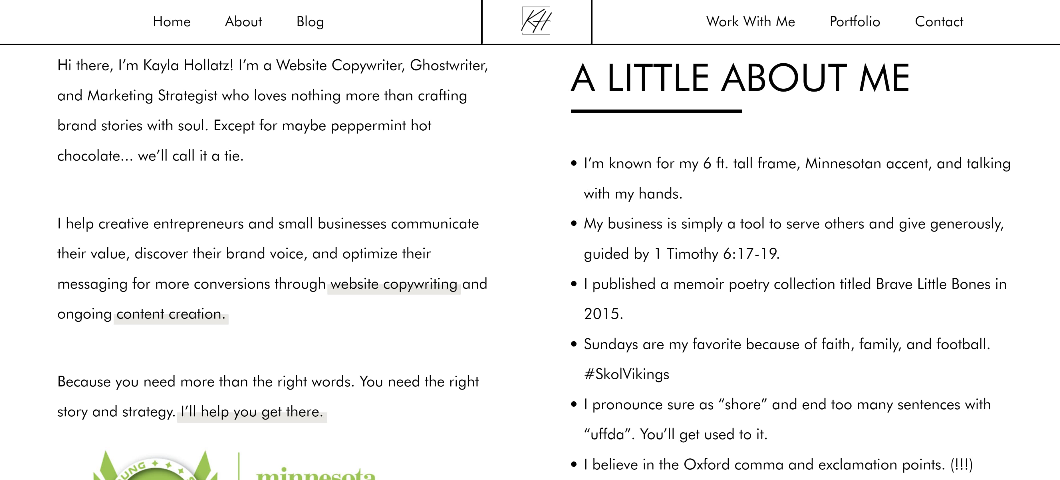
 17. Kayla Hollatz
Hollatz takes a different approach to her About page. First, it starts with a photo of Hollatz next to a brief statement detailing her objective.
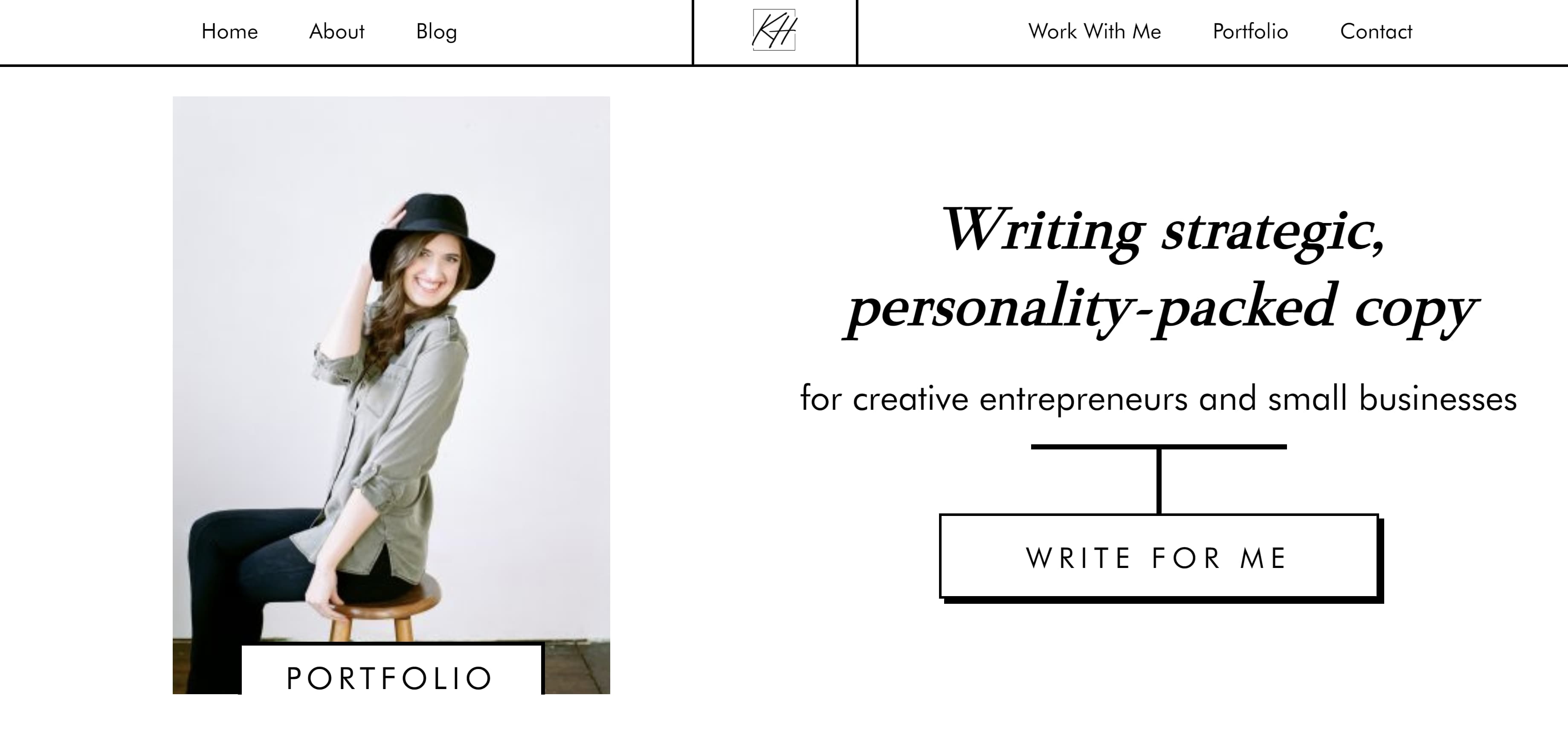 After scrolling down, visitors see an "About You" page instead of an "About Me" page. This is where Hollatz presents an issue many clients face.
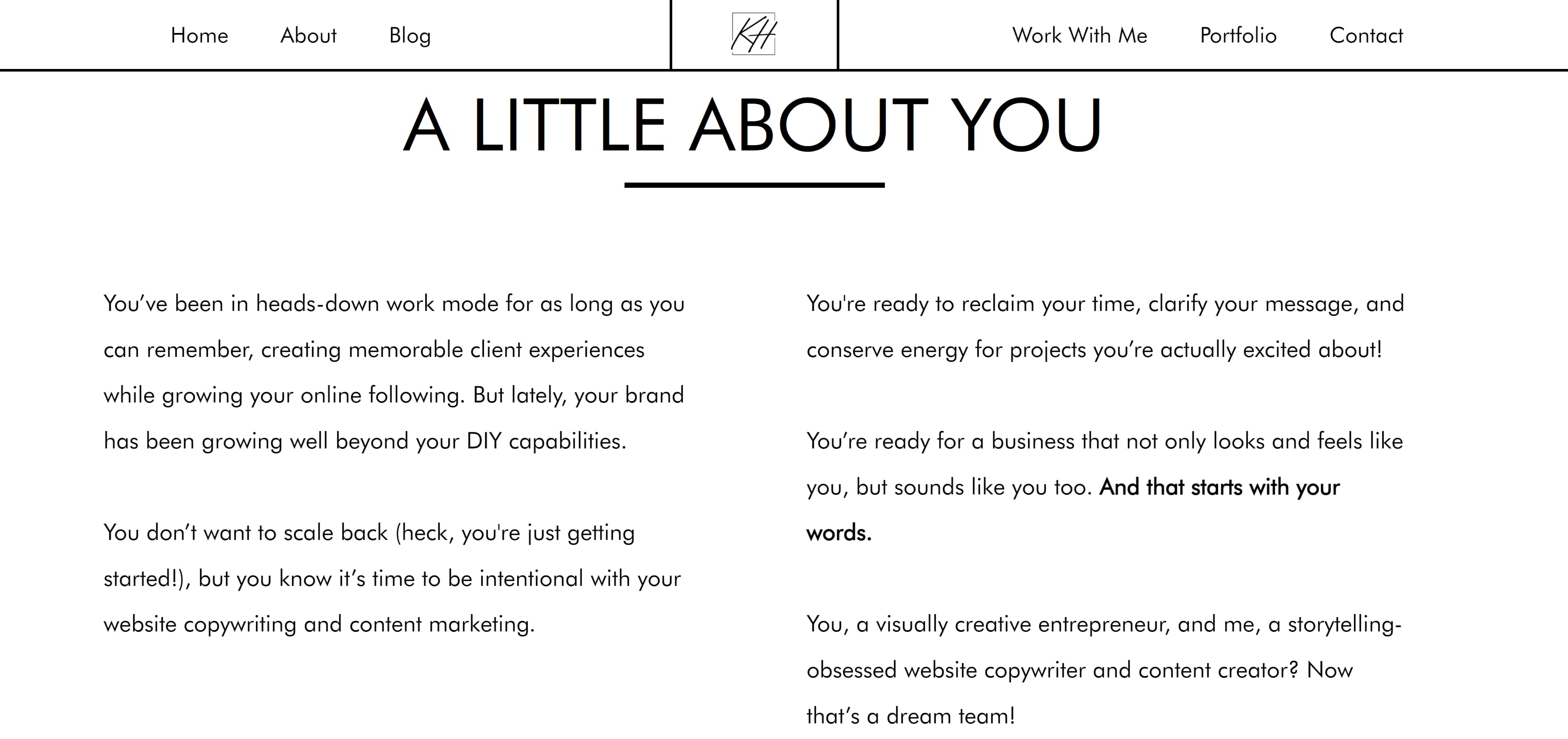 Finally, visitors can scroll further down to find an About Me page in which Hollatz presents herself as the answer to all of the potential client's problems.
 18. Andie Coupland
Coupland's About page shows that it is perfectly fine to veer away from personal details and to keep things strictly business. While we don't get insight into Coupland's life outside of writing, we do get a clear description of her experience and what she brings to the table as a copywriter. Note that she also includes a link to her LinkedIn for more information.
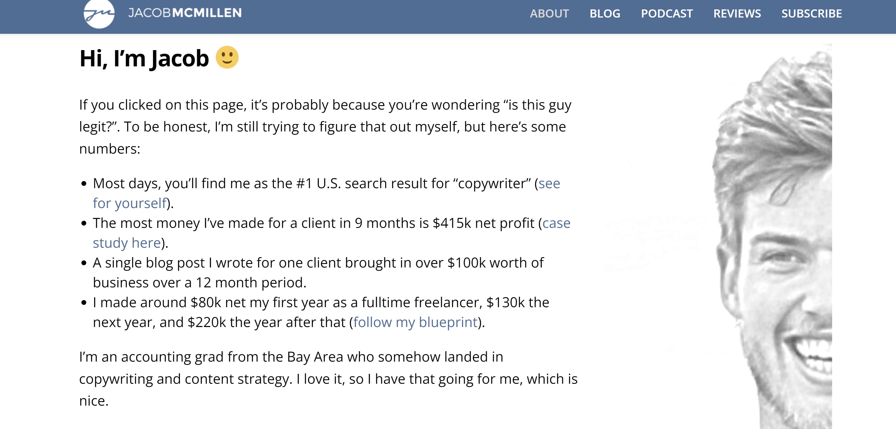
 19. Jacob McMillen
McMillen's About page establishes credibility by focusing on his accomplishments. He also puts his own spin on the writer's headshot by instead only showing half his face. It's a bold move but the gray coloring complements the muted blue and white banner, so it doesn't seem too out of place.
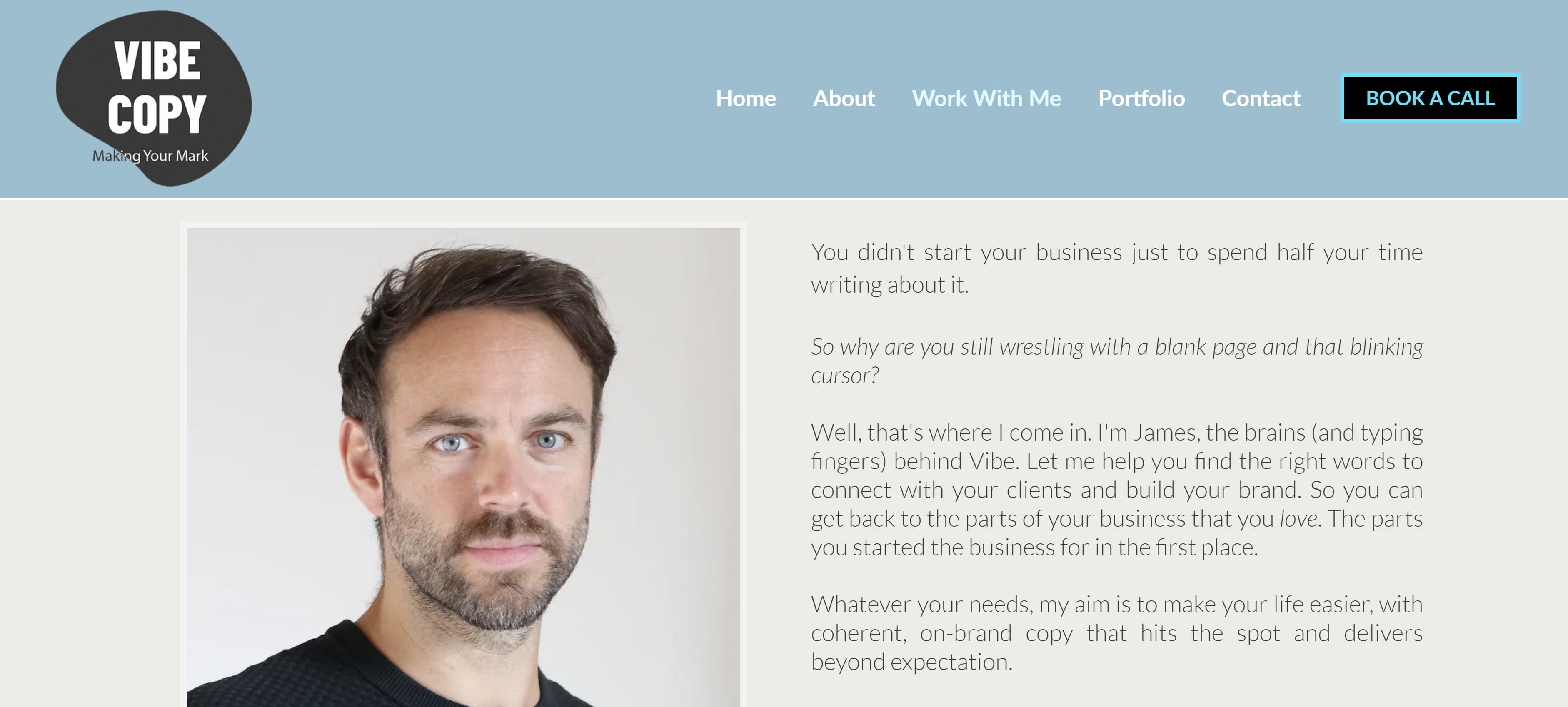
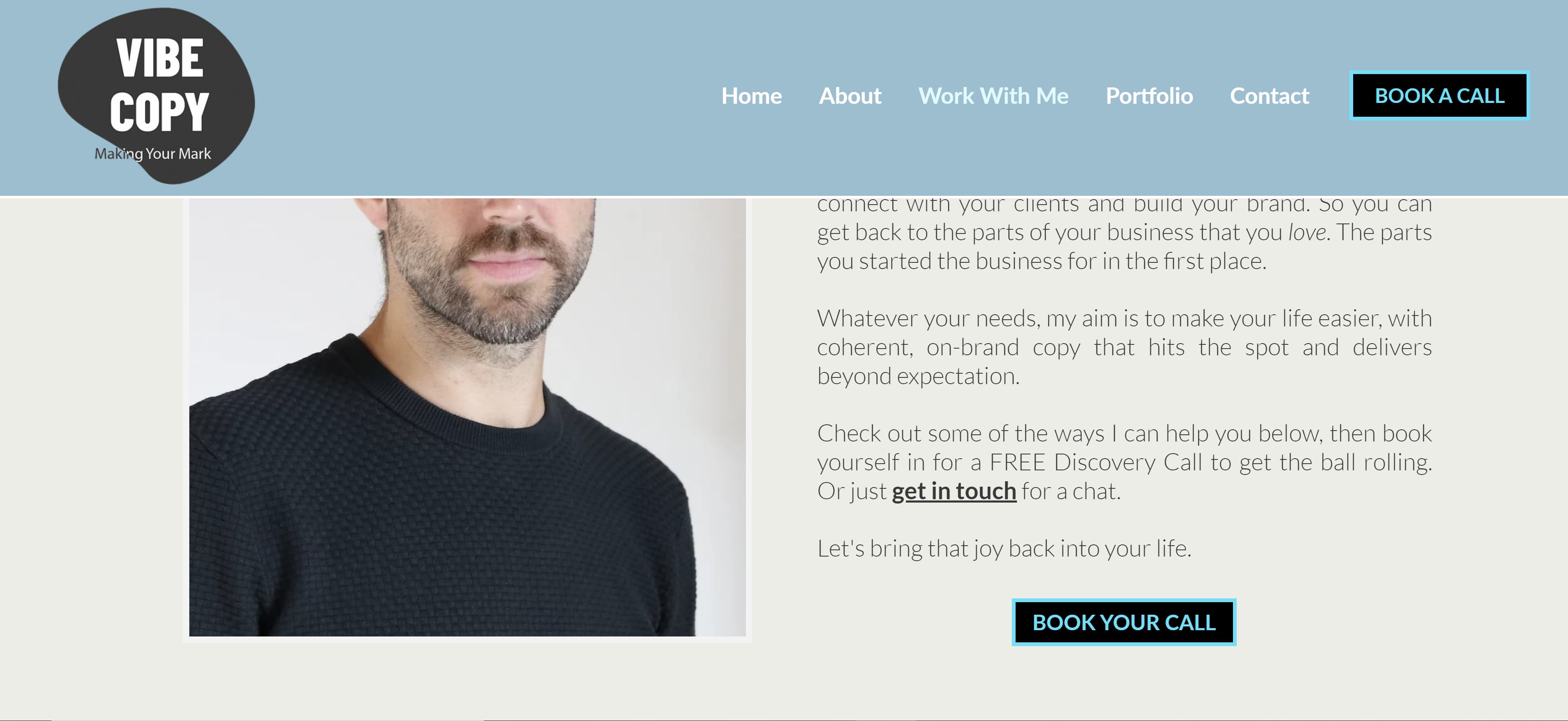
 20. James Schlesinger
Like Hollatz, Schlesinger uses his About page to present a problem potential clients could be facing, then he presents himself as the solution by explaining exactly what he can do for them. Then he ends his bio with a call to action, urging readers to contact him for his services.
 21. John Axtell
Are you looking for a punchy opener to grab the reader's attention? Why not try "I love high kicks!" Maybe avoid that exact phrase, since that's how Axtell decided to open his About page, but shouting a random fact about yourself is definitely a good start. Axtell took the opener a step further by including a photo of him doing a high kick.
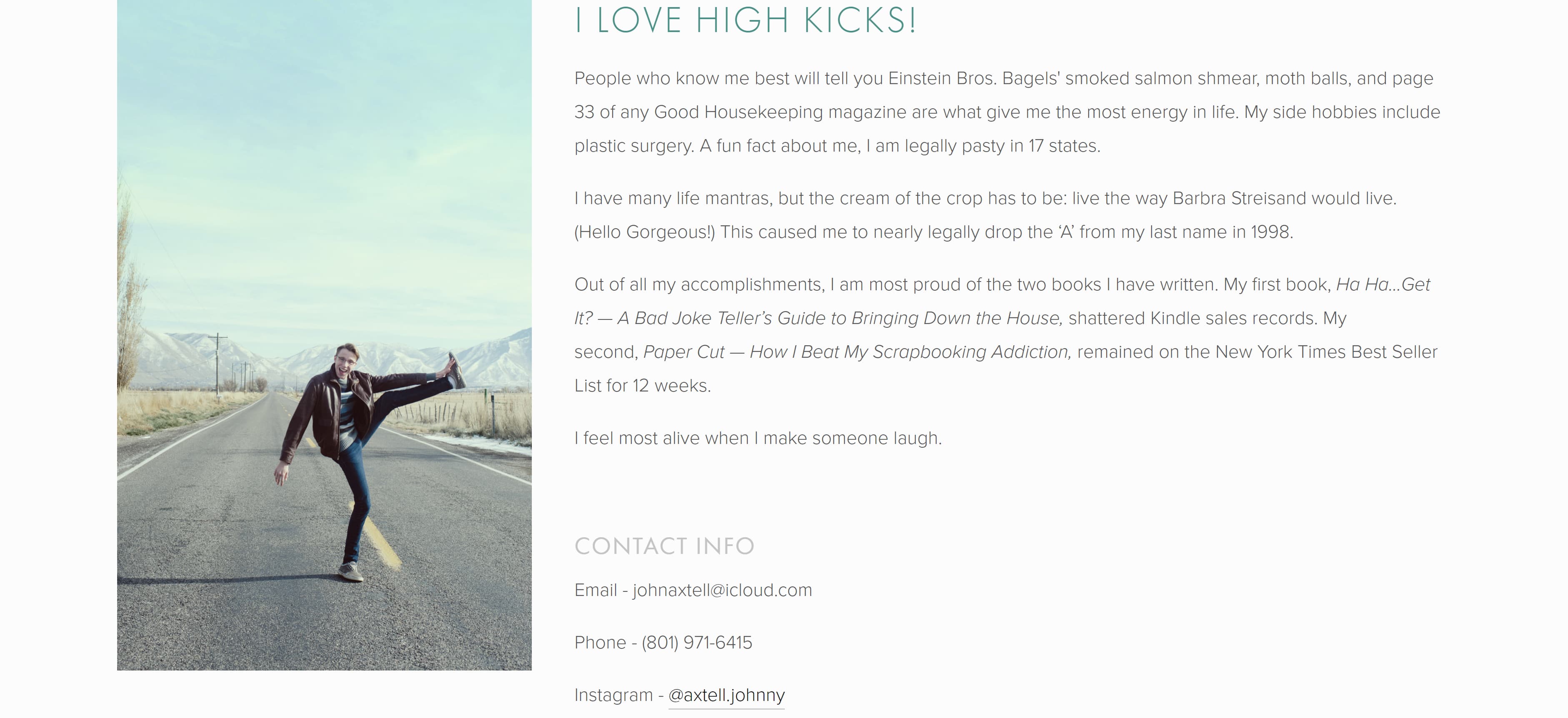
If you decide to open with a fun fact, like Axtell, coupling that opener with a photo showing that fact can definitely show your personality and grab the attention of potential clients.
Services
Some copywriters opt to dedicate a separate page of their online portfolio to breaking down the specific services they provide. If you choose to do the same, here are a couple of examples you can reference:
22. Danielle Wallace
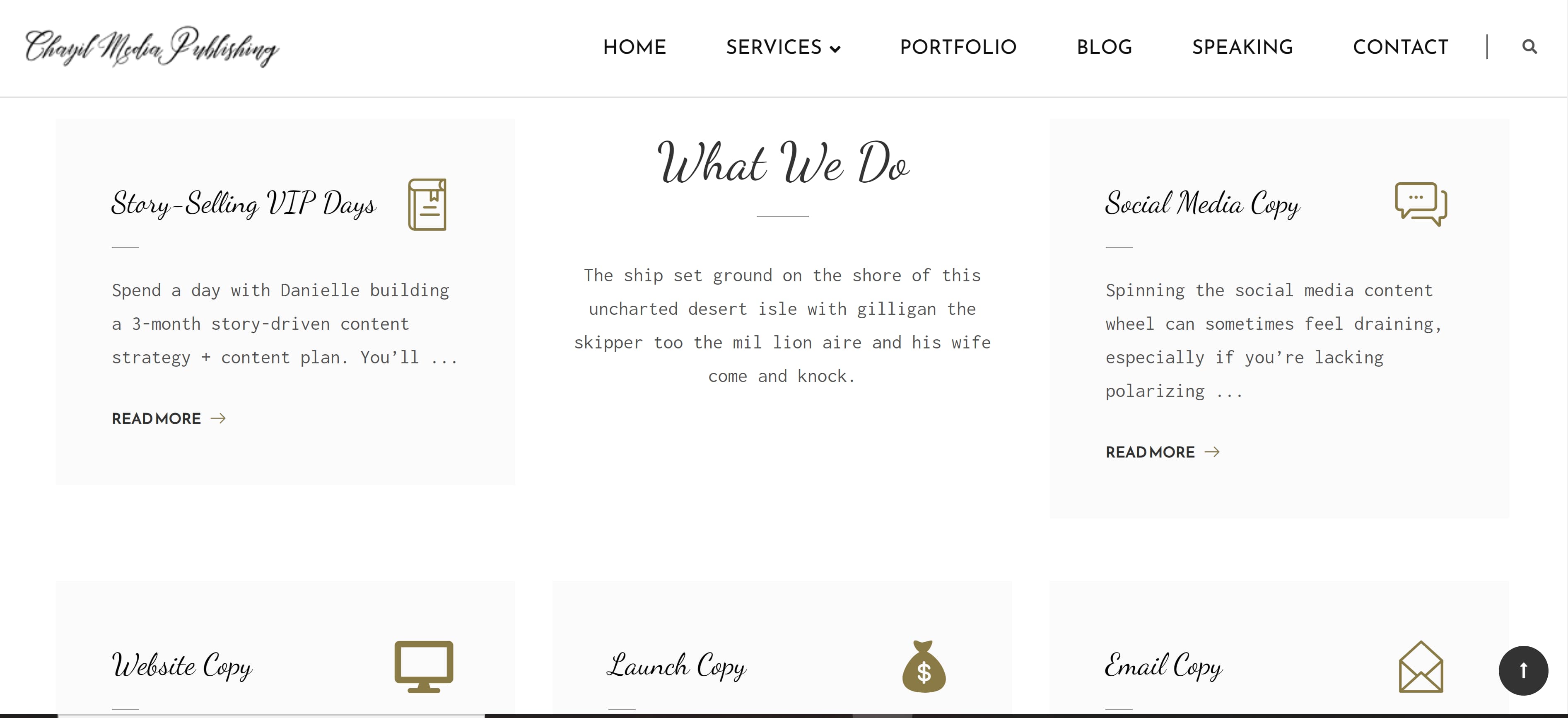
Wallace chose to separate her services into different clickable boxes that include icons and a mixture of script and typewriting fonts.
 23. Sandy Dang
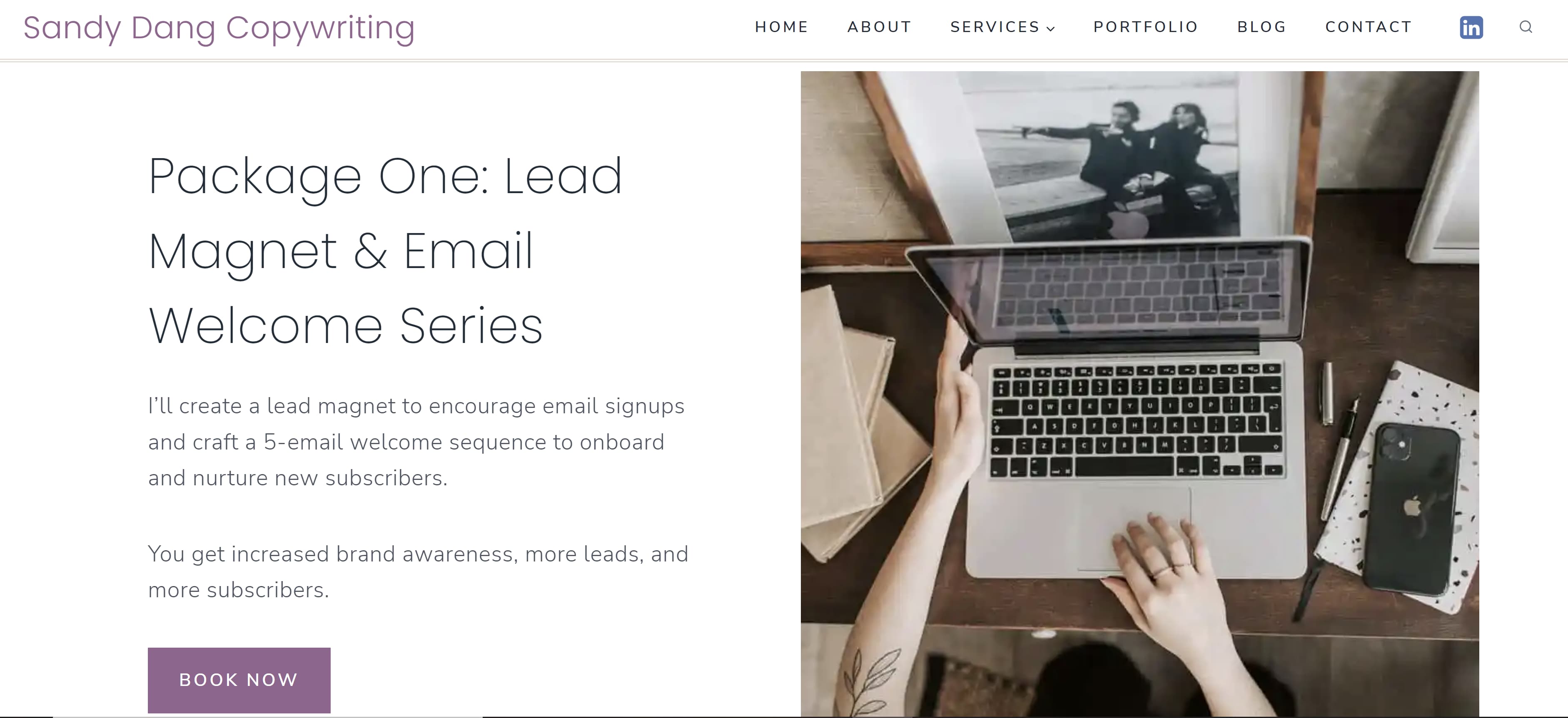
Dang displays her services in a more horizontal format with texts on one side and a large corresponding photo on the other. Each section of her service page includes a button that gives the option to book.
 24. Jennifer Locke
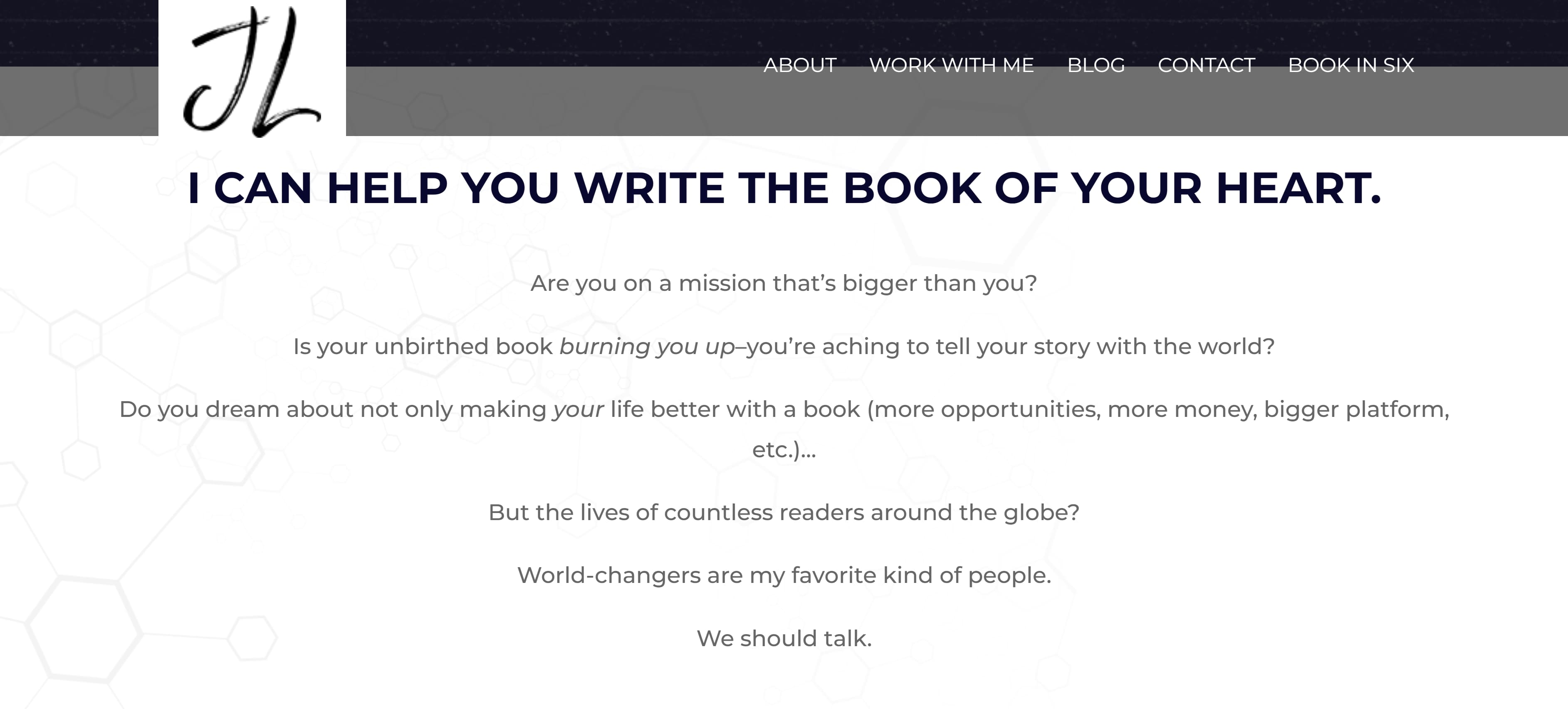
Lock kept the format straightforward by simply stating what she can do for the client and including a button that allows potential clients to schedule a consultation. This could be a great method for copywriters who specialize in only one for two services.
 25. Stuart Tarn
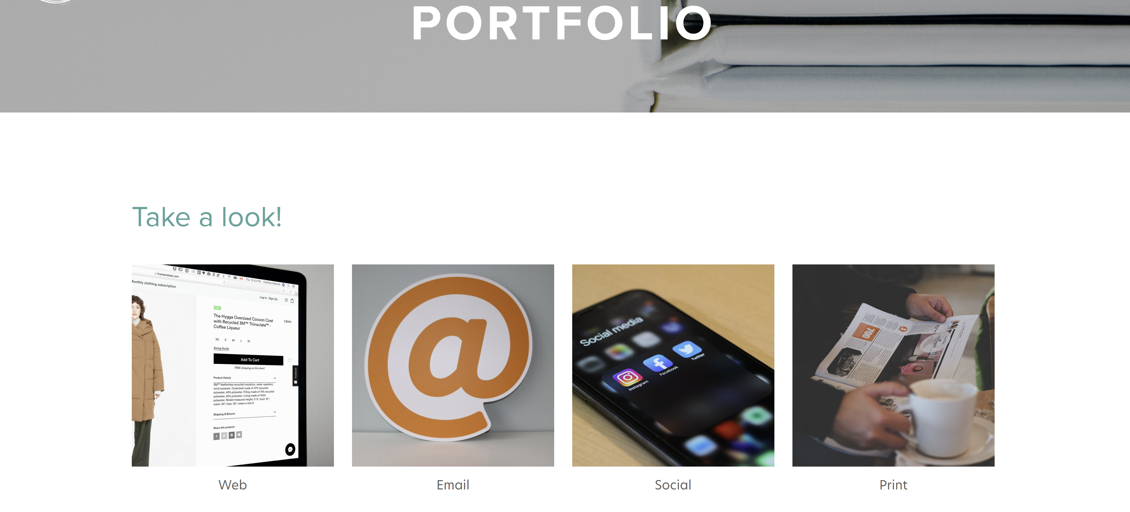
Of course, sometimes your portfolio is enough to show clients and employers what you're capable of. Tarn organized his portfolio in a simple way that shows he can provide web, email, social, and print copy. Clicking on each image will take the reader to his previous work.
 All of these copywriting portfolio examples are unique, but are all well organized, easy to navigate, and show a dash of personality while using complementary or neutral colors. Remember these points when putting together your own portfolio. Now, go out there and get that next big gig!
from Marketing https://blog.hubspot.com/marketing/copywriting-portfolio
If you're reading this blog, you've likely decided to start or revamp your copywriting portfolio. With so many portfolios out there, it's hard to figure out how to make yours stand out from the crowd.
What colors should you use? What kind of writing samples will show off your skills? Fortunately, I've put together a collection of copywriting portfolio examples that are sure to inspire you and guide you in the right direction.
Each copywriting portfolio example I've included is unique in terms of color, layout, and personality — highlighting the various ways you can approach putting a portfolio together and how it's okay to get creative with yours.
How to Create a Copywriting Portfolio
When creating your copywriting portfolio, avoid cramming in too many of your writing samples. You'll want to show off your diverse portfolio —that's understandable — but too many samples can overwhelm potential clients and employers.
Instead, opt for five or six writing samples that capture the different styles of writing you've done, such as technical, marketing, and business writing. Be sure to also include a balance of humorous and serious pieces, B2B and B2C writings, as well as short and long-form content.
If you have little-to-no writing samples, build your portfolio by starting a website or blog to showcase your writing skills, or contribute to other websites. You can also write for nonprofits or work internships.
Another method to build your portfolio is to write mock-copywriting samples based on local businesses. Just be sure to let employers or clients know they are mock-samples and that you weren't actually hired by those companies. The point isn't to deceive, but to show what you can do.
Copywriting Portfolio Examples
Now that you have a few of your best copywriting examples ready to upload, it's time to design your portfolio. You want a portfolio that stands out from the crowd, showcases your personality, highlights your skills, and is easy to navigate by potential employers.
To give you some inspiration, here are 25 examples of excellent copywriting portfolios broken down into the following categories:
- Homepage – The first page people see of your online portfolio and where you'll likely house your work samples
- About Me – Where you'll give readers an idea of who you are and what you do
- Services – What you can provide your clients
Each of these examples presents a different approach to copywriting portfolios that is sure to attract new opportunities.
Homepage
There are many different approaches to creating a homepage for your portfolio — however, it's best practice to ensure your homepage features your name, your contact information, and complementary colors. Most copywriters choose to feature their work directly on their homepage, but some find a way to link to their samples.
Here are several examples of outstanding homepage templates:
1. Carline Anglade-Cole
The homepage for Anglade-Cole's copywriting portfolio immediately establishes her as an expert in her field by bringing attention to the awards she's garnered throughout her career. The photo on her front page shows her at a speaking engagement with a confident smile, and the photo's caption clearly states her full name above "3X Award-Winning Direct-Response Copywriter, Author, and Consultant."
The badges for her awards are also displayed throughout, with the American Writers and Artists Institute badge placed in the middle next to the link to subscribe to her email list. Beneath her email list are badges from other accomplishments, including winning the bronze Nonfiction Book Award. If you're an award-winning copywriter, Anglade-Cole's page is a great example of how you can place your awards front and center to establish credibility.
 2. Gari Cruze
If you want your homepage to focus less on awards and more on who you've worked with, Cruze's homepage is an outstanding example. This homepage heavily features high-quality photos from the different campaigns he's worked on. Simply hover over each photo to see the name of the company or campaign, then click on the photo to see the copy he wrote and where it was published.


 If you're looking for a more straight-forward yet eye-catching approach to displaying your work, Cruze's example can lead you in the right direction.
3. Evan Benner
Benner takes a similar approach by using a mixture of high-quality photos and GIFs to display his work on his portfolio's homepage. However, Benner takes it a step further by including the year his work was published next to each photo. His homepage also includes a headshot and a small blurb about who he is and where he is based.
 Potential clients and employers can easily navigate his portfolio by scrolling down where they can see more links to his About page ("Meet Evan"), copy, and the projects he worked on.
 4. Jose Carlos Benítez
Copywriting portfolios don't have to be all work and no play, so don't be afraid to inject a little humor if you can. Benítez's personality and sense of humor are sprinkled throughout his portfolio's homepage.
Upon visiting his website, you're greeted with a black screen with white text that starts with "Hello there, human! Or robot!" and ends with "Scroll down to see the blood, sweat and tears." And for laughs, there's a random button that says "This is just a button." Spoiler Alert: The button doesn't do anything but I definitely laughed after I clicked on it and waited 30 seconds for something (nothing) to happen.
 Once you scroll down, you'll see a display of GIFs of the different campaigns Benítez has worked on over the years. Similar to Cruze and Brenner's portfolios, hovering over the GIFs will show the name of the company the campaign was for — and clicking on them will take you to his work.


 Featuring a bit of your personality throughout the portfolio will give potential clients and employers an idea of the kind of person they're working with — and their humor and vision might line up with yours.
5. Benji Shaw
If you want to include imagery in your portfolio, but prefer a more minimalist approach, then Shaw's portfolio will spark a few ideas. This portfolio features a black background with his name displayed in a large, easy-to-read font in the upper left corner. Two large images representing his work are featured in the foreground, and more of his work is shown by simply scrolling down. Like in previous examples, clicking the images will take you to another page that gives greater detail on the projects he's worked on.
 6. Aly J. Yale
Another excellent example for minimalists, Yale's portfolio doesn't rely on a ton of imagery. Instead her homepage is straightforward, simple, and only features her name in large black text against a white background —along with tabs in the upper right hand corner that lead to her bio, homepage, and contact page.
 If you scroll down Yale's homepage, you see the logos of the outlets that have published her work.
 Though I'd definitely suggest including a tab with links to your written work, this homepage shows that sometimes less is more and that you don't have to rely on bold images to have a strong portfolio.
7. Davina van Buren
The homepage for van Buren's portfolio is a great example for copywriters who are looking for a neat, organized way of promoting all of their talents, work, and social media in one place.

The content of the homepage is organized in a way that leads your eyes down the page. Its coordinated neutral colors are engaging without being too jarring. Also, notice how the tabs for the about page, portfolio, testimonials, contact information, and social media widgets are all neatly organized in a single row at the top.
This format is great if you're a copywriter who prefers a clean-cut, business professional portfolio.
8. Stephan Marsh
This portfolio is a great example if you're the kind of copywriter who wants to get straight to the point. With a tagline in big bold letters reading "Read less of what I say. See more of what I've done," Marsh makes it clear that he does not want to waste anyone's time. The top of his homepage even includes a self-contained PDF portfolio that can be downloaded immediately.
 This portfolio shows that even a person of few words can still find a way to make a bold first impression.
9. Jennifer Cheek
I love this homepage example because it shows how a copywriter can add their own personal touch to a portfolio template. What makes this portfolio stand out is its fun pink hues and the adorable yellow canary logo on the left side of the page. Once again, don't be afraid to show your personality on your portfolio's homepage, and that includes your quirky side.
 10. Anna Rogan
Rogan's homepage, like van Buran's, also leads your eye downward. As you scroll down you'll see more of her work samples, but what makes her page really interesting is that each sample comes with a corresponding color change. This makes for a fun, aesthetically pleasing scroll through her work.

 11. Kayla Dean
Dean's portfolio is called The Literary Co. and starts by letting visitors know she has a wealth of experience, having created copy for more than 100 clients. Her portfolio also has a blog-style setup where potential clients can scroll down and see all of her latest work, case studies, and the brands she has worked with.

 12. Dayarne Smith
Smith's website opens with a large image of a woman at a keyboard and features all of her relevant tabs at the top of the homepage. Once you scroll down, you'll see her portfolio with links to her work uniquely displayed in fun monitor illustrations.

 13. Sara Frandina
Frandina leaned into the writing theme by having her portfolio's homepage resemble notebook paper. She doubled down on the theme by crossing out a word in the tagline and "writing" in a new word.
 In addition to having standard information tabs at the top of the page, Frandina also included tabs linking to her past works separated by categories — customer research, email sequences, launch copy, long-form sales page, and website copy. These tabs can be found by scrolling down the homepage.
.jpg?width=3723&name=Sara%20Frandina%202%20(1).jpg)
About Me
This is where you showcase your personality and clearly define the expertise you bring as a copywriter. Notice that each example features a photo of the copywriter.
14. Kim Hobson
Figuring out what to say about yourself can be difficult. Where do you even start? Hobson found a way around that by breaking her About page into sections. In her introduction, she includes a photo of herself followed by a brief overview of what she does, where she is based, and how long she has been copywriting.
 Below her overview, she lists five quick facts about herself — some of which pertain to copywriting and others that cover her personal life. Then she has a section that breaks down her professional background.

 If you're not sure what to put in your About page, you can follow Hobson's formula by including a brief overview followed by a few fun facts and a breakdown of your career thus far.
15. Flourish Writing
Sarah, whose portfolio is called Flourish Writing, introduces herself using a funny anecdote about her first "published book" being written on craft paper and stored on her elementary school's shelf for years. This anecdote lets the reader know Sarah has had a passion for writing since she was a child and that passion can also produce excellent work.
Complete with a photo of Sarah with her adorable pup, this About page gives the reader a clear idea of who Sarah is when she isn't writing.
 16. Shanice Perriatt
Perriatt's About page is concise and well organized. Her opener clearly states her name and what she does: "I'm Shanice Perriatt – a digital marketer and content creator who blends the best of design and writing into compelling and engaging brand content."
Like Sarah, Perriatt also gives us insight into her life and hobbies – going to the gym, scrolling through Twitter, and going to the movies. Finally, the bio ends with Perriatt telling the reader the position she holds now.
The muted pastel background complements the green around headshot, making for a clean, informative page.
 17. Kayla Hollatz
Hollatz takes a different approach to her About page. First, it starts with a photo of Hollatz next to a brief statement detailing her objective.
 After scrolling down, visitors see an "About You" page instead of an "About Me" page. This is where Hollatz presents an issue many clients face.
 Finally, visitors can scroll further down to find an About Me page in which Hollatz presents herself as the answer to all of the potential client's problems.
 18. Andie Coupland
Coupland's About page shows that it is perfectly fine to veer away from personal details and to keep things strictly business. While we don't get insight into Coupland's life outside of writing, we do get a clear description of her experience and what she brings to the table as a copywriter. Note that she also includes a link to her LinkedIn for more information.
 19. Jacob McMillen
McMillen's About page establishes credibility by focusing on his accomplishments. He also puts his own spin on the writer's headshot by instead only showing half his face. It's a bold move but the gray coloring complements the muted blue and white banner, so it doesn't seem too out of place.
 20. James Schlesinger
Like Hollatz, Schlesinger uses his About page to present a problem potential clients could be facing, then he presents himself as the solution by explaining exactly what he can do for them. Then he ends his bio with a call to action, urging readers to contact him for his services.

 21. John Axtell
Are you looking for a punchy opener to grab the reader's attention? Why not try "I love high kicks!" Maybe avoid that exact phrase, since that's how Axtell decided to open his About page, but shouting a random fact about yourself is definitely a good start. Axtell took the opener a step further by including a photo of him doing a high kick.

If you decide to open with a fun fact, like Axtell, coupling that opener with a photo showing that fact can definitely show your personality and grab the attention of potential clients.
Services
Some copywriters opt to dedicate a separate page of their online portfolio to breaking down the specific services they provide. If you choose to do the same, here are a couple of examples you can reference:
22. Danielle Wallace
Wallace chose to separate her services into different clickable boxes that include icons and a mixture of script and typewriting fonts.
 23. Sandy Dang
Dang displays her services in a more horizontal format with texts on one side and a large corresponding photo on the other. Each section of her service page includes a button that gives the option to book.
 24. Jennifer Locke
Lock kept the format straightforward by simply stating what she can do for the client and including a button that allows potential clients to schedule a consultation. This could be a great method for copywriters who specialize in only one for two services.

 25. Stuart Tarn
Of course, sometimes your portfolio is enough to show clients and employers what you're capable of. Tarn organized his portfolio in a simple way that shows he can provide web, email, social, and print copy. Clicking on each image will take the reader to his previous work.
 All of these copywriting portfolio examples are unique, but are all well organized, easy to navigate, and show a dash of personality while using complementary or neutral colors. Remember these points when putting together your own portfolio. Now, go out there and get that next big gig!


No hay comentarios:
Publicar un comentario