When it comes to PowerPoint presentation design, there's no shortage of avenues you can take.
While all that choice — colors, formats, visuals, fonts — can feel liberating, it‘s important that you’re careful in your selection as not all design combinations add up to success.
In this blog post, I’m sharing some of my favorite PowerPoint tips and templates to help you nail your next presentation.
Table of Contents
- What makes a good PowerPoint presentation?
- PowerPoint Design Ideas
- Best PowerPoint Presentation Slides
- Good Examples of PowerPoint Presentation Design
What makes a good PowerPoint presentation?
In my opinion, a great PowerPoint presentation gets the point across succinctly while using a design that doesn't detract from it.
Here are some of the elements I like to keep in mind when I’m building my own.
1. Minimal Animations and Transitions
Believe it or not, animations and transitions can take away from your PowerPoint presentation. Why? Well, they distract from the content you worked so hard on.
A good PowerPoint presentation keeps the focus on your argument by keeping animations and transitions to a minimum. I suggest using them tastefully and sparingly to emphasize a point or bring attention to a certain part of an image.
2. Cohesive Color Palette
I like to refresh my memory on color theory when creating a new PowerPoint presentation.
A cohesive color palette uses complementary and analogous colors to draw the audience’s attention and help emphasize certain aspects at the right time.
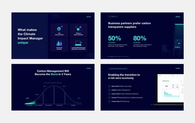
3. Contextualized Visuals
An image does speak more than words. And it’s been proven that the human brain is wired to process visuals much faster than words.
I take advantage of that by including graphs, photos, and illustrations to help me build upon my point.

Pro tip: When you include visuals, make sure you contextualize them by explaining verbally why the image is there. That way, you don’t risk confusing your audience.
PowerPoint Design Ideas
It‘s impossible for me to tell you the specific design ideas you should go after in your next PowerPoint, because, well, I don’t know what the goal of your presentation is.
Luckily, new versions of PowerPoint actually suggest ideas for you based on the content you're presenting. This can help you keep up with the latest trends in presentation design.
PowerPoint is filled with interesting boilerplate designs you can start with. To find these suggestions, open PowerPoint and click the “Design” tab in your top navigation bar. Then, on the far right side, you'll see the following choices:
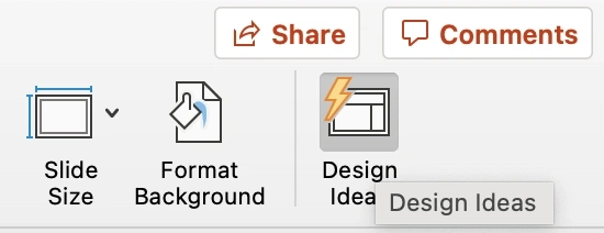
Click the “Design Ideas” option under this Design tab, as shown in the screenshot above. This icon will reveal a vertical list of interesting slide layouts based on what your slides already have on them.
Don't have any content on your slides yet? You can easily shuffle this vertical list of slide design ideas by clicking various themes inside the color carousel to the far left of the Design Ideas icon, as shown below:

As you browse and choose from the themes shown above, the Design Ideas pane to the right will interpret them and come up with layouts.
I’ve included some of my favorite ones below.
Atlas (Theme)
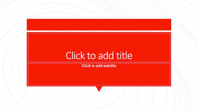
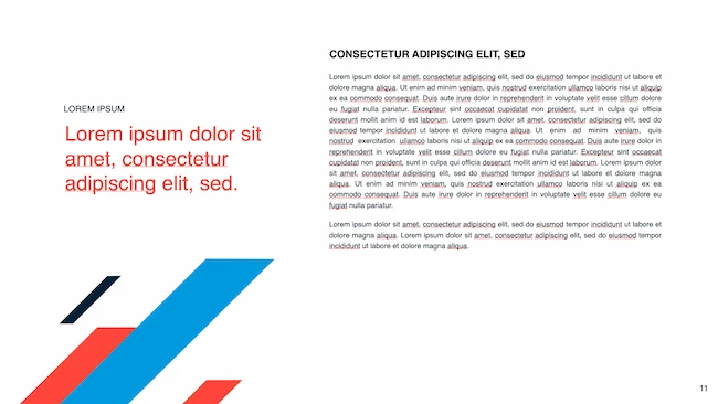
Covering a more creative subject for a younger or more energetic audience? I’d recommend using the cover slide design below. Its vibrant red color blocks and fun lines will appeal to your audience.
PowerPoint Ideas for This Theme:
- Use this simple theme to focus on key elements of your presentation.
- Customize the colors to match your brand or try contrasting colors for text and background for readability and visual appeal.
Madison (Theme)
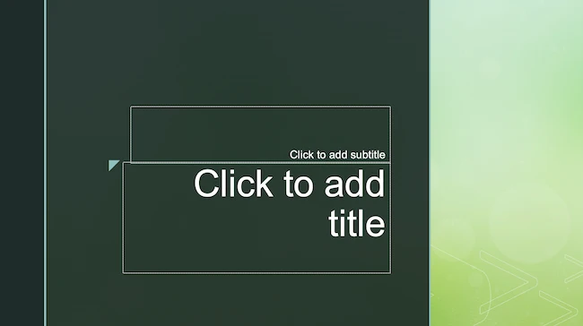
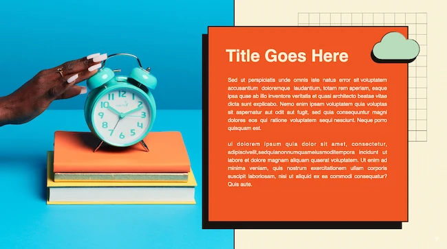
This design doesn't have the intensity of the first slide on this list. But I like how it has a simple structure that can make any PowerPoint presentation a good slideshow.
PowerPoint Ideas for This Theme:
- Add unique and on-brand fonts, textures, and borders to this theme for classic and cool presentations.
- Add an image collage or textured photograph to create distinct and consistent PowerPoints for your brand.
Parcel (Theme)
Parcel offers a variety of slide layouts with geometric shapes. Add these shapes to your slides to create interesting visual elements. I’ve used them for backgrounds, content, and decoration.
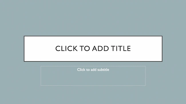
PowerPoint Ideas for This Theme:
- Add a color-blocked background for a fun but relaxing tone for your audience, or use color blocks to highlight sections of text.
- Experiment with this PowerPoint theme's contemporary fonts for cool slides that feel professional.
- Add a chart or graph to visualize data in your presentation.
Crop (Theme)
This is one of my favorite PowerPoint design ideas because it uses graphic elements such as lines and bars to give structure, contrast, and modern flair to your slides.
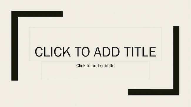
PowerPoint Ideas for This Theme:
- Make the most of this theme with high-quality images. Simple compositions with lots of negative space or bold focal points can help your slide's design pop.
- Use this theme‘s grid layout to create clean, organized layouts, even if design isn’t your strength.
Badge (Theme)
I’m particularly fond of this PowerPoint design style.
By using lines and contrasting elements — like a burst, as shown below — you add depth to your slides. This can help your content capture and hold your audience's attention more easily.
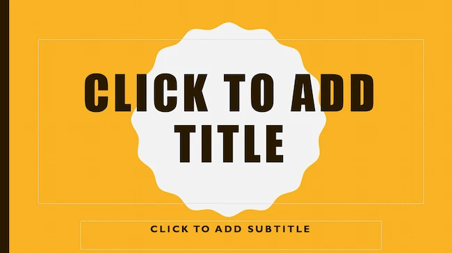
PowerPoint Ideas for This Theme:
- Add badges to highlight key points and sections, or to showcase achievements.
- Add original illustrations to your presentation's design. You might think you need to use professional illustrations for this. But adding quick doodles or sketches to this theme can help you create authentic and creative PowerPoint presentations.
If you're not loving my curated list of built-in PowerPoint design themes, no hard feelings. You can always download a free PowerPoint template and input your content onto pre-made slide styles.
Let’s take a look at the best ones you can download below.
Creative PowerPoint (Template)
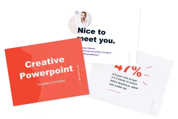
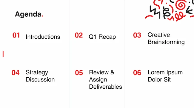
I like how this presentation template uses bright colors and plenty of white space to convey a modern but fun design. Organic shapes and geometric lines and patterns add an extra visual element (and personality) to the slides. Get it here.
Download These Templates for Free
Design Ideas for This Template:
- Create custom graphics or textures and layer them on top of this template's image layers to create beautiful slides for your brand. Be sure to use consistent styles and colors for a cohesive design.
- Get inspired by the clear visual hierarchy of this template as you customize it. Use font sizes, color, and graphics to highlight each section. This can help you make sure that important information stands out from supporting details.
Professional Style PowerPoint (Template)
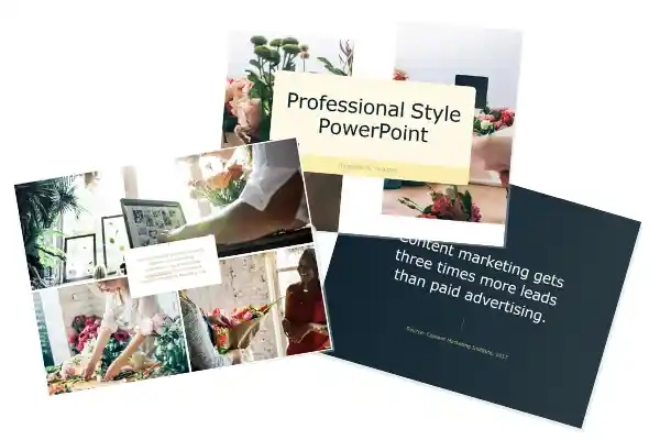
These PowerPoint slides use more neutral colors and fonts to create a calm and elegant vibe. It also highlights quality images to communicate key points which is great in my opinion. Get it here.
Download These Templates for Free
Design Ideas for This Template:
- This template works best with subtle pastels and muted colors. Try non-traditional color combos, like peach and mint green, for a unique PowerPoint presentation.
- Images and data visualizations will stand out in this template, so make sure you have excellent photos and illustrations to showcase.
Data PowerPoint (Template)
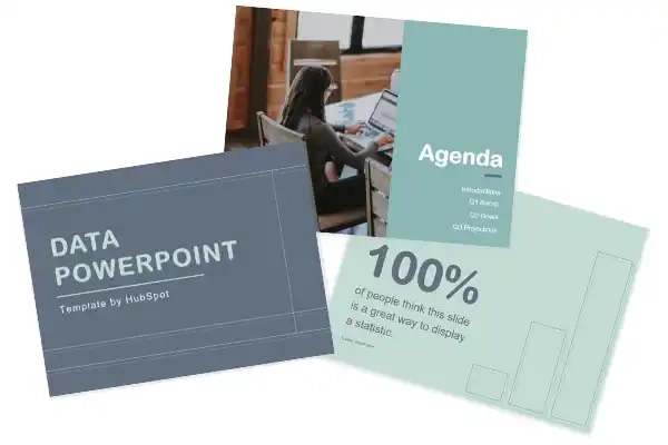
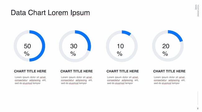
This template uses a rounded font to draw sharp contrast with the lines and graphs that will populate the presentation. If you want to offer engaging visuals with number-crunching content, I think the slide design ideas in this template are a great choice. Get it here.
Download These Templates for Free
Design Ideas for This Template:
- Try an on-brand duotone color scheme or use a dark background with this template to give your slides a simple but trendy look.
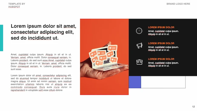
- Use the built-in icon library or import custom icons into your slides. You can use icons to represent important topics or concepts for easier skimming. This visual feature can also make your slides more exciting.
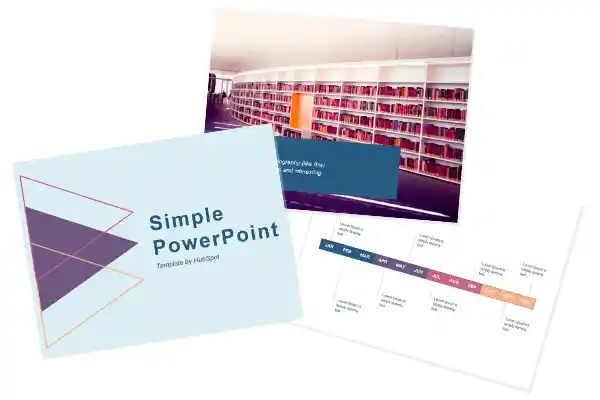
Simple PowerPoint (Template)
By pairing vibrant colors with pale ones, this PowerPoint gives an understated feel. I’d go with this one if you want to draw attention to your content while still being visually engaging. Get it here.
Download These Templates for Free
Design Ideas for This Template:
- Combine multiple images with vertical or horizontal formatting in this template for dynamic and beautiful slides.
- Play with contrasting typography styles. Try combining a bold heading font with a simple body font. This can help you draw attention to important information and make your PowerPoint design easy to read.
Want some inspo as you create your next presentation? Look no further — whether you're projecting your slides in person or sharing them online, I pulled together some examples that will help you impress your audience.
Business Presentation Slides
Business presentations can be intense. This set of PowerPoint slides could include a wide range of important information such as:
- Company history
- Mission and vision
- Business goals
- Market analysis
- Competitive landscape
- Growth strategies
So, business presentations can be overwhelming for an audience to consume. This makes great presentation design essential.
Download These Templates for Free
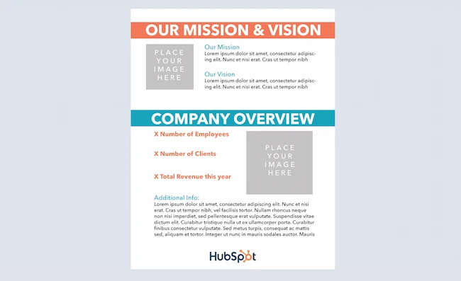
The Modern PowerPoint Template featured here is sleek and modern. But it's also fun and appealing, with a streamlined design that leaves a lasting impression.
Pro tip: I like to use headers to communicate top priorities in a business presentation. Then, you can use body copy and images to add details that will support and enhance your PowerPoint.
Business Plan Template
A well-crafted business plan is vital to any business, whether it's a startup, scale-up, or established company. A business plan can be just as complex as a business presentation, but it also needs to entice investors and partners.
Download These Templates for Free
I think this Retro PowerPoint Template is fun, interesting, and unique. It also has easy-to-read text and plenty of space for useful images and charts.
Company Profile Template
Like your business plan, your company profile is key to developing your business. But your company profile is more than a peek at your biz plan. It's a chance to highlight your team, culture and values, major clients, and your company history.
Download These Templates for Free
When done right, this presentation can show your competitive advantage and build trust for your brand. Download the company profile template featured above and five more great company profile templates today.
Marketing Plan Template
The right marketing plan presentation can decide whether your team will have the budget and resources it needs to meet your goals. That's why marketing plans need great presentation design.
After using a marketing plan template to write out your completed plan, use an eye-catching presentation template to share your ideas.
Download These Templates for Free
This Typographic PowerPoint Template will make it easy to use custom graphics and typography that will make your brand presentation shine.
Pro tip: Use different charts and graphs to highlight the data you used while making marketing plan decisions. This will reinforce the logic of your ideas while adding more visual interest.
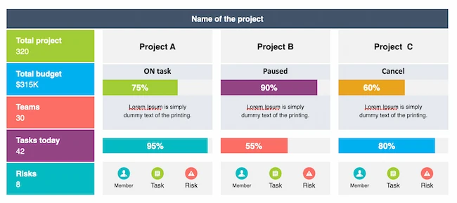
Project Status Report Template
Project status reports keep stakeholders informed about project milestones, timelines, risks, and budget. Try this template to add transparency, manage expectations, and stay proactive with your project presentations.
Annual Report Template
Annual reports offer a company's performance summary, achievements, finances, and more. This means that an organized layout is essential to showcase growth and wins for the year.
This presentation needs to be well-designed so that it inspires the trust and confidence of employees, shareholders, and members of the community.
Try this annual report template if you want to create a PDF or this template for PowerPoint.
Pro tip: Choose the right presentation software for your presentation. While most presentation design is created in PowerPoint or Keynote, sometimes it’s a good idea to try out new tools.
Product Launch Template
Product launch is an exciting time at any company. A great PowerPoint presentation for product release will include:
- Product features
- Benefits
- Target audience
- Pricing
- Marketing strategy
- Launch timeline
Besides generating excitement, this deck keeps stakeholders consistent and connected. To me, it's central to driving customer interest, engagement, and sales.
Download These Templates for Free
The Doodle Template is a great choice for product launch presentations with its range of slide features. It has lots of space for product images, as well as icons to represent stakeholders, teams, or product features.
Pro tip: Use the bright and cheery graphics in this template as is or replace them with sketches from your product creation process for a customized touch.
Visual Brand Identity Template
Consistency and visual appeal are crucial elements of building a strong brand identity.
Using a PowerPoint presentation template can help you clearly communicate the details that make your company's brand, logo, typography, colors, imagery, and design one of a kind.
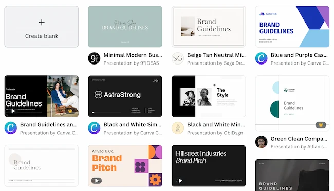
Start with this brand building guide to make sure you've nailed down the most important elements of your brand identity. Then, use one of these templates from Canva to develop your brand identity presentation.
Infographic Template
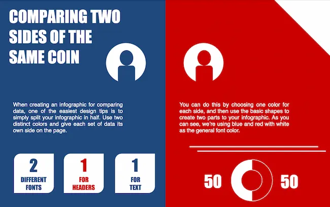
Infographics are a powerful way to present complex information or data in a visual way. Different types of information lend themselves to different presentation styles.
You can add these free PowerPoint templates for infographics to a larger slide presentation or use this format to create an infographic for other channels.
Pro tip: Add an infographic to a business or data presentation to add data insights and storytelling to your presentation slides. This will help make your PowerPoint presentation more memorable.
Financial Report Template
Concise financial reporting helps businesses review their financial performance for better decision-making. This presentation often includes confidential data such as revenue, profit, and cash flow.
Download These Templates for Free
The Abstract PowerPoint Template has slide designs for data comparison, quotes, and analysis. Its clean and simple design will make your financial report presentations look cool and professional.
Industry Trends Template
To stay ahead of the competition, you need the latest industry insights. And to keep that data engaging, you need great presentation design for trends.
Trends decks might include data on market research, competitive analysis, new technologies, or consumer behavior.
Download These Templates for Free
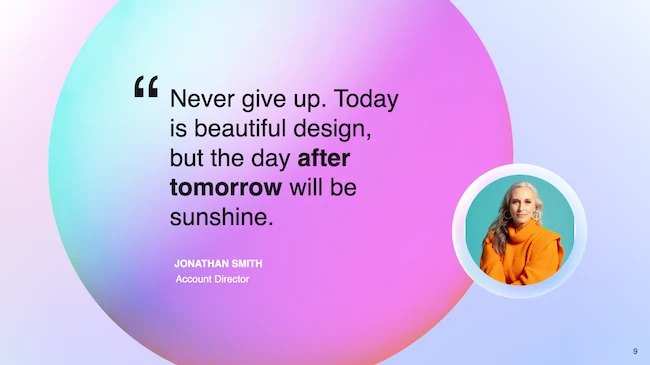
This 3D Gradient PowerPoint Template combines bold colors with fun shapes. To me, it's the perfect vehicle to highlight bright images, icons, and data on the latest trends.
Pro tip: New information can be tough to consume, so it's best to keep your copy short and easy to understand. Use images that tell a story to make the most of every section of your presentation.
Good Examples of PowerPoint Presentation Design
Here are 20 of my top sources of inspiration for PowerPoint presentation designs.
1. “The Search for Meaning in B2B Marketing,” Velocity Partners
We've said it once, and I'll say it again: I love this presentation from Velocity Partner's Co-Founder Doug Kessler. Not only is the content remarkable, but the design is also quite clever.
What I like: While each slide employs the same background visual, the copy in the notebook unfolds brilliantly through a series of colorful doodles and bold text. This gives the presentation a personal feel, which aligns with the self-reflective nature of the concept.
2. “You Don't Suck at PowerPoint,” Jesse Desjardins
If the contrast used throughout this PowerPoint presentation design were a human, I'd marry it.
This skillful presentation from Jesse Desjardins employs the perfect color palette: balancing black and white photos with pops of fluorescent pink, yellow, and blue.
What I like: The cheeky vintage photos work to reinforce the copy on each slide, making the presentation both interesting and visually appealing.
3. “Accelerating Innovation in Energy,” Accenture
Balancing visual backgrounds with text isn't easy. More often than not, the text is formatted in a way that winds up getting lost in the image. Not for Accenture.
What I like: This presentation combated this issue by combining shapes and graphics to create contrast between the text and the background. Well done.
4. “Visual Design with Data,” Seth Familian
Whenever I’m tasked with presenting a lot of information in a little bit of time, things can get sort of messy. To simplify this type of presentation, I like to use a visual agenda like the one shown above.
What I like: This index clearly signifies the start and finish of each section to make it easier for the viewer to follow along. The presenter takes it further by including an additional agenda for each exercise, so that the audience knows exactly what they're supposed to do.
5. “How to Craft Your Company's Storytelling Voice,” MarketingProfs
Do you love these hand-drawn illustrations or do you love these hand-drawn illustrations? I mean, c'mon, this presentation by MarketingProf is amazing.
What I like: Certainly, it would have been easier to generate these designs online, but this approach highlights their commitment to creating an out-of-the-box piece of content. And as a result, this presentation stands out in the best way possible.
6. “Blitzscaling: Book Trailer,” Reid Hoffman
If you're going to go the minimalistic route, I’d take note of this PowerPoint presentation example from Reid Hoffman.
This clean design adheres to a simple, consistent color scheme with clean graphics peppered throughout to make the slides more visually interesting.
What I like: Overall there are no frills or unnecessary additions, which allows the informative content to take priority.
7. “Healthcare Napkins,” Dan Roam
This presentation dates back to 2009, but the design is still as good as ever. The colorful, quirky doodles help tell the story while also serving as an interesting way to illustrate data (see slides 20 and 21).
What I like: For visual learners, this approach is much more inviting than a series of slides riddled with text-heavy bullet points.
8. “One Can Be Diverse: An Essay on Diversity,” With Company
This presentation employs both powerful images and modern typography to illustrate the point.
What I like: While many of the slides contain long quotes, they are broken up in a way that makes them easily digestible. Not to mention all of the text is crisp, clean, and concise.
9. "10 Things Your Audience Hates About Your Presentation," Stinson
This simplistic presentation example employs several different colors and font weights, but instead of coming off as disconnected, the varied colors work with one another to create contrast and call out specific concepts.
What I like: The big, bold numbers help set the reader's expectations, as they clearly signify how far along the viewer is in the list of tips.
10. “Pixar's 22 Rules to Phenomenal Storytelling,” Gavin McMahon
This presentation by Gavin McMahon features color in all the right places. While each of the background images boasts a bright, spotlight-like design, all the characters are intentionally blacked out.
What I like: This helps keep the focus on the tips, while still incorporating visuals. Not to mention, it's still easy for me to identify each character without the details. (I found you on slide eight, Nemo.)
11. “Facebook Engagement and Activity Report,” We Are Social
Here's another great example of data visualization in the wild.
What I like: Rather than displaying numbers and statistics straight up, this presentation calls upon interesting, colorful graphs, and charts to present the information in a way that just makes sense.
12. “The GaryVee Content Model,” Gary Vaynerchuk
This wouldn‘t be a true Gary Vaynerchuk presentation if it wasn’t a little loud, am I right?
What I like: Aside from the fact that I love the eye-catching, bright yellow background, Vaynerchuk does a great job of incorporating screenshots on each slide to create a visual tutorial that coincides with the tips. He also does a great job including a visual table of contents that shows your progress as you go .
13. “20 Tweetable Quotes to Inspire Marketing & Design Creative Genius,” IMPACT Branding & Design
We‘ve all seen our fair share of quote-chronicling presentations but that isn’t to say they were all done well. Often the background images are poor quality, the text is too small, or there isn't enough contrast.
Well, this professional presentation from IMPACT Branding & Design suffers from none of said challenges.
What I like: The colorful filters over each background image create just enough contrast for the quotes to stand out.
14. “The Great State of Design,” Stacy Kvernmo
This presentation offers up a lot of information in a way that doesn't feel overwhelming.
What I like: The contrasting colors create visual interest and “pop,” and the comic images (slides 6 through 12) are used to make the information seem less buttoned-up and overwhelming.
15. “Clickbait: A Guide To Writing Un-Ignorable Headlines,” Ethos3
Not going to lie, it was the title that convinced me to click through to this presentation but the awesome design kept me there once I arrived.
What I like: This simple design adheres to a consistent color pattern and leverages bullet points and varied fonts to break up the text nicely.
16. “Digital Transformation in 50 Soundbites,” Julie Dodd
This design highlights a great alternative to the “text-over-image” display we've grown used to seeing.
What I like: By leveraging a split-screen approach to each presentation slide, Julie Dodd was able to serve up a clean, legible quote without sacrificing the power of a strong visual.
17. “Fix Your Really Bad PowerPoint,” Slide Comet
When you‘re creating a PowerPoint about how everyone’s PowerPoints stink, yours had better be terrific. The one above, based on the ebook by Seth Godin, keeps it simple without boring its audience.
What I like: Its clever combinations of fonts, together with consistent color across each slide, ensure you're neither overwhelmed nor unengaged.
18. “How Google Works,” Eric Schmidt
Simple, clever doodles tell the story of Google in a fun and creative way. This presentation reads almost like a storybook, making it easy to move from one slide to the next.
What I like: This uncluttered approach provides viewers with an easy-to-understand explanation of a complicated topic.
19. “What Really Differentiates the Best Content Marketers From The Rest,” Ross Simmonds
Let‘s be honest: These graphics are hard not to love. I especially appreciate the author’s cartoonified self-portrait that closes out the presentation. Well played, Ross Simmonds.
What I like: Rather than employing the same old stock photos, this unique design serves as a refreshing way to present information that's both valuable and fun.
20. “Be A Great Product Leader,” Adam Nash
This presentation by Adam Nash immediately draws attention by putting the company's logo first — a great move if your company is well known.
What I like: He uses popular images, such as ones of Megatron and Pinocchio, to drive his points home. In the same way, you can take advantage of popular images and media to keep your audience engaged.
PowerPoint Presentation Examples for the Best Slide Presentation
Mastering a PowerPoint presentation begins with the design itself.
Get inspired by my ideas above to create a presentation that engages your audience, builds upon your point, and helps you generate leads for your brand.
Editor's note: This post was originally published in March 2013 and has been updated for comprehensiveness. This article was written by a human, but our team uses AI in our editorial process. Check out our full disclosure to learn more about how we use AI.
![Blog - Beautiful PowerPoint Presentation Template [List-Based]](https://no-cache.hubspot.com/cta/default/53/013286c0-2cc2-45f8-a6db-c71dad0835b8.png)
from Marketing https://blog.hubspot.com/blog/tabid/6307/bid/6012/17-examples-of-great-presentation-design.aspx
When it comes to PowerPoint presentation design, there's no shortage of avenues you can take.
While all that choice — colors, formats, visuals, fonts — can feel liberating, it‘s important that you’re careful in your selection as not all design combinations add up to success.
In this blog post, I’m sharing some of my favorite PowerPoint tips and templates to help you nail your next presentation.
Table of Contents
- What makes a good PowerPoint presentation?
- PowerPoint Design Ideas
- Best PowerPoint Presentation Slides
- Good Examples of PowerPoint Presentation Design
What makes a good PowerPoint presentation?
In my opinion, a great PowerPoint presentation gets the point across succinctly while using a design that doesn't detract from it.
Here are some of the elements I like to keep in mind when I’m building my own.
1. Minimal Animations and Transitions
Believe it or not, animations and transitions can take away from your PowerPoint presentation. Why? Well, they distract from the content you worked so hard on.
A good PowerPoint presentation keeps the focus on your argument by keeping animations and transitions to a minimum. I suggest using them tastefully and sparingly to emphasize a point or bring attention to a certain part of an image.
2. Cohesive Color Palette
I like to refresh my memory on color theory when creating a new PowerPoint presentation.
A cohesive color palette uses complementary and analogous colors to draw the audience’s attention and help emphasize certain aspects at the right time.

3. Contextualized Visuals
An image does speak more than words. And it’s been proven that the human brain is wired to process visuals much faster than words.
I take advantage of that by including graphs, photos, and illustrations to help me build upon my point.

Pro tip: When you include visuals, make sure you contextualize them by explaining verbally why the image is there. That way, you don’t risk confusing your audience.
PowerPoint Design Ideas
It‘s impossible for me to tell you the specific design ideas you should go after in your next PowerPoint, because, well, I don’t know what the goal of your presentation is.
Luckily, new versions of PowerPoint actually suggest ideas for you based on the content you're presenting. This can help you keep up with the latest trends in presentation design.
PowerPoint is filled with interesting boilerplate designs you can start with. To find these suggestions, open PowerPoint and click the “Design” tab in your top navigation bar. Then, on the far right side, you'll see the following choices:

Click the “Design Ideas” option under this Design tab, as shown in the screenshot above. This icon will reveal a vertical list of interesting slide layouts based on what your slides already have on them.
Don't have any content on your slides yet? You can easily shuffle this vertical list of slide design ideas by clicking various themes inside the color carousel to the far left of the Design Ideas icon, as shown below:

As you browse and choose from the themes shown above, the Design Ideas pane to the right will interpret them and come up with layouts.
I’ve included some of my favorite ones below.
Atlas (Theme)
Covering a more creative subject for a younger or more energetic audience? I’d recommend using the cover slide design below. Its vibrant red color blocks and fun lines will appeal to your audience.

PowerPoint Ideas for This Theme:
- Use this simple theme to focus on key elements of your presentation.
- Customize the colors to match your brand or try contrasting colors for text and background for readability and visual appeal.
Madison (Theme)
This design doesn't have the intensity of the first slide on this list. But I like how it has a simple structure that can make any PowerPoint presentation a good slideshow.

PowerPoint Ideas for This Theme:
- Add unique and on-brand fonts, textures, and borders to this theme for classic and cool presentations.
- Add an image collage or textured photograph to create distinct and consistent PowerPoints for your brand.
Parcel (Theme)
Parcel offers a variety of slide layouts with geometric shapes. Add these shapes to your slides to create interesting visual elements. I’ve used them for backgrounds, content, and decoration.

PowerPoint Ideas for This Theme:
- Add a color-blocked background for a fun but relaxing tone for your audience, or use color blocks to highlight sections of text.
- Experiment with this PowerPoint theme's contemporary fonts for cool slides that feel professional.
- Add a chart or graph to visualize data in your presentation.
Crop (Theme)
This is one of my favorite PowerPoint design ideas because it uses graphic elements such as lines and bars to give structure, contrast, and modern flair to your slides.

PowerPoint Ideas for This Theme:
- Make the most of this theme with high-quality images. Simple compositions with lots of negative space or bold focal points can help your slide's design pop.
- Use this theme‘s grid layout to create clean, organized layouts, even if design isn’t your strength.
Badge (Theme)
I’m particularly fond of this PowerPoint design style.
By using lines and contrasting elements — like a burst, as shown below — you add depth to your slides. This can help your content capture and hold your audience's attention more easily.

PowerPoint Ideas for This Theme:
- Add badges to highlight key points and sections, or to showcase achievements.
- Add original illustrations to your presentation's design. You might think you need to use professional illustrations for this. But adding quick doodles or sketches to this theme can help you create authentic and creative PowerPoint presentations.
If you're not loving my curated list of built-in PowerPoint design themes, no hard feelings. You can always download a free PowerPoint template and input your content onto pre-made slide styles.
Let’s take a look at the best ones you can download below.
Creative PowerPoint (Template)
I like how this presentation template uses bright colors and plenty of white space to convey a modern but fun design. Organic shapes and geometric lines and patterns add an extra visual element (and personality) to the slides. Get it here.
Download These Templates for Free
Design Ideas for This Template:
- Create custom graphics or textures and layer them on top of this template's image layers to create beautiful slides for your brand. Be sure to use consistent styles and colors for a cohesive design.
- Get inspired by the clear visual hierarchy of this template as you customize it. Use font sizes, color, and graphics to highlight each section. This can help you make sure that important information stands out from supporting details.
Professional Style PowerPoint (Template)
These PowerPoint slides use more neutral colors and fonts to create a calm and elegant vibe. It also highlights quality images to communicate key points which is great in my opinion. Get it here.
Download These Templates for Free
Design Ideas for This Template:
- This template works best with subtle pastels and muted colors. Try non-traditional color combos, like peach and mint green, for a unique PowerPoint presentation.
- Images and data visualizations will stand out in this template, so make sure you have excellent photos and illustrations to showcase.
Data PowerPoint (Template)
This template uses a rounded font to draw sharp contrast with the lines and graphs that will populate the presentation. If you want to offer engaging visuals with number-crunching content, I think the slide design ideas in this template are a great choice. Get it here.
Download These Templates for Free
Design Ideas for This Template:
- Try an on-brand duotone color scheme or use a dark background with this template to give your slides a simple but trendy look.
- Use the built-in icon library or import custom icons into your slides. You can use icons to represent important topics or concepts for easier skimming. This visual feature can also make your slides more exciting.
Simple PowerPoint (Template)
By pairing vibrant colors with pale ones, this PowerPoint gives an understated feel. I’d go with this one if you want to draw attention to your content while still being visually engaging. Get it here.
Download These Templates for Free
Design Ideas for This Template:
- Combine multiple images with vertical or horizontal formatting in this template for dynamic and beautiful slides.
- Play with contrasting typography styles. Try combining a bold heading font with a simple body font. This can help you draw attention to important information and make your PowerPoint design easy to read.
Want some inspo as you create your next presentation? Look no further — whether you're projecting your slides in person or sharing them online, I pulled together some examples that will help you impress your audience.
Business Presentation Slides
Business presentations can be intense. This set of PowerPoint slides could include a wide range of important information such as:
- Company history
- Mission and vision
- Business goals
- Market analysis
- Competitive landscape
- Growth strategies
So, business presentations can be overwhelming for an audience to consume. This makes great presentation design essential.
Download These Templates for Free
The Modern PowerPoint Template featured here is sleek and modern. But it's also fun and appealing, with a streamlined design that leaves a lasting impression.
Pro tip: I like to use headers to communicate top priorities in a business presentation. Then, you can use body copy and images to add details that will support and enhance your PowerPoint.
Business Plan Template
A well-crafted business plan is vital to any business, whether it's a startup, scale-up, or established company. A business plan can be just as complex as a business presentation, but it also needs to entice investors and partners.
Download These Templates for Free
I think this Retro PowerPoint Template is fun, interesting, and unique. It also has easy-to-read text and plenty of space for useful images and charts.
Company Profile Template
Like your business plan, your company profile is key to developing your business. But your company profile is more than a peek at your biz plan. It's a chance to highlight your team, culture and values, major clients, and your company history.
Download These Templates for Free
When done right, this presentation can show your competitive advantage and build trust for your brand. Download the company profile template featured above and five more great company profile templates today.
Marketing Plan Template
The right marketing plan presentation can decide whether your team will have the budget and resources it needs to meet your goals. That's why marketing plans need great presentation design.
After using a marketing plan template to write out your completed plan, use an eye-catching presentation template to share your ideas.
Download These Templates for Free
This Typographic PowerPoint Template will make it easy to use custom graphics and typography that will make your brand presentation shine.
Pro tip: Use different charts and graphs to highlight the data you used while making marketing plan decisions. This will reinforce the logic of your ideas while adding more visual interest.
Project Status Report Template
Project status reports keep stakeholders informed about project milestones, timelines, risks, and budget. Try this template to add transparency, manage expectations, and stay proactive with your project presentations.

Annual Report Template
Annual reports offer a company's performance summary, achievements, finances, and more. This means that an organized layout is essential to showcase growth and wins for the year.
This presentation needs to be well-designed so that it inspires the trust and confidence of employees, shareholders, and members of the community.
Try this annual report template if you want to create a PDF or this template for PowerPoint.
Pro tip: Choose the right presentation software for your presentation. While most presentation design is created in PowerPoint or Keynote, sometimes it’s a good idea to try out new tools.
Product Launch Template
Product launch is an exciting time at any company. A great PowerPoint presentation for product release will include:
- Product features
- Benefits
- Target audience
- Pricing
- Marketing strategy
- Launch timeline
Besides generating excitement, this deck keeps stakeholders consistent and connected. To me, it's central to driving customer interest, engagement, and sales.
Download These Templates for Free
The Doodle Template is a great choice for product launch presentations with its range of slide features. It has lots of space for product images, as well as icons to represent stakeholders, teams, or product features.
Pro tip: Use the bright and cheery graphics in this template as is or replace them with sketches from your product creation process for a customized touch.
Visual Brand Identity Template
Consistency and visual appeal are crucial elements of building a strong brand identity.
Using a PowerPoint presentation template can help you clearly communicate the details that make your company's brand, logo, typography, colors, imagery, and design one of a kind.

Start with this brand building guide to make sure you've nailed down the most important elements of your brand identity. Then, use one of these templates from Canva to develop your brand identity presentation.
Infographic Template
Infographics are a powerful way to present complex information or data in a visual way. Different types of information lend themselves to different presentation styles.
You can add these free PowerPoint templates for infographics to a larger slide presentation or use this format to create an infographic for other channels.
Pro tip: Add an infographic to a business or data presentation to add data insights and storytelling to your presentation slides. This will help make your PowerPoint presentation more memorable.
Financial Report Template
Concise financial reporting helps businesses review their financial performance for better decision-making. This presentation often includes confidential data such as revenue, profit, and cash flow.
Download These Templates for Free
The Abstract PowerPoint Template has slide designs for data comparison, quotes, and analysis. Its clean and simple design will make your financial report presentations look cool and professional.
Industry Trends Template
To stay ahead of the competition, you need the latest industry insights. And to keep that data engaging, you need great presentation design for trends.
Trends decks might include data on market research, competitive analysis, new technologies, or consumer behavior.
Download These Templates for Free
This 3D Gradient PowerPoint Template combines bold colors with fun shapes. To me, it's the perfect vehicle to highlight bright images, icons, and data on the latest trends.
Pro tip: New information can be tough to consume, so it's best to keep your copy short and easy to understand. Use images that tell a story to make the most of every section of your presentation.
Good Examples of PowerPoint Presentation Design
Here are 20 of my top sources of inspiration for PowerPoint presentation designs.
1. “The Search for Meaning in B2B Marketing,” Velocity Partners
We've said it once, and I'll say it again: I love this presentation from Velocity Partner's Co-Founder Doug Kessler. Not only is the content remarkable, but the design is also quite clever.
What I like: While each slide employs the same background visual, the copy in the notebook unfolds brilliantly through a series of colorful doodles and bold text. This gives the presentation a personal feel, which aligns with the self-reflective nature of the concept.
2. “You Don't Suck at PowerPoint,” Jesse Desjardins
If the contrast used throughout this PowerPoint presentation design were a human, I'd marry it.
This skillful presentation from Jesse Desjardins employs the perfect color palette: balancing black and white photos with pops of fluorescent pink, yellow, and blue.
What I like: The cheeky vintage photos work to reinforce the copy on each slide, making the presentation both interesting and visually appealing.
3. “Accelerating Innovation in Energy,” Accenture
Balancing visual backgrounds with text isn't easy. More often than not, the text is formatted in a way that winds up getting lost in the image. Not for Accenture.
What I like: This presentation combated this issue by combining shapes and graphics to create contrast between the text and the background. Well done.
4. “Visual Design with Data,” Seth Familian
Whenever I’m tasked with presenting a lot of information in a little bit of time, things can get sort of messy. To simplify this type of presentation, I like to use a visual agenda like the one shown above.
What I like: This index clearly signifies the start and finish of each section to make it easier for the viewer to follow along. The presenter takes it further by including an additional agenda for each exercise, so that the audience knows exactly what they're supposed to do.
5. “How to Craft Your Company's Storytelling Voice,” MarketingProfs
Do you love these hand-drawn illustrations or do you love these hand-drawn illustrations? I mean, c'mon, this presentation by MarketingProf is amazing.
What I like: Certainly, it would have been easier to generate these designs online, but this approach highlights their commitment to creating an out-of-the-box piece of content. And as a result, this presentation stands out in the best way possible.
6. “Blitzscaling: Book Trailer,” Reid Hoffman
If you're going to go the minimalistic route, I’d take note of this PowerPoint presentation example from Reid Hoffman.
This clean design adheres to a simple, consistent color scheme with clean graphics peppered throughout to make the slides more visually interesting.
What I like: Overall there are no frills or unnecessary additions, which allows the informative content to take priority.
7. “Healthcare Napkins,” Dan Roam
This presentation dates back to 2009, but the design is still as good as ever. The colorful, quirky doodles help tell the story while also serving as an interesting way to illustrate data (see slides 20 and 21).
What I like: For visual learners, this approach is much more inviting than a series of slides riddled with text-heavy bullet points.
8. “One Can Be Diverse: An Essay on Diversity,” With Company
This presentation employs both powerful images and modern typography to illustrate the point.
What I like: While many of the slides contain long quotes, they are broken up in a way that makes them easily digestible. Not to mention all of the text is crisp, clean, and concise.
9. "10 Things Your Audience Hates About Your Presentation," Stinson
This simplistic presentation example employs several different colors and font weights, but instead of coming off as disconnected, the varied colors work with one another to create contrast and call out specific concepts.
What I like: The big, bold numbers help set the reader's expectations, as they clearly signify how far along the viewer is in the list of tips.
10. “Pixar's 22 Rules to Phenomenal Storytelling,” Gavin McMahon
This presentation by Gavin McMahon features color in all the right places. While each of the background images boasts a bright, spotlight-like design, all the characters are intentionally blacked out.
What I like: This helps keep the focus on the tips, while still incorporating visuals. Not to mention, it's still easy for me to identify each character without the details. (I found you on slide eight, Nemo.)
11. “Facebook Engagement and Activity Report,” We Are Social
Here's another great example of data visualization in the wild.
What I like: Rather than displaying numbers and statistics straight up, this presentation calls upon interesting, colorful graphs, and charts to present the information in a way that just makes sense.
12. “The GaryVee Content Model,” Gary Vaynerchuk
This wouldn‘t be a true Gary Vaynerchuk presentation if it wasn’t a little loud, am I right?
What I like: Aside from the fact that I love the eye-catching, bright yellow background, Vaynerchuk does a great job of incorporating screenshots on each slide to create a visual tutorial that coincides with the tips. He also does a great job including a visual table of contents that shows your progress as you go .
13. “20 Tweetable Quotes to Inspire Marketing & Design Creative Genius,” IMPACT Branding & Design
We‘ve all seen our fair share of quote-chronicling presentations but that isn’t to say they were all done well. Often the background images are poor quality, the text is too small, or there isn't enough contrast.
Well, this professional presentation from IMPACT Branding & Design suffers from none of said challenges.
What I like: The colorful filters over each background image create just enough contrast for the quotes to stand out.
14. “The Great State of Design,” Stacy Kvernmo
This presentation offers up a lot of information in a way that doesn't feel overwhelming.
What I like: The contrasting colors create visual interest and “pop,” and the comic images (slides 6 through 12) are used to make the information seem less buttoned-up and overwhelming.
15. “Clickbait: A Guide To Writing Un-Ignorable Headlines,” Ethos3
Not going to lie, it was the title that convinced me to click through to this presentation but the awesome design kept me there once I arrived.
What I like: This simple design adheres to a consistent color pattern and leverages bullet points and varied fonts to break up the text nicely.
16. “Digital Transformation in 50 Soundbites,” Julie Dodd
This design highlights a great alternative to the “text-over-image” display we've grown used to seeing.
What I like: By leveraging a split-screen approach to each presentation slide, Julie Dodd was able to serve up a clean, legible quote without sacrificing the power of a strong visual.
17. “Fix Your Really Bad PowerPoint,” Slide Comet
When you‘re creating a PowerPoint about how everyone’s PowerPoints stink, yours had better be terrific. The one above, based on the ebook by Seth Godin, keeps it simple without boring its audience.
What I like: Its clever combinations of fonts, together with consistent color across each slide, ensure you're neither overwhelmed nor unengaged.
18. “How Google Works,” Eric Schmidt
Simple, clever doodles tell the story of Google in a fun and creative way. This presentation reads almost like a storybook, making it easy to move from one slide to the next.
What I like: This uncluttered approach provides viewers with an easy-to-understand explanation of a complicated topic.
19. “What Really Differentiates the Best Content Marketers From The Rest,” Ross Simmonds
Let‘s be honest: These graphics are hard not to love. I especially appreciate the author’s cartoonified self-portrait that closes out the presentation. Well played, Ross Simmonds.
What I like: Rather than employing the same old stock photos, this unique design serves as a refreshing way to present information that's both valuable and fun.
20. “Be A Great Product Leader,” Adam Nash
This presentation by Adam Nash immediately draws attention by putting the company's logo first — a great move if your company is well known.
What I like: He uses popular images, such as ones of Megatron and Pinocchio, to drive his points home. In the same way, you can take advantage of popular images and media to keep your audience engaged.
PowerPoint Presentation Examples for the Best Slide Presentation
Mastering a PowerPoint presentation begins with the design itself.
Get inspired by my ideas above to create a presentation that engages your audience, builds upon your point, and helps you generate leads for your brand.
Editor's note: This post was originally published in March 2013 and has been updated for comprehensiveness. This article was written by a human, but our team uses AI in our editorial process. Check out our full disclosure to learn more about how we use AI.
![Blog - Beautiful PowerPoint Presentation Template [List-Based]](https://no-cache.hubspot.com/cta/default/53/013286c0-2cc2-45f8-a6db-c71dad0835b8.png)
![→ Free Download: 10 PowerPoint Presentation Templates [Access Now]](https://no-cache.hubspot.com/cta/default/53/2d0b5298-2daa-4812-b2d4-fa65cd354a8e.png)

No hay comentarios:
Publicar un comentario