A while ago (as in 13 years ago) we created the first Website Grader. The goal was simple: help anyone with a website evaluate its effectiveness at attracting an audience of interested and relevant buyers.
We founded HubSpot in 2006 and created Website Grader in 2008 because we believed that the inbound methodology — building meaningful, lasting relationships with prospects and customers — was not only a more effective way to grow a business, it was the right way to grow a business. And we knew how important it was for people to leverage their websites to attract visitors and connect with customers to grow.
Fast forward to 2021, and websites do a whole lot more than attract visitors.
Your website is a sales rep, providing prospects with the features and pricing of your offering. And helping them book a meeting to learn more.
Your website is part of your customer service team, answering questions about your products and services through a knowledge base or chatbot.
Your website is a member of your HR team, sharing information about your company culture and open positions.
The list goes on...
To put it bluntly: your website is really freaking important! Today, 86% of people will find your business online. Your website is your first impression, your primary spokesperson, your around-the-clock inbound sales team — you get my point. It’s one of the most important assets to your business.
It’s no wonder we see businesses invest so much in their websites. In a recent HubSpot Research study, 63% of marketers indicated that they were going to upgrade their website this year.
Website upgrades can include:
- Performance: Page speed, load time, page requests, page size, and more
- Search Engine Optimization (SEO): Page index, meta descriptions, content plugins, and descriptive link text
- Design: Responsive design, legible font size, and tap targets
- Security: HTTPS and secure javascript libraries
Since 2008, we’ve graded over 1 million unique websites on the above four factors. With all this investment, are they actually getting better? Are businesses focusing on the right website upgrades? For example, are websites providing better security for their visitors. Are they offering faster load speeds for quick access? What about mobile accessibility and SEO best practices?
Let’s take a look at average performance in 2015 compared to this year to see what’s changed.
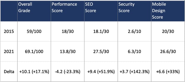
Website Performance Data (2015 vs 2021)

What surprises me the most about this data is that the improvements in technology over the past five years haven’t led to the same improvement in website performance. The overall grade average has only improved 17.1% in little over five years, and performance has actually decreased by 23.3%. The average website grade in 2020 is a D+ (69.1 out of 100). My mother wouldn’t be happy if I came home with that kind of grade.
We also found that only 3.8% of websites have an overall score of 90 or more. If your website scores above a 90, pat yourself on the back. Here are the percentile ranges from our data:
- 80 overall score: 82nd percentile
- 85 overall score: 91st percentile
- 90 overall score: 96th percentile
Here are some observations of the individual benchmark scores:
Website performance has decreased in the past half-decade.
Websites should load faster in 2021 than they did in 2015 — but the exact opposite is true. Performance was the only benchmark metric that decreased in five years. This includes testing for page size, page requests, page speed, and five additional tests that offer a holistic performance grading.
The result? Websites are slower today than they were in 2015.
This is a risk for businesses: the longer visitors wait for your page to load, the more likely they’ll leave your page.
For every second that your website takes to load, people are leaving your business. Good performance should be a priority when improving your website. How does your website’s performance compare?
Search engine optimization is the biggest winner.
In a 2020 survey, we found that 64% of marketers are actively investing in search engine optimization (SEO) and growing their organic presence.
Marketers care about SEO, and this has led to significant progress in the SEO benchmark since 2015 — a 51.9% improvement. Search engine optimization is essential to getting discovered online. It’s good that so many websites are following SEO best practices to improve the discovery of their business. How does your SEO compare?
Security had the second-biggest gain, but the total average falls short.
Our security benchmark shows that websites have improved their security by 142.3% over five years. This is a huge gain but there’s still a lot of room for improvement — the 2021 average score is only 6.3 out of 10.
Security is essential to have on your site to protect customer data. If your website isn’t secure, your visitors might lose trust in your business, especially when shopping on your site. We found that 85% of people won’t visit a site if it’s not secure.
Additionally, security improves discoverability. Starting in 2019, Google prioritized displaying websites with HTTPS in search results. Website Grader checks that your website uses HTTPS and has secure JavaScript libraries.
These two security factors are critical for delivering a secure experience for your visitors. How does your website security compare?
Mobile optimized websites improved marginally.
In the mid-2010s, it felt like every website was going responsive — that is, investing in mobile-first website design. It made sense.
Everywhere I looked, people were heads down on their phones, reading the latest Facebook post or watching a viral YouTube video. And, things haven’t changed much. Well, they have, but now people are scrolling through Instagram or browsing the latest TikTok dance challenge.
Responsiveness wasn’t just a trend — in the first quarter of 2021, mobile devices (excluding tablets) generated 54.8% of global website traffic. So how do websites stack up on small screens?
We found that our mobile design benchmark average improved by 8% over five years. Today, average websites score 21.6 out of 30 on mobile design. A great improvement, though I’d love to see that number go up even more.
Instagram, for example, is a website that does exceptionally well in how they design and optimize users’ mobile experience. It has a seamless mobile shopping feature for businesses to sell products directly through its mobile website or in-app.

One study by Google found that 59% of shoppers surveyed said that shopping on mobile is important when deciding which brand or retailer to buy from.
That’s a huge portion of people looking at your website on mobile and making a decision of whether or not to buy from you. Mobile design will not only impact the experience that people have with your site, but also influences social media posts and your rankings in search engines.
Check your mobile design score on Website Grader.
Where do we go from here?
Our goal with the original Website Grader was to help anyone with a website —developer, marketer, or entrepreneur — to quickly grade their website’s performance. We’ve received good feedback from our users, but we are always growing and evolving.
So we asked ourselves, how could we make Website Grader better?
Our users’ comments had a common thread. They graded their site. They saw where their websites fell short. But we stopped short of teaching them how to improve:
- "More information about how to solve website problems"
- "Instructions on how to get better performance and SEO to get our score higher"
- "How about putting explanations and guidelines for beginners?"
Introducing the New Website Grader
You talked. We listened. Not only have we updated Website Grader’s grading system and foundational technology to get you a more accurate score, but we’ve also created a five-lesson video course that helps you improve your grade. All for free.
You can find the Website Optimization course inside Website Grader starting today.
One last question: How did HubSpot.com score?
HubSpot’s score has not historically been the best. At one point, we averaged 70-80 on Website Grader. Years of marketing updates had slowed things down over time.
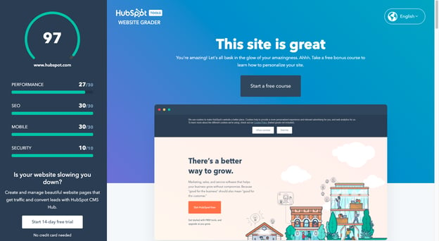
Since then, we’ve worked hard to improve HubSpot.com’s design and performance over the last five years for our visitors and customers. Powered by HubSpot CMS Hub, our website now scores a 97 out of 100 on Website Grader — no kidding. It’s something we're extremely proud of.

Your website is one of your most important assets in attracting business. A bad user experience could lose customer interest, but that doesn’t have to happen if you take the necessary steps to optimize it. If you’re curious to see how your site measures up, run it through our Website Grader and find out how you can make your site more delightful.
Editor’s note: This post was originally published in June 2020 and has been updated for comprehensiveness.
from Marketing https://blog.hubspot.com/marketing/website-grader
A while ago (as in 13 years ago) we created the first Website Grader. The goal was simple: help anyone with a website evaluate its effectiveness at attracting an audience of interested and relevant buyers.
We founded HubSpot in 2006 and created Website Grader in 2008 because we believed that the inbound methodology — building meaningful, lasting relationships with prospects and customers — was not only a more effective way to grow a business, it was the right way to grow a business. And we knew how important it was for people to leverage their websites to attract visitors and connect with customers to grow.
Fast forward to 2021, and websites do a whole lot more than attract visitors.
Your website is a sales rep, providing prospects with the features and pricing of your offering. And helping them book a meeting to learn more.
Your website is part of your customer service team, answering questions about your products and services through a knowledge base or chatbot.
Your website is a member of your HR team, sharing information about your company culture and open positions.
The list goes on...
To put it bluntly: your website is really freaking important! Today, 86% of people will find your business online. Your website is your first impression, your primary spokesperson, your around-the-clock inbound sales team — you get my point. It’s one of the most important assets to your business.
It’s no wonder we see businesses invest so much in their websites. In a recent HubSpot Research study, 63% of marketers indicated that they were going to upgrade their website this year.
Website upgrades can include:
- Performance: Page speed, load time, page requests, page size, and more
- Search Engine Optimization (SEO): Page index, meta descriptions, content plugins, and descriptive link text
- Design: Responsive design, legible font size, and tap targets
- Security: HTTPS and secure javascript libraries
Since 2008, we’ve graded over 1 million unique websites on the above four factors. With all this investment, are they actually getting better? Are businesses focusing on the right website upgrades? For example, are websites providing better security for their visitors. Are they offering faster load speeds for quick access? What about mobile accessibility and SEO best practices?
Let’s take a look at average performance in 2015 compared to this year to see what’s changed.
Website Performance Data (2015 vs 2021)

What surprises me the most about this data is that the improvements in technology over the past five years haven’t led to the same improvement in website performance. The overall grade average has only improved 17.1% in little over five years, and performance has actually decreased by 23.3%. The average website grade in 2020 is a D+ (69.1 out of 100). My mother wouldn’t be happy if I came home with that kind of grade.
We also found that only 3.8% of websites have an overall score of 90 or more. If your website scores above a 90, pat yourself on the back. Here are the percentile ranges from our data:
- 80 overall score: 82nd percentile
- 85 overall score: 91st percentile
- 90 overall score: 96th percentile
Here are some observations of the individual benchmark scores:
Website performance has decreased in the past half-decade.
Websites should load faster in 2021 than they did in 2015 — but the exact opposite is true. Performance was the only benchmark metric that decreased in five years. This includes testing for page size, page requests, page speed, and five additional tests that offer a holistic performance grading.
The result? Websites are slower today than they were in 2015.
This is a risk for businesses: the longer visitors wait for your page to load, the more likely they’ll leave your page.
For every second that your website takes to load, people are leaving your business. Good performance should be a priority when improving your website. How does your website’s performance compare?
Search engine optimization is the biggest winner.
In a 2020 survey, we found that 64% of marketers are actively investing in search engine optimization (SEO) and growing their organic presence.
Marketers care about SEO, and this has led to significant progress in the SEO benchmark since 2015 — a 51.9% improvement. Search engine optimization is essential to getting discovered online. It’s good that so many websites are following SEO best practices to improve the discovery of their business. How does your SEO compare?
Security had the second-biggest gain, but the total average falls short.
Our security benchmark shows that websites have improved their security by 142.3% over five years. This is a huge gain but there’s still a lot of room for improvement — the 2021 average score is only 6.3 out of 10.
Security is essential to have on your site to protect customer data. If your website isn’t secure, your visitors might lose trust in your business, especially when shopping on your site. We found that 85% of people won’t visit a site if it’s not secure.
Additionally, security improves discoverability. Starting in 2019, Google prioritized displaying websites with HTTPS in search results. Website Grader checks that your website uses HTTPS and has secure JavaScript libraries.
These two security factors are critical for delivering a secure experience for your visitors. How does your website security compare?
Mobile optimized websites improved marginally.
In the mid-2010s, it felt like every website was going responsive — that is, investing in mobile-first website design. It made sense.
Everywhere I looked, people were heads down on their phones, reading the latest Facebook post or watching a viral YouTube video. And, things haven’t changed much. Well, they have, but now people are scrolling through Instagram or browsing the latest TikTok dance challenge.
Responsiveness wasn’t just a trend — in the first quarter of 2021, mobile devices (excluding tablets) generated 54.8% of global website traffic. So how do websites stack up on small screens?
We found that our mobile design benchmark average improved by 8% over five years. Today, average websites score 21.6 out of 30 on mobile design. A great improvement, though I’d love to see that number go up even more.
Instagram, for example, is a website that does exceptionally well in how they design and optimize users’ mobile experience. It has a seamless mobile shopping feature for businesses to sell products directly through its mobile website or in-app.

One study by Google found that 59% of shoppers surveyed said that shopping on mobile is important when deciding which brand or retailer to buy from.
That’s a huge portion of people looking at your website on mobile and making a decision of whether or not to buy from you. Mobile design will not only impact the experience that people have with your site, but also influences social media posts and your rankings in search engines.
Check your mobile design score on Website Grader.
Where do we go from here?
Our goal with the original Website Grader was to help anyone with a website —developer, marketer, or entrepreneur — to quickly grade their website’s performance. We’ve received good feedback from our users, but we are always growing and evolving.
So we asked ourselves, how could we make Website Grader better?
Our users’ comments had a common thread. They graded their site. They saw where their websites fell short. But we stopped short of teaching them how to improve:
- "More information about how to solve website problems"
- "Instructions on how to get better performance and SEO to get our score higher"
- "How about putting explanations and guidelines for beginners?"
Introducing the New Website Grader
You talked. We listened. Not only have we updated Website Grader’s grading system and foundational technology to get you a more accurate score, but we’ve also created a five-lesson video course that helps you improve your grade. All for free.
You can find the Website Optimization course inside Website Grader starting today.
One last question: How did HubSpot.com score?
HubSpot’s score has not historically been the best. At one point, we averaged 70-80 on Website Grader. Years of marketing updates had slowed things down over time.
Since then, we’ve worked hard to improve HubSpot.com’s design and performance over the last five years for our visitors and customers. Powered by HubSpot CMS Hub, our website now scores a 97 out of 100 on Website Grader — no kidding. It’s something we're extremely proud of.

Your website is one of your most important assets in attracting business. A bad user experience could lose customer interest, but that doesn’t have to happen if you take the necessary steps to optimize it. If you’re curious to see how your site measures up, run it through our Website Grader and find out how you can make your site more delightful.
Editor’s note: This post was originally published in June 2020 and has been updated for comprehensiveness.


No hay comentarios:
Publicar un comentario