To understand human-centered design, let’s start with what it isn’t.
Imagine you work at a gaming design company, and one day your boss comes to you and says, “Teenagers these days -- they need to get off their phones. Let’s design a crossword-puzzle board game for teenagers -- they’d welcome the opportunity to get offline.”
Your boss has good intentions, but his intentions don’t match your consumer’s reality. His idea isn’t empathetic towards a teenager’s passions, and it isn’t a solution that fits their wants and needs.
Now, let’s look at a real example of human-centered design: meal subscription boxes.
Take HelloFresh, founded in 2011 by Dominik Richter, Thomas Griesel, and Jessica Nilsson. The company delivers a box of fresh food to your door, with easy recipes included. The founders recognized that people have trouble finding time to shop for groceries and struggle to create healthy, affordable meals -- they came up with a solution to both problems.
Unlike your boss in the first example, the HelloFresh founders didn’t develop an idea unrelated to real consumer needs. Instead, they recognized a struggle someone was facing and then worked to invent a solution. In this way, it’s arguable that human-centered design is a safer and more trustworthy approach to problem-solving.
Whether your role requires you to pitch ideas in marketing meetings or design the products your company sells, it’s critical you know the process of human-centered design. By putting your consumer at the forefront of your creative process, you ensure each product you create and distribute is a true, long-term solution to your consumer’s needs. If done correctly, you’ll gain a much more reliable and loyal customer base.
Now that we’ve covered the importance of human-centered design, let’s dive into the various stages of a human-centered design process and look at some examples so you feel confident implementing the strategy for yourself.
Human-centered Design Process
IDEO -- the global design firm behind Apple’s first computer mouse, the Palm Pilot, in 1998, and more -- came up with three phases for the human-centered design process, which has helped them create such successful and long-lasting products.
The three phases of the human-centered design process are inspiration, ideation, and implementation.
Phase One: Inspiration.
The inspiration stage requires true on-the-ground research. You’ll need to engage directly with your target audience to understand their biggest problems and pain points. It’s important to research your target audience. You want to find out: what makes your consumer happy? What makes them frustrated? What do they do first in the morning? How do they devour content? What takes up most of their time?
Essentially, you want to see from their point of view.
There are a few different methods you could use to research your audience. For instance, you might send out surveys to customers via email or create a survey submission form on one of your web pages. If you find it difficult to get people to fill out the survey, you might offer incentives -- 10% off their next purchase or a ticket for a raffle contest with a giveaway prize.
You could facilitate a focus group if you don’t feel comfortable with surveys.
If you often interact with consumers on the phone or email, you might hear about issues they’re having organically.
If you’re still unsure which direction to take, check out 19 Tools & Resources for Conducting Market Research for more ideas.
Once you’ve done your market research, list with your team all the trivial and major problems with which your consumer struggles (within your skill set or products, of course). Consider the biggest hassles your consumer faces and how your products could get better to solve those issues.
Phase Two: Ideation.
Like the HelloFresh founders, your team must envision a future that doesn’t exist yet. Now that you know what problems your consumer faces, what solutions could help them become better, happier, and more productive?
The ideation stage is your “no such thing as a bad idea” brainstorming session. It requires you and your colleagues to create and tweak a long list. Take good ideas, and make them better. Refine and tweak them. Imagine all the different ways you could solve a customer’s problem, big and small.
When you’re confident you have a realistic, human-centered idea to solve for a customer’s needs, you’ll need to envision how a product could solve that solution.
Let’s use our HelloFresh example to see this stage more clearly. In Phase Two, Ideation, you’ve already recognized that people don’t have time to grocery shop and want healthy meals (that was Phase One). In this step, you’ve made a long list of potential solutions, i.e., “YouTube tutorials to create healthy meals? Write a cookbook? Pay for someone to come into your home and cook for you? Pay for a truck to deliver healthy food to your door?”
Ultimately, your team has decided -- aha! We’ll create a meal subscription service.
Now, you want to prototype and test this product on your ideal persona.
Remember, the whole premise behind human-centered design is digging into your consumer’s actual needs and providing a solution to those needs. If you receive feedback on limitations of your product, don’t get dejected -- get inspired. That feedback is exactly what you need to ensure your product will gain long-term traction with your target consumer base.
Phase Three: Implementation.
So you’ve created and tested a prototype of your product, collected feedback, and seem ready for release to a wider audience.
Now, it’s time to market your product. Ultimately, you’ll want to imagine yourself in your consumer’s shoes and then market to them from that point of view: How would I like to learn about this product if I were them?
Since your product revolves around your consumer’s struggles, you’ll want to develop an effective marketing strategy to spread the word about your product as a long-term solution to a real struggle.
You also might want to consider partnering with other businesses who offer similar solutions or share an audience with similar problems. By partnering with a business, you’re able to offer the user more of an all-in-one solution.
Human-centered Design Examples
1. Colgate Toothbrush
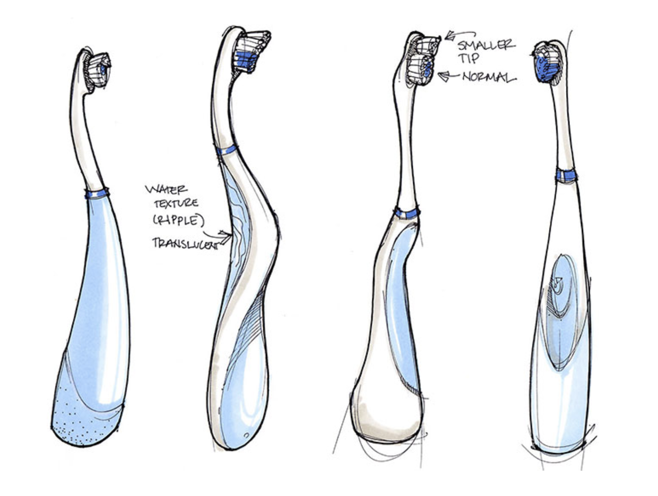
Colgate-Palmolive’s toothbrush, Acti-Brush, was innovative in the 1990s, but since then, competitor toothbrushes have surpassed Colgate’s on the market. Colgate-Palmolive hired Altitude, a design consulting firm focused on human-centered designs, to create a new toothbrush model.
The Altitude team extensively researched the audience and then developed the Motion, a new, slimmer, high-powered toothbrush with oscillating heads and an arcing neck. The entire product, from superficial features to performance, centered around one critical question: will this serve our user’s needs? Ultimately, the Motion successfully solved a user’s problem -- needing a slender toothbrush that could still deliver on performance -- the industry hadn’t previously addressed.
2. Spotify
Remember the days of paying $1.99 for one song, or hanging around the aisles of Walmart, searching for your favorite album?
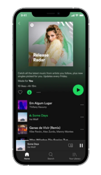
I'd argue that one of the most impressive displays of human-centered design is Spotify -- a product that showed me my prior method for purchasing music was a problem before I even recognized it as one.
Spotify succeeded by empathizing with their users’ struggle to pay for music from disparate sources and created a solution we could all embrace. Thanks to Spotify, users can get all their music in one place for one monthly fee. I’m willing to pay more for that kind of tailored, customized, helpful service.
3. Fitbit
Before handy fitness trackers, we’d have to estimate how many calories we burned in a day and find the inherent motivation to be more active (which, as we all know, is an untrustworthy source).
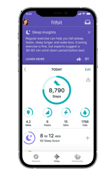
The invention of products like Fitbit is undeniably human-centered. The inventors of fitness trackers recognized people’s challenges with tracking and maintaining fitness goals and provided a useful long-term solution. The product works with the user in mind by telling the user how many calories she burned and urging her to exercise more.
4. Venmo
Venmo is another example of a product that solved a problem before most people realized it was one. I personally didn’t see how cumbersome exchanging money was until Venmo provided a solution.
The founders of Venmo, Andrew Kortina and Iqram Magdon-Ismail, stumbled across the idea of Venmo only when they encountered the problem. They went to New York City, and Iqram forgot his wallet. Andrew paid for everything, and at the end of the trip, Iqram wrote him a check.
During that exchange of money, they thought, “Why is this still the best way of exchanging money? Why can’t we do this on our phones?”
The Venmo founders needed to solve a problem they encountered and build a solution from which other people could also benefit.

Feeling Inspired?
Hopefully, these examples confirm the usefulness of human-centered design for creating long-lasting and innovative products. You’re now ready to tackle your creative process from a new angle -- the human angle.
from Marketing https://blog.hubspot.com/marketing/human-centered-design
To understand human-centered design, let’s start with what it isn’t.
Imagine you work at a gaming design company, and one day your boss comes to you and says, “Teenagers these days -- they need to get off their phones. Let’s design a crossword-puzzle board game for teenagers -- they’d welcome the opportunity to get offline.”
Your boss has good intentions, but his intentions don’t match your consumer’s reality. His idea isn’t empathetic towards a teenager’s passions, and it isn’t a solution that fits their wants and needs.
Now, let’s look at a real example of human-centered design: meal subscription boxes.
Take HelloFresh, founded in 2011 by Dominik Richter, Thomas Griesel, and Jessica Nilsson. The company delivers a box of fresh food to your door, with easy recipes included. The founders recognized that people have trouble finding time to shop for groceries and struggle to create healthy, affordable meals -- they came up with a solution to both problems.
Unlike your boss in the first example, the HelloFresh founders didn’t develop an idea unrelated to real consumer needs. Instead, they recognized a struggle someone was facing and then worked to invent a solution. In this way, it’s arguable that human-centered design is a safer and more trustworthy approach to problem-solving.
Whether your role requires you to pitch ideas in marketing meetings or design the products your company sells, it’s critical you know the process of human-centered design. By putting your consumer at the forefront of your creative process, you ensure each product you create and distribute is a true, long-term solution to your consumer’s needs. If done correctly, you’ll gain a much more reliable and loyal customer base.
Now that we’ve covered the importance of human-centered design, let’s dive into the various stages of a human-centered design process and look at some examples so you feel confident implementing the strategy for yourself.
Human-centered Design Process
IDEO -- the global design firm behind Apple’s first computer mouse, the Palm Pilot, in 1998, and more -- came up with three phases for the human-centered design process, which has helped them create such successful and long-lasting products.
The three phases of the human-centered design process are inspiration, ideation, and implementation.
Phase One: Inspiration.
The inspiration stage requires true on-the-ground research. You’ll need to engage directly with your target audience to understand their biggest problems and pain points. It’s important to research your target audience. You want to find out: what makes your consumer happy? What makes them frustrated? What do they do first in the morning? How do they devour content? What takes up most of their time?
Essentially, you want to see from their point of view.
There are a few different methods you could use to research your audience. For instance, you might send out surveys to customers via email or create a survey submission form on one of your web pages. If you find it difficult to get people to fill out the survey, you might offer incentives -- 10% off their next purchase or a ticket for a raffle contest with a giveaway prize.
You could facilitate a focus group if you don’t feel comfortable with surveys.
If you often interact with consumers on the phone or email, you might hear about issues they’re having organically.
If you’re still unsure which direction to take, check out 19 Tools & Resources for Conducting Market Research for more ideas.
Once you’ve done your market research, list with your team all the trivial and major problems with which your consumer struggles (within your skill set or products, of course). Consider the biggest hassles your consumer faces and how your products could get better to solve those issues.
Phase Two: Ideation.
Like the HelloFresh founders, your team must envision a future that doesn’t exist yet. Now that you know what problems your consumer faces, what solutions could help them become better, happier, and more productive?
The ideation stage is your “no such thing as a bad idea” brainstorming session. It requires you and your colleagues to create and tweak a long list. Take good ideas, and make them better. Refine and tweak them. Imagine all the different ways you could solve a customer’s problem, big and small.
When you’re confident you have a realistic, human-centered idea to solve for a customer’s needs, you’ll need to envision how a product could solve that solution.
Let’s use our HelloFresh example to see this stage more clearly. In Phase Two, Ideation, you’ve already recognized that people don’t have time to grocery shop and want healthy meals (that was Phase One). In this step, you’ve made a long list of potential solutions, i.e., “YouTube tutorials to create healthy meals? Write a cookbook? Pay for someone to come into your home and cook for you? Pay for a truck to deliver healthy food to your door?”
Ultimately, your team has decided -- aha! We’ll create a meal subscription service.
Now, you want to prototype and test this product on your ideal persona.
Remember, the whole premise behind human-centered design is digging into your consumer’s actual needs and providing a solution to those needs. If you receive feedback on limitations of your product, don’t get dejected -- get inspired. That feedback is exactly what you need to ensure your product will gain long-term traction with your target consumer base.
Phase Three: Implementation.
So you’ve created and tested a prototype of your product, collected feedback, and seem ready for release to a wider audience.
Now, it’s time to market your product. Ultimately, you’ll want to imagine yourself in your consumer’s shoes and then market to them from that point of view: How would I like to learn about this product if I were them?
Since your product revolves around your consumer’s struggles, you’ll want to develop an effective marketing strategy to spread the word about your product as a long-term solution to a real struggle.
You also might want to consider partnering with other businesses who offer similar solutions or share an audience with similar problems. By partnering with a business, you’re able to offer the user more of an all-in-one solution.
Human-centered Design Examples
1. Colgate Toothbrush
Colgate-Palmolive’s toothbrush, Acti-Brush, was innovative in the 1990s, but since then, competitor toothbrushes have surpassed Colgate’s on the market. Colgate-Palmolive hired Altitude, a design consulting firm focused on human-centered designs, to create a new toothbrush model.
The Altitude team extensively researched the audience and then developed the Motion, a new, slimmer, high-powered toothbrush with oscillating heads and an arcing neck. The entire product, from superficial features to performance, centered around one critical question: will this serve our user’s needs? Ultimately, the Motion successfully solved a user’s problem -- needing a slender toothbrush that could still deliver on performance -- the industry hadn’t previously addressed.

2. Spotify
Remember the days of paying $1.99 for one song, or hanging around the aisles of Walmart, searching for your favorite album?
I'd argue that one of the most impressive displays of human-centered design is Spotify -- a product that showed me my prior method for purchasing music was a problem before I even recognized it as one.
Spotify succeeded by empathizing with their users’ struggle to pay for music from disparate sources and created a solution we could all embrace. Thanks to Spotify, users can get all their music in one place for one monthly fee. I’m willing to pay more for that kind of tailored, customized, helpful service.

3. Fitbit
Before handy fitness trackers, we’d have to estimate how many calories we burned in a day and find the inherent motivation to be more active (which, as we all know, is an untrustworthy source).
The invention of products like Fitbit is undeniably human-centered. The inventors of fitness trackers recognized people’s challenges with tracking and maintaining fitness goals and provided a useful long-term solution. The product works with the user in mind by telling the user how many calories she burned and urging her to exercise more.

4. Venmo
Venmo is another example of a product that solved a problem before most people realized it was one. I personally didn’t see how cumbersome exchanging money was until Venmo provided a solution.
The founders of Venmo, Andrew Kortina and Iqram Magdon-Ismail, stumbled across the idea of Venmo only when they encountered the problem. They went to New York City, and Iqram forgot his wallet. Andrew paid for everything, and at the end of the trip, Iqram wrote him a check.
During that exchange of money, they thought, “Why is this still the best way of exchanging money? Why can’t we do this on our phones?”
The Venmo founders needed to solve a problem they encountered and build a solution from which other people could also benefit.

Feeling Inspired?
Hopefully, these examples confirm the usefulness of human-centered design for creating long-lasting and innovative products. You’re now ready to tackle your creative process from a new angle -- the human angle.


No hay comentarios:
Publicar un comentario