When people arrive at your Facebook Page, where do you think they first look?
I'll give you some hints. It's a visual piece of content that sits at the top of your Page. Its dimensions are 820 pixels wide by 312 pixels tall. It takes up almost a quarter of the screen on most desktop browsers.
That's right — it's your Facebook cover photo.

Sometimes called your Facebook banner, this graphic is one of the most noticeable parts of your Page. It's therefore crucial that you follow Facebook cover photo best practices and optimize your cover photo for the right dimensions.
A cover photo can take your Facebook Business Page to the next level. Whether you're using Facebook to generate leads, close your next sale, or create a customer community, knowing how to make and optimize your cover photo is very important. And when you consider the Facebook cover photo dimensions above, it can be tough to balance creativity with the requirements of the platform.
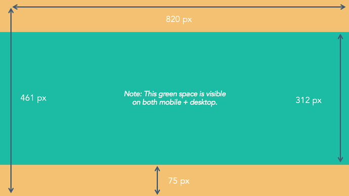
As you can see from the figure above, there's a lot of space that you can risk cutting off of your final cover photo design depending on where your audience is viewing the page — mobile or desktop.
Therefore, it's best to focus the brunt of your content in that green space, where everyone can see your cover photo regardless of the device they're using.
Need help getting started? Below, you'll find Facebook cover photo templates, and just as many best practices to guide you when designing your brand's banner artwork. At the bottom of this post, find out how to turn your cover photo into a cover video, and check out a few examples to see what others have done.
Facebook Cover Photo Best Practices
1. Do abide by Facebook's cover photo guidelines.
It seems like a no-brainer, but obeying Facebook’s cover photo guidelines is crucial to your Facebook Page existing in the first place. I'd highly suggest reading through the full Page Guidelines, but here are a few important things to keep in mind for your Facebook banner:
- Your cover is public.
- Covers can't be deceptive, misleading, or infringe on anyone else's copyright.
- You can't encourage people to upload your cover to their personal timelines.
If you get caught violating the above terms, Facebook could take action against your Page. And while Facebook doesn't explicitly say what will happen if you violate their cover photo guidelines, it's probably not smart to get your Facebook Page taken down over a cover photo infraction, so read the guidelines in full and adhere to them.
2. Do make sure your Facebook cover photo size is right.
As stated at the beginning of this article, the best Facebook banner size is 820 pixels wide by 312 pixels tall for computers, and 640 pixels wide by 360 pixels tall on mobile devices.
You don't want to spend all this time designing a cover photo only to have it look weird when you upload it to Facebook.
If you upload an image smaller than those dimensions, Facebook will stretch it to fit the right size, as long as it's at least 399 pixels wide and 150 pixels tall.
If you want a no-hassle way to make sure your cover photos are the right size, download our pre-sized template for Facebook cover photos.
Featured Resource: Facebook Cover Photo Templates

3. Don't worry about the old '20% text' rule, but still try to stay visual.
Back in 2013, Facebook removed any reference to the 20% rule on text in cover photos ... but that doesn't mean you should go wild with using text in your design. The previous rule said that only 20% of your cover photo could be text. Personally, I thought that was way too restrictive for marketers, but the sentiment behind the rule was a good one.
If you're going to use text in your cover photo, keep that text concise. Your photo will be much more informative and engaging. You can see how we've tried to strike that balance on HubSpot's Facebook Page below.
 Want to see how HubSpot uses Facebook? Like our Facebook Page here.
4. Do give your cover image a focal point and colors that match your brand.
Think of your cover photo as the portion of your Page that's "above the fold." If it's distracting or confusing, people will be more likely to click off the Page.
Many of the best Facebook cover photos include a centerpiece to focus visitors' attention, along with a color scheme that aligns with the rest of their brand. Remember, your social media accounts are extensions of your business, and should give that impression to visitors right away.
They also use negative white (i.e., empty) space as an advantage to make the subject, the copy, and the elements unique to Facebook (like the CTA button on Facebook business Pages) stand out even more.
Here's an example from The New York Times:
And one from social media management platform Sprout Social:
5. Don't try to blend the contents of your cover photo with your profile picture.
With some clever design tweaks, you used to be able to manipulate your profile picture and cover photo so they appear as if they're two parts of the same canvas.
One of Paris' old cover photos is a great example of this:

You can still do this on your personal profile, but Facebook no longer sets up Business Pages this way.
Now, as shown in the examples earlier in this article, the profile picture is completely separate from the cover photo.
We admire your creativity, but don't prepare your design this way if you haven't yet launched a Business Page.
6. Do draw attention to the action buttons on the bottom right.
You might've noticed in a few of the cover photo examples above that their primary call-to-action (CTA) buttons were different. HubSpot’s says "Send Message," while Sprout Social's says "Sign Up."
Depending on your business, you can launch a Page on Facebook with a unique CTA button to the bottom right of your cover photo. Take this button into consideration when designing your cover photo, and make it clear in the photo that this is a visitor's next step.
LinkedIn Learning does this in a subtle way below, placing the graphic of a man on a laptop over the “Sign Up” button, drawing your eye to that call-to-action.

Note: While it might seem like a good idea to add directional cues like an arrow to get people to click on the CTA buttons, note that those CTA buttons don't appear the same way on the mobile app. In other words, it might be confusing to mobile users if you directly integrate the cover photo design with the buttons.
I'll show you how Business Pages look on mobile devices in just a minute.
7. Do right-align the objects in your cover photo.
Since your profile picture is on the left, you want to add some balance to your Facebook cover photo design by having the focus of the image be on the right.
Take a look at these cover photos. Which one looks more aesthetically pleasing?
Right-aligned focus:

Left-aligned focus:
Doesn't the right-aligned cover photo look better? In Samsung’s new cover photo, the biggest design elements (the profile picture, the text, and the two phones) are evenly spaced. In Samsung's old cover photo, your attention goes immediately to the left side of the page, completely missing the name of the product on the upper-right side.
Not only is adding balance a crucial element of design, but it also allows for your cover photos to be more visually effective on mobile. Which brings me to my next point ...
8. Do keep mobile users in mind.
Statista reports that 98.3% of Facebook's user base accesses the social network from mobile devices like smartphones and tablets. That's huge — and it's exactly why it's so important to keep mobile users top-of-mind when designing your Facebook cover photo.
On mobile, a much larger portion of your cover photo is blocked out. The right side is typically cut out entirely.
Let's take a look at a real-life example. Below, check out what Cisco's Facebook Page looks like in a desktop browser versus on Facebook's mobile app.
Desktop:

Mobile:
 Whereas your cover photo displays at 820 pixels wide by 312 pixels tall on desktop, it displays only 640 pixels wide by 360 pixels tall on smartphones. Take a look at this Facebook help document for more information.
It’s important to note that the text in Cisco’s cover photo is completely cut off. While it looks best to right-align your visual elements, be careful not to put important content so far to the right that it gets cut off on mobile.
9. Do include a shortened link in your cover photo description that aligns with your page CTA.
If you want to use your cover photo to support a Page CTA, make sure your cover photo description also includes a text CTA and link to the same offer. This way, any time people view your cover photo directly, they can access the link.
Here's this practice in action on the Adobe Creative Cloud Facebook Page:
Make sure you shorten your links and add UTM codes so you can track clicks on them. Shortening and tracking features are available in Marketing Hub and in tools like bitly.
(If you want to learn more about how to write effective call-to-action copy for your cover photo description, click here to download our free ebook on creating compelling CTAs.)
10. Do pin a related post right below your Facebook cover image.
Have you ever "pinned" a post to your Facebook Page's Timeline? Basically, pinning a post allows you to highlight a typical Facebook post on the top of your Timeline for seven days. It's signified by a “PINNED POST” title on the top right of the post, like on Behance’s Page below:

How does this relate to optimizing your Facebook cover photo? Well, if you're spending time aligning your Facebook Page CTA, your cover photo design, and your cover photo description copy, you should also make sure to post about the same thing directly to your page, and pin that post to the top of your Timeline.
That way, you're giving people one very clear call-to-action when they arrive to your page (albeit in several different locations) — which should help conversions.
To pin a Facebook post: Simply publish the post to Facebook, then click the three dots on the top right corner of the post and choose "Pin to Top of Page."
11. Do consider publishing a Facebook cover video.
You read that right. Facebook Business Pages now have the option to add a video in lieu of a static cover photo, provided they meet certain requirements.
Let’s go over how you can do that.
Post a Facebook cover video by first saving a video file at 820 pixels wide by 312 pixels tall to your desktop.
Next, upload that video to your Page’s video library.
 Facebook will only let you choose a video that fits its dimension requirements. The platform currently supports cover videos that are between 20 and 90 seconds long, and a minimum of 820 pixels wide by 312 pixels tall. The maximum (and recommended) size is 820 by 462 pixels with a video resolution of 1080p.
After uploading the video, click "Edit" at the bottom right of your cover photo, and select “Choose from Videos."
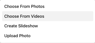
Pick the video you’ve just uploaded and reposition it so that it focuses on the element you’d like to highlight.
When you click “Next,” you'll be asked to select from 10 thumbnails for your video. Choose the one that works best.
Keep in mind that Facebook cover videos play on a loop — once it ends, it automatically starts over if the viewer is still on your Facebook page. With that in mind, make sure whatever you post is pleasant if seen more than once. Extreme, action-packed videos might appear exhausting when played over and over.
Facebook Cover Video Examples
Cover videos are a terrific option for the video-inclined, and brands across numerous industries have already taken advantage of it to hold their visitors' attention.
Here are some great cover videos to inspire you.
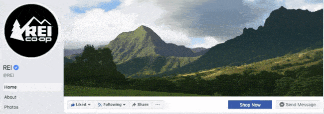
REI
REI sells outdoor equipment for activities like camping, hiking, running, boating, and biking. The company's subtle cover video reflects its products, all in one peaceful time lapse of the scenery it knows its audience craves.
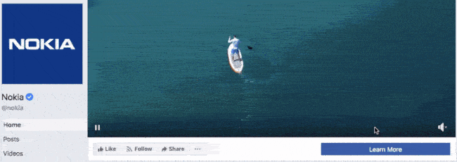
Nokia
Nokia wants to be everywhere its users are — whether they're paddle-boarding, scuba diving, skateboarding, or working. Its Facebook cover video embodies its core customer in a visually pleasing way.
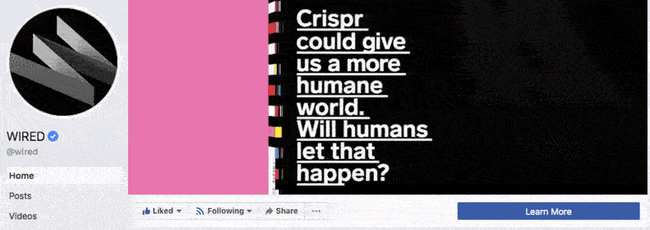
WIRED Magazine
When your publication changes as fast as the news cycle, it can be hard to keep your readers focused on the stories you feel deserve extra attention. WIRED Magazine uses its Facebook cover video for just this purpose, as shown in the example below.
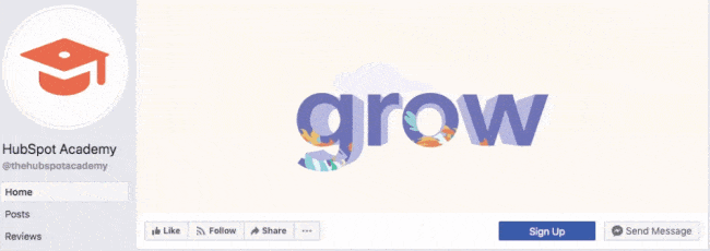
HubSpot Academy
Alright, maybe we're biased, but our brilliant creative team crushed it with the video below, made for HubSpot Academy. Sometimes, animation is the best way to capture the essence of your brand.
Next, let’s look at some examples of what Facebook cover videos look like when you’re logged into the platform.
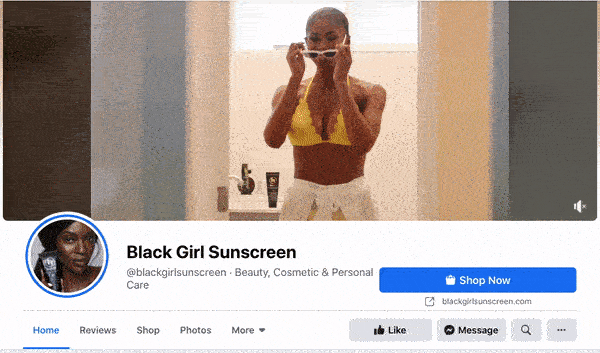
Black Girl Sunscreen
Black Girl Sunscreen makes us feel all the good things with its Facebook cover video. In it, the brand shows its customers enjoying the sun, making us wish that summer were here (or that it would last forever).
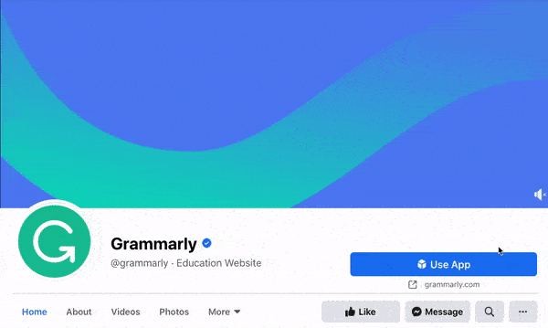
Grammarly
Grammarly is a tool for error-checking articles, emails, and any other written documents. The company's subtle cover video reflects how smooth its customers’ writing will be after they run it through the Grammarly program.
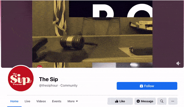
The Sip
The Sip is a Black-run and woman-owned Facebook community dedicated to promoting self-care and social awareness. The brand uses a video to present the topics that they cover in their platform, which invites users to stay on the page and engage.
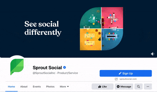
Sprout Social
Sprout Social allows brands to manage their social media profiles in one platform. Its Facebook cover video shows four different bubbles that signify the writing, posting, reporting, and analyzing of social media posts in a single box. In this way, Sprout Social shows exactly how its tool works.
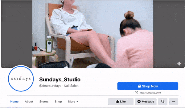
Sundays Studio
This woman-owned nail care brand uses its cover video to show how customers feel once they step into a Sundays salon — or wear Sundays nail polish.
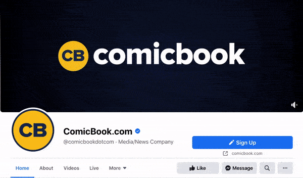
ComicBook.com
ComicBook.com is a news website covering everything that’s related to movies, shows, and pop culture. In its Facebook cover video, it gives viewers a taste of the topics, movies, and actors the publication covers on a daily basis.
Stasher
Stasher appeals to eco-conscious buyers with a fun, animated Facebook cover video that shares how your purchase impacts the planet.

As you can see from these examples, your video should be just as simple as a cover photo. Keep in mind that the same guidelines outlined in best practice #1 apply to cover videos as well.
Facebook Cover Photo Sizes that Work for Your Business
Choosing the right cover size for your Facebook Page may seem simple, but it can have a huge impact on users and prospects visiting your Page. An ill-fitting cover photo or video can look unprofessional and give the wrong impression about the quality of your products or services. With the tips I’ve shared, you’ll be sure to choose a Facebook cover photo that embodies your brand, conveys quality, and engages users on the platform.
Editor's note: This post was originally published in July 2020 and has been updated for comprehensiveness.

from Marketing https://blog.hubspot.com/marketing/facebook-cover-photo-size-best-practices
When people arrive at your Facebook Page, where do you think they first look?
I'll give you some hints. It's a visual piece of content that sits at the top of your Page. Its dimensions are 820 pixels wide by 312 pixels tall. It takes up almost a quarter of the screen on most desktop browsers.
That's right — it's your Facebook cover photo.
Sometimes called your Facebook banner, this graphic is one of the most noticeable parts of your Page. It's therefore crucial that you follow Facebook cover photo best practices and optimize your cover photo for the right dimensions.
A cover photo can take your Facebook Business Page to the next level. Whether you're using Facebook to generate leads, close your next sale, or create a customer community, knowing how to make and optimize your cover photo is very important. And when you consider the Facebook cover photo dimensions above, it can be tough to balance creativity with the requirements of the platform.
As you can see from the figure above, there's a lot of space that you can risk cutting off of your final cover photo design depending on where your audience is viewing the page — mobile or desktop.
Therefore, it's best to focus the brunt of your content in that green space, where everyone can see your cover photo regardless of the device they're using.
Need help getting started? Below, you'll find Facebook cover photo templates, and just as many best practices to guide you when designing your brand's banner artwork. At the bottom of this post, find out how to turn your cover photo into a cover video, and check out a few examples to see what others have done.
Facebook Cover Photo Best Practices
1. Do abide by Facebook's cover photo guidelines.
It seems like a no-brainer, but obeying Facebook’s cover photo guidelines is crucial to your Facebook Page existing in the first place. I'd highly suggest reading through the full Page Guidelines, but here are a few important things to keep in mind for your Facebook banner:
- Your cover is public.
- Covers can't be deceptive, misleading, or infringe on anyone else's copyright.
- You can't encourage people to upload your cover to their personal timelines.
If you get caught violating the above terms, Facebook could take action against your Page. And while Facebook doesn't explicitly say what will happen if you violate their cover photo guidelines, it's probably not smart to get your Facebook Page taken down over a cover photo infraction, so read the guidelines in full and adhere to them.
2. Do make sure your Facebook cover photo size is right.
As stated at the beginning of this article, the best Facebook banner size is 820 pixels wide by 312 pixels tall for computers, and 640 pixels wide by 360 pixels tall on mobile devices.
You don't want to spend all this time designing a cover photo only to have it look weird when you upload it to Facebook.
If you upload an image smaller than those dimensions, Facebook will stretch it to fit the right size, as long as it's at least 399 pixels wide and 150 pixels tall.
If you want a no-hassle way to make sure your cover photos are the right size, download our pre-sized template for Facebook cover photos.
Featured Resource: Facebook Cover Photo Templates
3. Don't worry about the old '20% text' rule, but still try to stay visual.
Back in 2013, Facebook removed any reference to the 20% rule on text in cover photos ... but that doesn't mean you should go wild with using text in your design. The previous rule said that only 20% of your cover photo could be text. Personally, I thought that was way too restrictive for marketers, but the sentiment behind the rule was a good one.
If you're going to use text in your cover photo, keep that text concise. Your photo will be much more informative and engaging. You can see how we've tried to strike that balance on HubSpot's Facebook Page below.
Want to see how HubSpot uses Facebook? Like our Facebook Page here.
4. Do give your cover image a focal point and colors that match your brand.
Think of your cover photo as the portion of your Page that's "above the fold." If it's distracting or confusing, people will be more likely to click off the Page.
Many of the best Facebook cover photos include a centerpiece to focus visitors' attention, along with a color scheme that aligns with the rest of their brand. Remember, your social media accounts are extensions of your business, and should give that impression to visitors right away.
They also use negative white (i.e., empty) space as an advantage to make the subject, the copy, and the elements unique to Facebook (like the CTA button on Facebook business Pages) stand out even more.
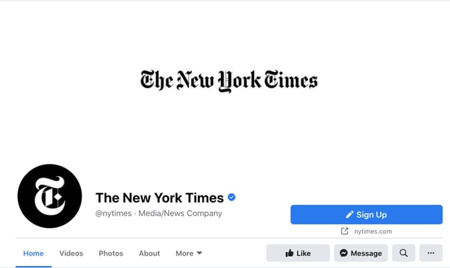
Here's an example from The New York Times:
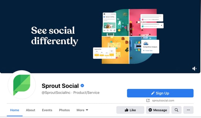
And one from social media management platform Sprout Social:
5. Don't try to blend the contents of your cover photo with your profile picture.
With some clever design tweaks, you used to be able to manipulate your profile picture and cover photo so they appear as if they're two parts of the same canvas.
One of Paris' old cover photos is a great example of this:
You can still do this on your personal profile, but Facebook no longer sets up Business Pages this way.
Now, as shown in the examples earlier in this article, the profile picture is completely separate from the cover photo.
We admire your creativity, but don't prepare your design this way if you haven't yet launched a Business Page.
6. Do draw attention to the action buttons on the bottom right.
You might've noticed in a few of the cover photo examples above that their primary call-to-action (CTA) buttons were different. HubSpot’s says "Send Message," while Sprout Social's says "Sign Up."
Depending on your business, you can launch a Page on Facebook with a unique CTA button to the bottom right of your cover photo. Take this button into consideration when designing your cover photo, and make it clear in the photo that this is a visitor's next step.
LinkedIn Learning does this in a subtle way below, placing the graphic of a man on a laptop over the “Sign Up” button, drawing your eye to that call-to-action.
Note: While it might seem like a good idea to add directional cues like an arrow to get people to click on the CTA buttons, note that those CTA buttons don't appear the same way on the mobile app. In other words, it might be confusing to mobile users if you directly integrate the cover photo design with the buttons.
I'll show you how Business Pages look on mobile devices in just a minute.
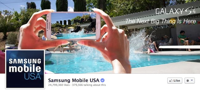
7. Do right-align the objects in your cover photo.
Since your profile picture is on the left, you want to add some balance to your Facebook cover photo design by having the focus of the image be on the right.
Take a look at these cover photos. Which one looks more aesthetically pleasing?
Right-aligned focus:
Left-aligned focus:
Doesn't the right-aligned cover photo look better? In Samsung’s new cover photo, the biggest design elements (the profile picture, the text, and the two phones) are evenly spaced. In Samsung's old cover photo, your attention goes immediately to the left side of the page, completely missing the name of the product on the upper-right side.
Not only is adding balance a crucial element of design, but it also allows for your cover photos to be more visually effective on mobile. Which brings me to my next point ...
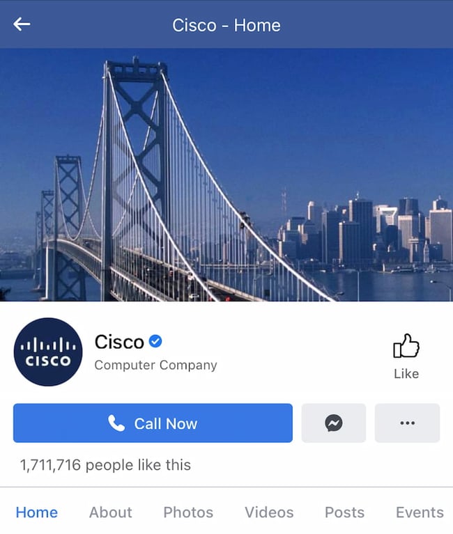
8. Do keep mobile users in mind.
Statista reports that 98.3% of Facebook's user base accesses the social network from mobile devices like smartphones and tablets. That's huge — and it's exactly why it's so important to keep mobile users top-of-mind when designing your Facebook cover photo.
On mobile, a much larger portion of your cover photo is blocked out. The right side is typically cut out entirely.
Let's take a look at a real-life example. Below, check out what Cisco's Facebook Page looks like in a desktop browser versus on Facebook's mobile app.
Desktop:
Mobile:
Whereas your cover photo displays at 820 pixels wide by 312 pixels tall on desktop, it displays only 640 pixels wide by 360 pixels tall on smartphones. Take a look at this Facebook help document for more information.
It’s important to note that the text in Cisco’s cover photo is completely cut off. While it looks best to right-align your visual elements, be careful not to put important content so far to the right that it gets cut off on mobile.
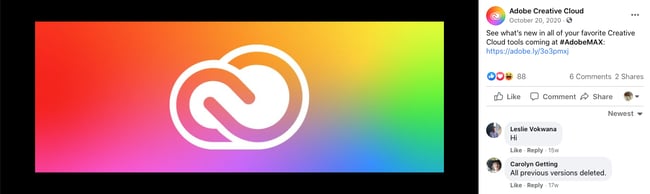
9. Do include a shortened link in your cover photo description that aligns with your page CTA.
If you want to use your cover photo to support a Page CTA, make sure your cover photo description also includes a text CTA and link to the same offer. This way, any time people view your cover photo directly, they can access the link.
Here's this practice in action on the Adobe Creative Cloud Facebook Page:
Make sure you shorten your links and add UTM codes so you can track clicks on them. Shortening and tracking features are available in Marketing Hub and in tools like bitly.
(If you want to learn more about how to write effective call-to-action copy for your cover photo description, click here to download our free ebook on creating compelling CTAs.)
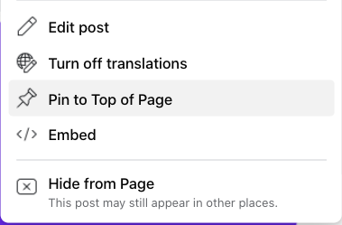
10. Do pin a related post right below your Facebook cover image.
Have you ever "pinned" a post to your Facebook Page's Timeline? Basically, pinning a post allows you to highlight a typical Facebook post on the top of your Timeline for seven days. It's signified by a “PINNED POST” title on the top right of the post, like on Behance’s Page below:
How does this relate to optimizing your Facebook cover photo? Well, if you're spending time aligning your Facebook Page CTA, your cover photo design, and your cover photo description copy, you should also make sure to post about the same thing directly to your page, and pin that post to the top of your Timeline.
That way, you're giving people one very clear call-to-action when they arrive to your page (albeit in several different locations) — which should help conversions.
To pin a Facebook post: Simply publish the post to Facebook, then click the three dots on the top right corner of the post and choose "Pin to Top of Page."
11. Do consider publishing a Facebook cover video.
You read that right. Facebook Business Pages now have the option to add a video in lieu of a static cover photo, provided they meet certain requirements.
Let’s go over how you can do that.
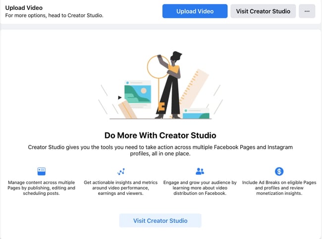
Post a Facebook cover video by first saving a video file at 820 pixels wide by 312 pixels tall to your desktop.
Next, upload that video to your Page’s video library.
Facebook will only let you choose a video that fits its dimension requirements. The platform currently supports cover videos that are between 20 and 90 seconds long, and a minimum of 820 pixels wide by 312 pixels tall. The maximum (and recommended) size is 820 by 462 pixels with a video resolution of 1080p.
After uploading the video, click "Edit" at the bottom right of your cover photo, and select “Choose from Videos."
Pick the video you’ve just uploaded and reposition it so that it focuses on the element you’d like to highlight.
When you click “Next,” you'll be asked to select from 10 thumbnails for your video. Choose the one that works best.
Keep in mind that Facebook cover videos play on a loop — once it ends, it automatically starts over if the viewer is still on your Facebook page. With that in mind, make sure whatever you post is pleasant if seen more than once. Extreme, action-packed videos might appear exhausting when played over and over.
Facebook Cover Video Examples
Cover videos are a terrific option for the video-inclined, and brands across numerous industries have already taken advantage of it to hold their visitors' attention.
Here are some great cover videos to inspire you.
REI
REI sells outdoor equipment for activities like camping, hiking, running, boating, and biking. The company's subtle cover video reflects its products, all in one peaceful time lapse of the scenery it knows its audience craves.
Nokia
Nokia wants to be everywhere its users are — whether they're paddle-boarding, scuba diving, skateboarding, or working. Its Facebook cover video embodies its core customer in a visually pleasing way.
WIRED Magazine
When your publication changes as fast as the news cycle, it can be hard to keep your readers focused on the stories you feel deserve extra attention. WIRED Magazine uses its Facebook cover video for just this purpose, as shown in the example below.
HubSpot Academy
Alright, maybe we're biased, but our brilliant creative team crushed it with the video below, made for HubSpot Academy. Sometimes, animation is the best way to capture the essence of your brand.
Next, let’s look at some examples of what Facebook cover videos look like when you’re logged into the platform.
Black Girl Sunscreen
Black Girl Sunscreen makes us feel all the good things with its Facebook cover video. In it, the brand shows its customers enjoying the sun, making us wish that summer were here (or that it would last forever).
Grammarly
Grammarly is a tool for error-checking articles, emails, and any other written documents. The company's subtle cover video reflects how smooth its customers’ writing will be after they run it through the Grammarly program.
The Sip
The Sip is a Black-run and woman-owned Facebook community dedicated to promoting self-care and social awareness. The brand uses a video to present the topics that they cover in their platform, which invites users to stay on the page and engage.
Sprout Social
Sprout Social allows brands to manage their social media profiles in one platform. Its Facebook cover video shows four different bubbles that signify the writing, posting, reporting, and analyzing of social media posts in a single box. In this way, Sprout Social shows exactly how its tool works.
Sundays Studio
This woman-owned nail care brand uses its cover video to show how customers feel once they step into a Sundays salon — or wear Sundays nail polish.
ComicBook.com
ComicBook.com is a news website covering everything that’s related to movies, shows, and pop culture. In its Facebook cover video, it gives viewers a taste of the topics, movies, and actors the publication covers on a daily basis.
Stasher
Stasher appeals to eco-conscious buyers with a fun, animated Facebook cover video that shares how your purchase impacts the planet.
As you can see from these examples, your video should be just as simple as a cover photo. Keep in mind that the same guidelines outlined in best practice #1 apply to cover videos as well.
Facebook Cover Photo Sizes that Work for Your Business
Choosing the right cover size for your Facebook Page may seem simple, but it can have a huge impact on users and prospects visiting your Page. An ill-fitting cover photo or video can look unprofessional and give the wrong impression about the quality of your products or services. With the tips I’ve shared, you’ll be sure to choose a Facebook cover photo that embodies your brand, conveys quality, and engages users on the platform.
Editor's note: This post was originally published in July 2020 and has been updated for comprehensiveness.
No hay comentarios:
Publicar un comentario